Earth Tones Lesson #1

The vast majority of the time I paint with nothing more than earth tones to which I add mineral colors when needed. Philosophically I consider mineral tones to be earth tones because they are both crushed rocks, but technically earth tones are clay pigments containing iron-oxide and mineral tones derive their colors from other compounds. In constructing my palette I use both earth and mineral pigments simply because it is hard to get a strong blue without lapis lazuli (ultramarine), but there are some blue earths. A strong green is also a bit difficult to obtain from earth without malachite (which was the classical choice), but there many choices of muted and stronger green earths which while not as strong as malachite or chromium green will suffice. The strongest reds can be obtained from cinnabar (vermillion), which is a mineral tone, but because it is regarded as highly toxic it is important to know that a very good strong red can be also obtained from burnt sienna. If an artist uses both of these, as the old masters did, modern strong red pigments such cadmium, pyrrole, napthol, etc., are not needed.

Modern artists often neglect studying earth tone and mineral tone palettes because mastering them is difficult, but if you can master them color handling becomes rather simple and so I will try to help you understand these colors better in a series of posts.

A pigment is the portion of the paint that gives the paint its color.  It may be an organic dye such as found in the madder plant (which makes a cool red rose color) or it may be a metal such as cobalt (which can produce a number of colors, but is usually used to make a strong-fast drying blue) or it may simply be a crushed rock (which is usually used for muted yellows, oranges, reds, red-violets, and greens all within a broad spectrum of what we consider brown.

As I wrote before, I consider all crushed rocks to be earth tones including lapis lazulli (ultramarine blue), malachite (green), azurite (blues and turquoises), cinnabar (vermilion red) and so on, but most artists don’t consider those earth tones, but we will regard them as being part of an earth tone palette for the sake of discussion.

Most earth tones, except the mineral tones, are “complex colors” which means they are difficult to describe.  Non-complex colors are colors that most people recognize by sight and by name such as red, orange, yellow, blue, green, violet, etc. We’ll call these “simple colors”. Simple colors are fully saturated (contain very little gray) so they are easy to describe and easy to learn how to properly mix and modify.  Earth tones are generally the opposite.  They are difficult to understand, difficult to describe, and difficult for beginners to modify or work with.

There is a trick which can help you to understand complex colors however. You simply need to associate it with a more highly saturated version of itself.  This will help you to classify the color and understand its proper use in your palette and in your painting and you will understand how to mix it with other colors and how to modify it rather easily.

For instance yellow ochre is a complex color.  It is difficult to describe.  It is not exactly yellow as we understand the word today.  Some shades are cooler (containing green) and some are warmer (containing orange) and yet usually you can use it either way in a painting. It is neutral enough that it can appear as a warm or cool in most landscapes. In flesh it appears to warm, but can be mixed with white to create a flesh tone lit by cool light making something akin to a muted naples yellow. In all cases we can replace a strong yellow with yellow ochre to make the yellows in our painting less intense than if we had used something like hansa or cadmium yellow.

Because yellow ochre is semi-transparent its use in glazes affects its temperature even more dramatically than it would with an opaque yellow like cadmium.  If you apply it thickly with a lot of oil over a over a bright white ground and then wipe it away so that only the stain is left behind remains it can be so bright it can hurt the eyes.

Properties like those yellow ochre displays make certain pigments desirable because they increase the applications they can be used for, but pigments that have strange properties like that can be hard to explain to other artists.

If I wanted to teach another artist about yellow ochre I could simply tell him that he should try to replace his regular yellow (cadmium yellow, or hansa yellow, or lemon yellow, or whatever yellow he normally uses), with yellow ochre and try it out.

Another way to teach the artist would be if I see that his model has some yellow in it where the light is hitting it I could suggest that he try to glaze some yellow ochre over the white there and see what happens.

In that fashion through practice we are able to understand our complex colors.  It’s accomplished by simplifying the color to nothing more than a replacement for a more saturated version of the same color.

Most artists can understand that yellow ochre is just a complex yellow because of its name, but other colors offer no clue as to their more saturated version.

What we are trying to find then when understanding a complex color is the dominant hue.  For example yellow ochre’s dominant hue is yellow.  Indian red’s dominant hue is red.  But what about Raw Sienna?  The name doesn’t offer any clues.  So then how do we find the dominant hue?

If your eyes are very sensitive to color you may be able to see the dominant hue, but the hue shifts dramatically depending on the colors use, especially with the transparent pigments.  Also the hue can appear to shift by when compared to surrounding colors.  Also some pigments look very different in powdered form than they do as a paint.  Also some pigments appear extremely different in watercolor than in oil.

If you are having trouble understanding a color try to paint a transitional gradient going from opaque to completely transparent.  As a general rule colors are always more cool when they are more transparent and more warm when they are more opaque (this rule is usually only broken when the color is glazed or washed over a warm colored ground).  Because of that rule when comparing two colors they may appear very similar at one level of transparency or as a dry powder, but will appear quite different when oil is added or when they are very transparent or even after they have been left to dry.  That means that the process for finding a color’s dominant hue is not always straight forward.  You may need to experiment to understand the differences between two colors that are very similar.

While a lot of theorists compare colors by way of computer it can be done with the eyes if the eyes are trained even by those who have some color blindness.  In the same way that a professional piano tuner can adjust the tones of the notes produced by the strings of the piano using nothing more than a pitch pipe you can find the dominant hue of a color by comparing it to another color.

For example if you are trying to determine yellow ochre’s dominant hue you could pick some paints out of your collection and compare it to those.  If the color most similar to yellow ochre is labeled yellow then you know that yellow is the dominant hue in yellow ochre.  If you don’t have a large collection of paints you can use a color wheel or a color chart from the internet displayed on your computer monitor.  These aren’t perfect solutions because color wheels are usually printed from the limited printer’s palette of the CMYK process colors so some colors don’t look correct on that type of color wheel and computer monitors don’t display color perfectly, but both are still very good resources that you may already have and so you should make use of them as much as possible.  When using them just find the color swatch on the color wheel or monitor that most resembles the yellow ochre and you’ll have a good idea of what the dominant hue of yellow ochre is.

In our example for instance; it turns out that blue doesn’t look anything like yellow ochre so that’s eliminated, and red is also nothing like yellow ochre.  So then we know that the dominant hue of yellow ochre is not blue or red.  Green is similar and orange is similar to yellow ochre, but between those two we find the color most like yellow ochre.  Yes.  Yellow is the hue most like yellow ochre and therefore yellow ochre is a type of yellow.

If you have a color wheel or a collection of color swatches you may be able to find the exact color matching yellow ochre or something very very close and you can mark that spot on the wheel or that swatch as being yellow ochre and you can keep that for reference, but either way, you now more fully understand what yellow ochre really is.

Once the dominant hue of any color is known you can treat it as though it were that color.  For example because yellow ochre is a type of yellow you would know that if you want it to become warmer you could add orange or if you wanted it to become cooler you could add green.  If you want to dull the saturation down a bit and darken it you could add violet.  Those modifications follow the same rules as working with regular yellow.

Also because you now know that yellow ochre is a type of yellow you would also know that in any place that you see that your model contains yellow you could substitute yellow ochre there.  Why would you do that?  Well perhaps you don’t have the exact yellow you need, but you have yellow ochre, or perhaps you just want to limit your palette to colors less intense so that the painting is not so garish.  These are common strategies that artists use when working with color.  That sort of flexible approach to color is why color is a difficult subject to teach art students.  They don’t understand that color is not all that important as long as it’s close to the intent of the artist.  What is very important however is the “tone” or “darkness” of the spot being painted.  We’ll cover that in another article extensively, but for now understand that tone is of primary importance while color is of secondary importance, but that the concepts are interchangeable because colors have tone so when you paint with a color you are adding or subtracting tone and there are no tones that are entirely colorless.

I will now list some earth tones and explain their dominant hues as I often use them.

Yellow Ochre – Yellow

Raw Sienna – Yellowish Orange

Burnt Sienna – Reddish Orange

Indian Red – Orangish Red

Turkish Red (or Mars red) – Cooler Crimson Red

Caput Mortuum – Violetish Red

Now you can see that even complex colors can form a scale or wheel making their classification rather simple.  We went from yellow, to orange, into two kinds of red and into the redder violet.

A complete scale like this can be made for reference with whatever colors you have in your collection, but the umbers present some difficulty when trying to classify them.  One such difficulty involves the non-standard naming conventions.

As an example of the confusion that can arise from non-standard naming conventions I leave you with this; Umber, when burnt, is called burnt umber.  So usually if a paint is called simply “umber” it is probably not burnt umber.  However plain umber is sometimes also called “raw umber”, not merely “umber” so a company may offer a paint simply called “umber” or perhaps one called “raw umber”, but sometimes they offer both.

In many cases “raw umber” is different than “umber”, even though they are both unburned.  When a company distinguishes between the two they are indicating that what they offer as “raw umber” is a type of umber that is generally lighter than what they offered as simply “umber.”  So that means that if they offer both the “umber” will be darker and the “raw umber” will be lighter, but in both cases they will have very little red in them because both are unburned.

Furthermore there is an umber which is always very green called “green umber” and then there is “raw umber greenish shade” which is more green than normal umber, but not always as green as green umber.

The green hue in umber arises from the presence of a metal called manganese whereas the presence of the red in the pigment is from iron oxide (the same thing that in various forms colors most earth-tone pigments).

Because manganese gives umber its green undertone if more manganese is present the umber becomes more green.  And if there is more iron oxide present the umber becomes more red. The red becomes more intense by burning.

Because red and green are complimentary colours or near complimentary colors the presence of both in one pigment, as we find it in the umbers, make umber a more neutral colour than we find in the siennas and ochres.  Also remember that the more colorant is present in the pigment the more dark and opaque the paint becomes.  Umber that contains more clay and less colorant is generally lighter overall and that sort of pigment is what most companies call their “raw umber” rather than simply “umber.”

I believe that the industry should not distinguish between umber and raw umber but should only list umber as being dark or light and use the term umber and raw umber interchangeably in the same way that they do for sienna and raw sienna.  This would clear up a lot of confusion.  For example notice the differences between how sienna and umber has to be approached in these two Wikipedia (yuck) articles (http://en.wikipedia.org/wiki/Umber AND http://en.wikipedia.org/wiki/Sienna).  Those pages are perfect examples of why it’s so hard to teach colour to students and it has to be stopped!

To their credit the company that I like to order earth tone dry pigments from, Sinopia.com, handles the names of their pigments very well.  They give the name of the pigment (just called Umber, Sienna, etc), whether it is burned or not (always calling it “raw” if it’s unburned and “burnt” if it is burned to avoid any confusion), and then listing its darkness and often its color temperature in comparison to the average temperatures of that kind of pigment, and sometimes its dominant hue.

For example in my collection I have these Sinopia siennas: Raw Sienna Warm Shade PC206RS, Burnt Sienna Deep Warm Shade PC316BS, Raw Sienna Deep Orange Shade PC210RS, and Burnt Sienna Warm Shade Light PC310BS.

And in my collection I have these Sinopia umbers: Raw Umber Very Dark Neutral Shade PC414RU, Burnt Umber Very Dark PC524BU, and Burnt Umber Reddish Brown PC510BU,  Burnt Umber Brownish Warm PC502BU, and Raw Umber Greenish Dark PC402Ru.

Because there is often confusion between colour names it is best to use a manufacturers colour chart usually available on their website to see samples of the color before you order it to make certain it’s the colour you need.  It’s also advised to check a few different manufacturers to see what they have to offer.  There is absolutely no problem mixing paints from different companies as long as they are paints of the same medium (oil paint with oil paint, watercolours with watercolours, etc).

In another article we’ll explore paint purchasing more extensively, but a little tip for now is that if you always use a dark umber you’ll find that you save time and probably some money by choosing a darker umber to begin with rather than mixing another colour into your umber to darken it.  Avoiding using two pigments together helps keep the colour more pure and it keeps your glazes more transparent.

Because great painters master the optical effects paint can achieve great companies like Sinopia.com offer a wide range of earth tones in a dry pigment form where another company would only offer one or perhaps two at the most in a ready-to-use paint form.  Because I usually paint from pigment and not from pre-mixed paints I like to have a lot of pigments on hand to give me the exact effect I want, plus I’m a pigment piggy.  Oink Oink!

A lot of artists only include one type of brown on their palette at a time.  Raw umber is a common one to use because it can be modified to resembled burnt umber pretty easily.  For warmer paintings an artist may choose to begin with burnt umber to save time and maximize transparency which would be diminished with a mix.  If the painting is very warm burnt sienna may be chosen.  I personally use a lot of browns on my palette all simultaneously, but that’s not uncommon to portraiture work when working in a classical method.  It’s more uncommon in landscape painting in the way that the impressionist’s did things and uncommon in many modern palettes for reasons that I feel are hard to justify, but we’ll cover those things in other articles.

To make understanding the most common browns that you may find on many artist’s palettes easier you can organize the siennas and umbers by their dominant hues like this:

1. Raw Sienna – Yellowish Orange or Orange, medium darkness

2. Raw Umber – Medium Orange or Reddish Orange with a green undertone which keeps the color neutral and very gray making umber a good color to mix with white or black to produce gray tones.  The darkness varies a lot depending on maker, if it’s just called “umber” it’s usually pretty dark, if it’s called “raw umber” it’s usually lighter. You can consider raw umber to be a “cool brown”.

3.  Burnt Umber – Orangish Red or even redder in the “Reddish Brown Shade.”  It is usually dark except for “Reddish Brown shade” which is lighter. You can consider burnt umber to be a “warm brown”. Burnt umber is usually very transparent. The transparency of raw umber varies a bit more from company to company but burnt umber is usually always very transparent.

4. Burnt Sienna – Very Reddish Orange.  It’s a little darker than its raw version

5. Raw Umber – Cool Slightly Greenish Red-Brown

6. Venetian Red – Orange-Red in a very warm Red-Brown. Transparent. Very good for making flesh tones that are a bit reddish.

I hope this gives you an idea of how to use earth tones in your paintings.  I’ll try to explain more about these colors in other articles.

Posted in Uncategorized | Leave a comment

A Real Eclipse – Not The Chick Flick

On May 20th 2012 Anno Domini the moon passed over the sun leaving a perfect ring of light known as the “Ring of Fire.”  In case you missed it here’s a jpg of the event as I saw it from my house.  This is a picture of how the sun appeared as a projection from my telescope (with the eye piece removed) on black paper.  In life the image was much more crisp, but the light flared the camera a lot.  This was the best photo I could grab.  I made a video also but it’s rather long and boring and just shows more of this so I won’t be posting it.

Eclipse

Posted in Uncategorized | Leave a comment

Chen and Family Arrives in America

We are so happy to have Chen Guangcheng and his family in the United States as

the most honourable guests our nation has ever had.  No leader in the

world has stood up to the fierce wrath of the Chinese government.  Even

our dear leader Obama does not have the courage to or desire to defy

them and Biden declared that we would not second guess China’s one

child policy.  Yet this humble blind man, who’s eyes can see the unborn

child in a woman’s womb, saw the horrors of abortion for what they are

and heeded the calling of God as their advocate.  Our nation is truly

blessed to have him as our guest.

Despite my regular work I am trying to paint a portrait of Chen Guangcheng on an 11×14 inch canvas board.  I am using lightfast pigments from sinopia.com with cold pressed linseed oil from Gamblin as the medium.  If the portrait can be finished and is of a reasonable quality I think I will attempt to auction it off or accept a single contribution for it and donate whatever proceeds to ChinaAid.Org the Christian organization which helped Chen and his family escape the communist country of China.

Chen’s nephew has been charged with murder and will need legal help and your prayers.  This fight is not over.  The persecution of Christians and political activists in China will not stop until communism is rejected by the whole of the Chinese people.

Posted in Uncategorized | Leave a comment

Small Light

Digi-Candle

Digi-Candle

Psalms 18:28-31
28    For thou wilt light my candle: the LORD my God will enlighten my darkness.
29    For by thee I have run through a troop; and by my God have I leaped over a wall.
30    As for God, his way is perfect: the word of the LORD is tried: he is a buckler to all those that trust in him.
31    For who is God save the LORD? or who is a rock save our God?
(KJV)

It has been said that even the smallest light can penetrate the darkest part of the universe and be perceived.  A small light can indeed appear bright when it stands in contrast to darkness.  The aim of all art should be to display of the contrast of the light and the dark just as God designed it as the artist of the universe.  The nature of light as God created it is what we should attempt to imitate.

Regardless of the medium, we artists use contrast to display the form as a demonstration of the difference between light and darkness.  We can use paint, stone, fabric, and pixels to display light and darkness to full effect.  Pixels are are great way to display light because our palette of light is limited only by the medium and the computer screen is a light source so we have the viewer look into it just as they may look into a candle.

One of the reasons why classical artists worked in so many different mediums without difficultly is that they understood that their studies were all aimed at studying light and darkness not the specific mediums of painting or sculpture or architecture or metal-work.  That, among other things, allowed them to easily move from one discipline to another.

While doing a classical study we do not use the light to reveal the form.   The chosen model is unimportant to the study.  Instead we use the form to reveal the light and darkness for it’s own sake.  The effect is what many artists now call “chiaroscuro” but I think the old masters would have just called it “correct.”

Genesis 1:1-19
1    In the beginning God created the heaven and the earth.
2    And the earth was without form, and void; and darkness was upon the face of the deep. And the Spirit of God moved upon the face of the waters.
3    And God said, Let there be light: and there was light.
4    And God saw the light, that it was good: and God divided the light from the darkness.
5    And God called the light Day, and the darkness he called Night. And the evening and the morning were the first day.
6    And God said, Let there be a firmament in the midst of the waters, and let it divide the waters from the waters.
7    And God made the firmament, and divided the waters which were under the firmament from the waters which were above the firmament: and it was so.
8    And God called the firmament Heaven. And the evening and the morning were the second day.
9    And God said, Let the waters under the heaven be gathered together unto one place, and let the dry land appear: and it was so.
10    And God called the dry land Earth; and the gathering together of the waters called he Seas: and God saw that it was good.
11    And God said, Let the earth bring forth grass, the herb yielding seed, and the fruit tree yielding fruit after his kind, whose seed is in itself, upon the earth: and it was so.
12    And the earth brought forth grass, and herb yielding seed after his kind, and the tree yielding fruit, whose seed was in itself, after his kind: and God saw that it was good.
13    And the evening and the morning were the third day.
14    And God said, Let there be lights in the firmament of the heaven to divide the day from the night; and let them be for signs, and for seasons, and for days, and years:
15    And let them be for lights in the firmament of the heaven to give light upon the earth: and it was so.
16    And God made two great lights; the greater light to rule the day, and the lesser light to rule the night: he made the stars also.
17    And God set them in the firmament of the heaven to give light upon the earth,
18    And to rule over the day and over the night, and to divide the light from the darkness: and God saw that it was good.
19    And the evening and the morning were the fourth day.
(KJV)

In this quick digital painting that took about 10 minutes we see that a relatively dull light, a candle light, appears quite bright.  This is due to the contrast of the darkness surrounding it.  (I also capitalized on the proper use of transitional color in the more transparent portions of the black and some light transmission through the transparent wax, but those are different subjects).

On a scale of 0 to 100 with 0 being pure white and 100 being pure dark (a standard measurement I use for digital art) the candle’s flame is at 16.  That means our candle isn’t super bright (a zero would be a light at it’s brightest white so we’re a good distance from that considering we are looking directly into a light source), but it’s singular light can be seen as clearly as one man’s eye looks into another’s for the surrounding darkness draws the eye into the center of the flame.

Matthew 6:22-23
22    The light of the body is the eye: if therefore thine eye be single, thy whole body shall be full of light.
23    But if thine eye be evil, thy whole body shall be full of darkness. If therefore the light that is in thee be darkness, how great is that darkness!
(KJV)

I hope this little study gives you some ideas of how to use light and darkness in your art.

Posted in Uncategorized | Leave a comment

Pomegranate in Oil #1

Pomegranate in Oil #1

Pomegranate in Oil #1

This painting is for sale if anybody wants to make an offer.  Eventually I’ll sell it on an auction site or off my website or something, but you could always buy it before that.  It’s oil paint on a canvas panel board 9×12 inches (a little bigger than my scanner so the signature is cropped off in the scan, but is intact on the painting).  The pigments used were all lightfast.  They were Yellow Ochre, Burnt Sienna, and Burnt Umber Very Dark (all from the standard sinopia historical pigment set), with Winsor and Newton’s Soft Mixing White (Titanium and Zinc white together with safflower oil).  This painting was done alla prima.  No varnish.  The physical texture is smoothish, not rough and won’t collect a lot of dust.  It’s a cool hued painting and is pleasant.  It’s dry now.  No frame.  Email me if you want to buy it.  Thanks.

Posted in Uncategorized | Leave a comment

Viggo the Sepian

viggosketch

Sepia is a color very similar to burnt umber but more neutral.  The lighter shade I used is CMYK color something around 50 32 69 42 for darkest areas and 44 55 63 20 for a midtone).

Because it’s like umber it’s used in similar ways.  In particular sepia is a useful color when creating skin tones.  The lighter shades work well as a neutral tone and the darker shades work as a substitute for black when creating hard lines.  It can be used in an under-painting, but because sepia is easier to conceal than pure black it is also regularly used as an ink to do ink drawings on the canvas before the painting is begun.

In this case I’ve done a simple sketch of Viggo Mortensen as Aragon in the Lord of the Rings movies.  As you can tell the eyes are a little off but I did not take any measurements while doing the sketch and I did not use any construction lines since this was a study on color use and not accurate drawing.  The pencil I used was a CretaColor Sepia Light Number 463 22.  It came as part of a 27 piece set I got for Christmas available here…

http://www.dickblick.com/products/cretacolor-drawing-sets/

I used the pencil, the blending stick, and the kneaded eraser in the kit.  I only used the eraser towards the end of the process to touch up ever so slightly.  I also used the white pastel pencil in the kit to highlight the eyes.  I like the eraser in the kit as it was super sticky and picked up material better than some generic kneaded erasers I’ve used.

I sketched on watercolor paper because I couldn’t find any sketch paper at the time and this perhaps made the project a bit more expensive, but… oh well, the added texture was nice.

The sketch was accomplished by viewing the image on the computer screen which was about 40 inches away.  I simply held my pencil with an outstretched arm towards the screen marking lengths of one area of the picture to another from the tip of the pencil to any area on the pencil with my thumbnail (which is long because I play classical guitar) and used the lengths I obtained to mark the distance of one point and another on the paper making light marks until I was sure everything was in place and in proportion.  No actual measurements were taken.  That method isn’t really accurate enough for doing facial detail but it usually good enough for figure drawing.  I choose to use the method only to save time and as you can tell the accuracy of the placement of features of the face is lacking.

I started laying in tones in a bit of a light cross hatch fashion with the point and somewhat side of the pencil very lightly.  Then I used the blending stick to blend those areas into smoother tones and then I continued with the blender to sort of paint in areas to create the transitional areas as I would with a brush.  When I needed to I would apply more pigment from the pencil to the paper and continued blending, but I also picked up some pigment from the pencil with the tip of the stick and applied it to the paper with the stick directly.

Once I got the picture done all in sepia I lifted just a few areas ever so slightly with the eraser to bring back a few of the whites and then used the white pastel pencil to add the highlights in the eyes and a few on the nose and lips and so on.  It’s better to avoid having to do this because the pastel never looks like the paper does but it helps give you fine detail where it’s needed.

Sketching hurts my hands, but the results can be pleasing.  Hopefully this gives you idea of how to use the color sepia in your art.

Posted in Uncategorized | Leave a comment

Studies

All artists should practice their craft by creating simple studies to teach themselves the fundamentals of art.  Because the studies are very small and lack detail they can teach the principles more clearly and with less frustration than a full piece would.  In particular studies are useful for understanding color, but they are also useful in understanding form, pose, balance, composition, line, tone, lighting, and all the other fundamentals.  Here are two simple studies I did last year in watercolor with sinopia pigments that helped me understand the use of color.  The first is a pomegranate which I did with yellow ochre, green umber, and if I remember correctly, raw umber.  I sketched it quickly and went to color immediately without working out any tone.  The result of that palette was a cool hued painting only about four inches in size.  I liked it and I have in on my wall today.  The second I did loosely without any detail to the face or hands but this time I stuck to a warm palette of only two colors using the wash to control the tone.  The palette was nothing more than burnt sienna for the darker reds (the color swatch on the left) and raw sienna for the orange-reds (the swatch on the right).

It’s important to understand the difference between doing studies and doing commercial work.  When you are producing work for a client you have to be accurate in every respect of the art, even though it takes a considerable amount of time to work that way.  You have to be willing to tell the editor to take a hike if he’s pressuring you to work faster than you can while still doing great work.  There is nothing more insulting and disrespectful to an artist and his family than an editor who sets an artificial deadline for you when he knows the work doesn’t have to be done until a time well-after that thinking that it will motivate you to work harder and faster to make himself look better at his job.  If you are self disciplined to work hard until the work is complete you don’t need an editor at all except as a help in coordinating the work between artists and catching errors that you missed.  Self discipline to work until it’s done is how you have to work to be successful and meet the real deadlines.  Because a study distracts from your commercial work but is absolutely necessary for improving your art when you are doing studies for yourself you can ignore accuracy in many respects.  For example if you are doing a color study then the drawing isn’t all that important.  The goal is to understand the color in your hand and how to use it to render form.  If you are studying drawing you can ignore color.  If you are learning about lighting you might want to pick up a camera instead of a pencil.  If you are learning about composition (and don’t have allergies) get outside of the studio if you can and visit a flower shop.  I’m sure your wife will appreciate the gift.

The reason that a lot of artists have a hard time improving is that they don’t study correctly.  They either try to only accomplish a masterpiece every time or they do silly little drawings of mice all day every day with the same type of pencil from their imagination only.  They draw the mice because they already know how to do it and so it’s enjoyable for them, but they never go on to other subjects or try their hand at pen drawing and so never learn how to move their tool deftly and the former type of student gets frustrated and hates everything they do because it never looks they way they want.

The solution is to break up your study time into understanding the elements that make great art.  By studying line, color, form, composition, light, texture, depth, presentation, graphics, calligraphy, etc., all separately you will learn much faster and be able to incorporate what you have learned into your commercial pieces.  You won’t be frustrated that the drawing didn’t look excellent because you didn’t waste your time on that.  You can tell yourself, “That’s alright.  Drawing is tomorrow.  Today is composition and that looks pretty good.”

I’ll be posting a study that I’ve done of a Rembrant painting illustrating his extremely limited color palette and some of my thoughts about it another time.  Until then I hope you enjoy these studies.

Posted in Uncategorized | Leave a comment

Baroque

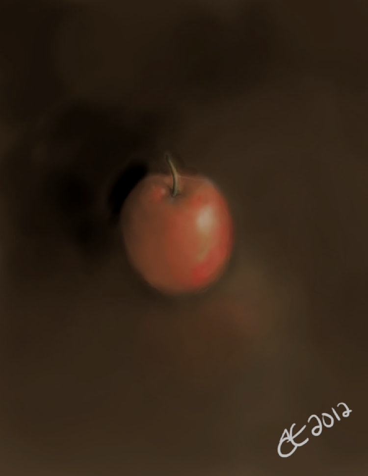
I thought I’d take 15 minutes to create a quick digital painting in the baroque style.  I did this with a series of fast glazes using only one brush set to various opacities and controlling the tone and the color simultaneously.  The red was a little more washed out than I would have liked.  I think a deeper brown red would have worked better, but I didn’t want to waste time, I have to get back to flatting Xforce and Ultimates.  Let me know if you like this.  I had to darken it a bit since my windows setup is set a bit darker than most peoples machines because that works better for comics and I noticed it the picture was too light in linux and on other people’s screens.

digifruit

Posted in Uncategorized | Leave a comment

Mario Painting

Check out the painting of Mario on Embs Computer Art at this link.  http://embscomputerart.com/paintings.htm

Posted in Uncategorized | Leave a comment

Under Painting

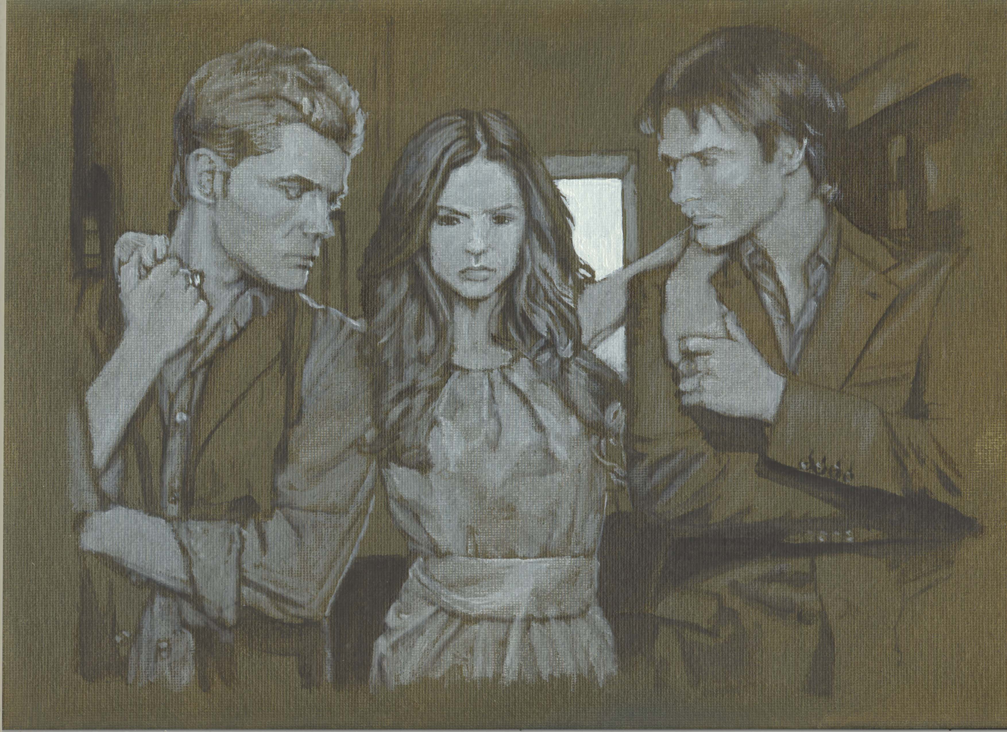
Feb 19, 2012 Step 1: Right now I’m doing an under-painting in oil for a portrait of the cast of The Vampire Diaries. I’m applying the paint as a series of glazes over a dark neutral background. I want to keep as much of the original background color as I can and use white only to raise the tone and black only to lower the tone without mixing each with the other.  The goal here is to use mostly transparent grisaille execution over a colored toned background.  Soon I will be making some videos on painting for everyone to see some of my process, but this will have to do for now.  Scroll down to see the next step.

UnderPainting

This is my UnderPainting so far

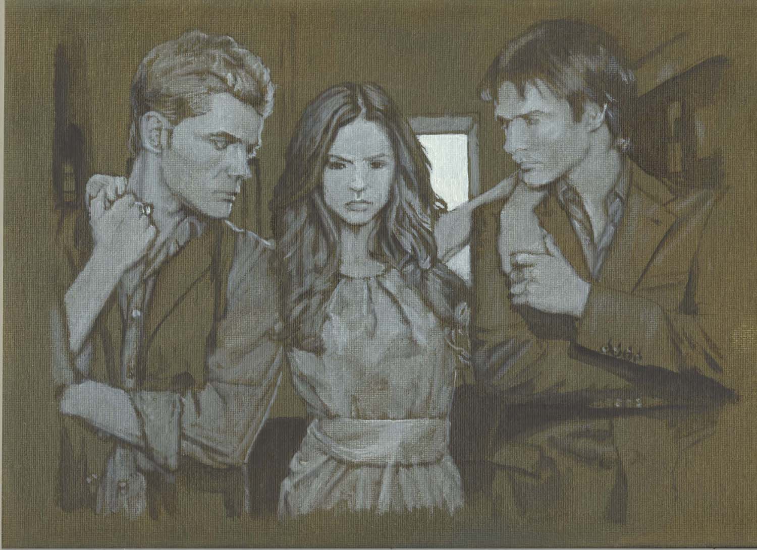
Mar 2, 2012 Step 2 : Haven’t had much time to work on the painting but here’s how the under painting is going.  I still need to refine the faces and adjust the tones on the skin a bit.  Then I may be ready for some color here and there, but I might refine the dress a bit more before that.

UnderPainting In Progress

UnderPainting In Progress

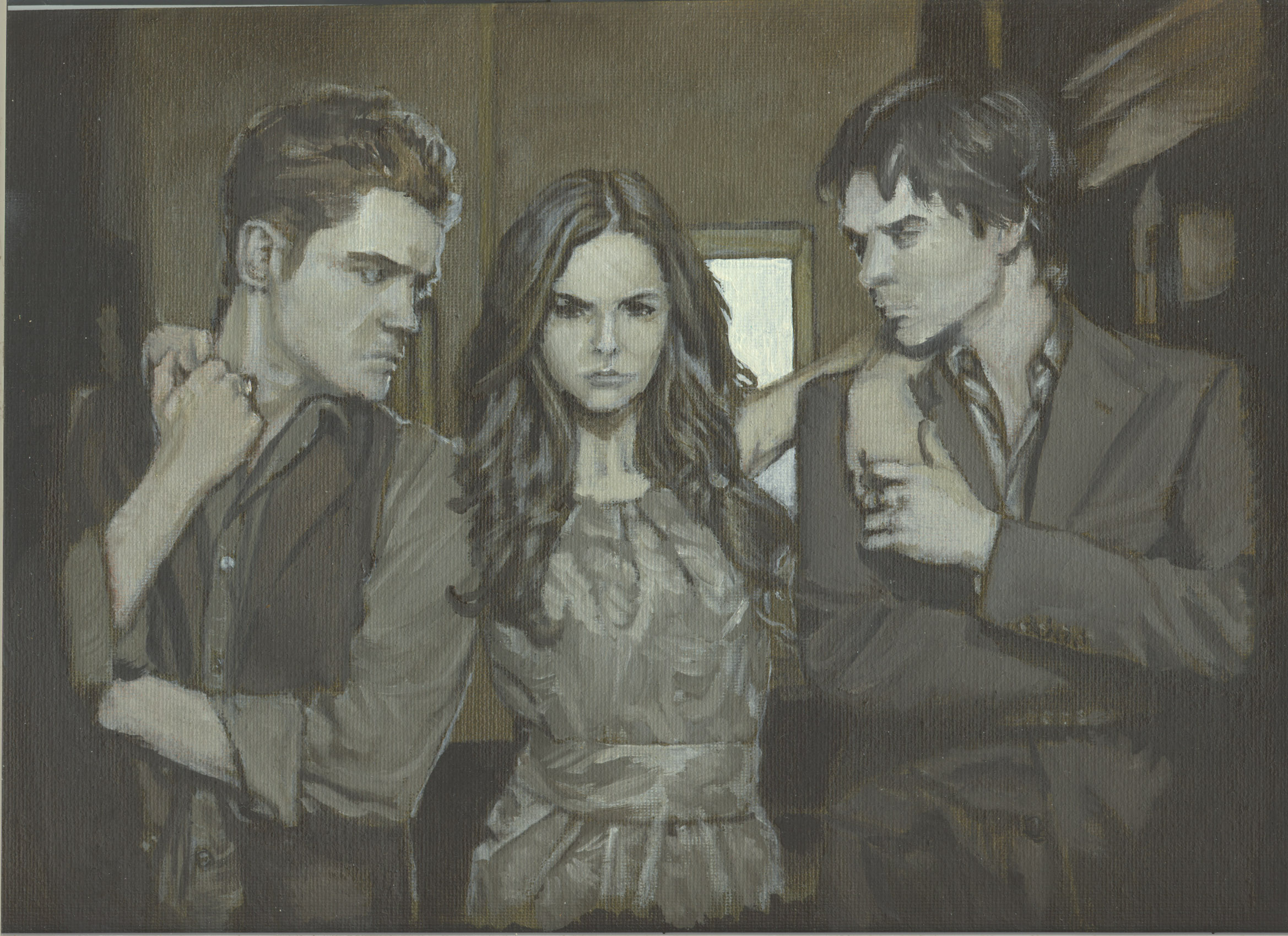
Feb 25, 2013 Step 3: Yes it’s been a long time since I’ve been able to work on this painting.  I can’t remember the last time but between then and now it’s just been sitting there gathering dust until I could scan it in to show you the progress.  Here I’ve started adding in color washes that also contained tonal adjustments.  I’ve tried to add the color in very gradually so as not to blow the monochromatic nature of the painting.  I think it’s looking pretty darn good considering the board is only 9×12 inches.  Ya, three torso tall figures abreast with some room for a background on 9×12 with all that detail.  Needless to say I’m using pretty small brushes, but it’s still a pain.  I might have to get my magnifiers out soon, I’m not as young as I used to be.  Honestly the detail is not as fine as I would like, but the rough texture of the canvas is bothering me.

UnderColor Stage 1

UnderColor Stage 1

To get a smooth stroke the ratio of oil to pigment has to be just right and when working at a small scale like this the amount of oil you need is a bit difficult to gauge.  Especially so, when you don’t want to waste any paint by mixing up more than you’ll need for one session.  If you premix your paints and store them in tubes you can avoid some of those problems, but when working at a small scale it’s often better to have a high pigment content to achieve the same color density which means your paint would be expensive to use for larger paintings (which is one of the reasons acrylic paints made for painting miniatures is more expensive than regular acrylic paint) and a high pigment content makes glazing a bit difficult.

If you use too much oil or thinner (thinner is especially bad in this regard) in any case the pressure of the brush will deflect pigment away from the center of the stroke.  The pigment will be carried by the oil or the thinner and the pigment won’t lay under the brush during the stroke and remain where you placed it.  It will end up sitting on the outside of where the brush passed on both sides.  That sort of brush work can be used for other things, but it’s not what we are doing now and I had trouble with it in stage one because I had too much thinner in my mix.  I have learned since I began this painting so long ago that it’s better to not have any thinner in your paint at all in most circumstances but I wanted the painting to dry more quickly.  Now I know that I shouldn’t have bothered to worry about it.  It just made things harder than the benefit of having thinner was worth.  Thin layers like this dry fast enough on their own.  They say live and learn, and I did.

You might wonder if a heavier bodied oil would be worth trying out if you are having real trouble.  I wondered the same thing, but prefer using as few tools as I can and just controlling what I can through mastery of the few tools I allow myself.  I haven’t played around with a heavy bodied oil enough to know how it would affect a small scale painting either and I didn’t want to find out on a real piece I was putting together.  I’ll reserve that kind of experimentation for studies, but let me just say that it’s just not necessary, you just have to get the mix right.

Just remember if you don’t use enough oil the color won’t be transparent enough and won’t flow.  Remember we are applying the color as glazes, not opaquely.  But if you use too much the pigment will move around too much before it settles.  It just takes practice so don’t be discouraged.  Work on a larger scale, maybe a 12×12 canvas for a bust of a single person as a study until you figure it out for yourself and then experiment with other sizes.

Every pigment is a little different and even oil from the same company produced in the same batch can have a different body depending on how it was stored and transported.  Plus if the paint is allowed to sit out for a while, especially if it’s spread out into a physically thin layer it will begin to oxidize and harden.  (Some artists prefer it that way especially when applying the paint in a dry brush method.)  And so be patient, you’ll get better just as I have.

I realized that I needed to buy some more small brushes because my little ones are fuzzed out already from the rough texture of the first layer.

As you can see, most of the real work of the piece was done in the underpainting stage and now we are at what I call an undercolor stage which is where we start filling in colors to establish color relationships and we try, try, try, not to ruin the tonal ones established in the tonal underpainting stage (steps 1 and 2), but rather improve them.  The idea here is to warm the flesh tones and the background a bit and to fill in some colored areas of the clothing and hair while preserving as much of the former work as possible unless you notice it’s incorrect.  The clothing has gone from open hollow bodied shapes which revealed the tonal ground to solid bodies that block it.  That brings the figures to the forefront and give them a presence in the work.  Before they were ghosts, now they are vampires.  We aren’t finished yet.

Posted in Uncategorized | Leave a comment

Important Update

The Digital King James Bible has been updated to edition 1.2

Verses 25 and 26 were missing from Genesis chapter 50 where I joined Genesis to Exodus.  These verses have been added back into the text so please download the new version and please delete the old version if you have downloaded it to avoid your own confusion.

I’ve also added the word “coffin” to the list of all the words in the Bible as the change in the PDF Bible affected the list of words because the word “coffin” only appears once in the Bible, but it’s in Genesis 50:26 so you’ll have to download the new list if you still have the old one. Thank you.

Remember that if you see any errors with anything I’ve posted especially the Free PDF Bible just send an email to reporterrors@embscomputerart.com and I’ll address the issue immediately.  Thank you.

Posted in Uncategorized | Leave a comment

Bible Concordance Progress

The Bible Concordance is coming along. I’ve finished all A, B, C and most D words, along with all V, W, X, Y, and Z words. Only 8667 words to go!  The first edition will simply be a list of all the words in the Bible with a list of the verses in which they can be found.  After the release of the first edition I will go over the whole list of words again to prove it.

The next edition will include an ensample text from each verse containing that word just like we find in large concordances to make the list of verses more useful.  I will program a computerized process for that work, probably in either java or perl, but the initial process, which I need for the first edition, must be partly one of manual labour as a way to help prove the text of the digital Bible and the list of words that were compiled from it.  I’ve already noticed three words that have variant spellings that need to be addressed.

The goal of the PDF Bible Concordance is to provide a royalty-free, free to print, free to distribute, Bible concordance as a tool for Bible study just like the free pdf Bible

Other projects Embs Computer Art will undertake after the concordance will be an exhaustive Bible dictionary and the first truly exhaustive topical reference of the entire Bible.  Each of those will also be released in phases so that they are somewhat useful at any stage during development.

Isaiah 28:9-11

Whom shall he teach knowledge? and whom shall he make to understand doctrine? them that are weaned from the milk, and drawn from the breasts.
10 For precept must be upon precept, precept upon precept; line upon line, line upon line; here a little, and there a little:
11 For with stammering lips and another tongue will he speak to this people.

Posted in Uncategorized | Leave a comment

SOPA and tyranny

The internet is the greatest invention since the printing press.  Just as the printing press broke the back of Rome and set Europe free from Catholicism by allowing Bibles to be printed in native languages the internet has given access to the word of God to anyone and everyone who can afford some basic equipment and an ISP account while websites, chat rooms, and message boards, have led untold numbers of souls to Christ.

The Bible is now regularly being produced digitally without physical binding and will be distributed as other electronic settings have, setting millions of souls free in countries where printing Bibles is illegal.  The printing press made the King James Bible the best selling book of all time and digital books have made the King James Bible the most widely distributed book throughout eternity, much to the dismay of one supporter of SOPA, Rupert Murdoch, the owner of Zondervan, a Bible corrupting publisher.

Murdoch can’t make money from the King James Bible you see, because it’s not copyrighted, so he corrupts the Bible, calls it the New International Version, and tries to protect his bastard-child-Bible with SOPA because he loves money.

Yes, if you wonder what the motivation for SOPA is simply read 1st Timothy 6:10 which says, “For the love of money is the root of all evil: which while some coveted after, they have erred from the faith, and pierced themselves through with many sorrows.”

Now that the Bible is more widely available we can expect to suffer more as Christians being persecuted by friends, family, bosses, and governments, for the apostle Paul wrote in 2nd Timothy chapter 2 verses 8-9, “Remember that Jesus Christ of the seed of David was raised from the dead according to my gospel: 9 Wherein I suffer trouble, as an evil doer, even unto bonds; but the word of God is not bound.”

Because of the internet that prophecy is fulfilled for now the word of God is available throughout the whole world without any binding and we Christians, like Paul, will have to suffer persecution as the price for unbinding the word of God.

Digital Bibles will be the way China will be set free.  No smuggling will be necessary as it was during the time of William Tyndale.  The Bible will be downloaded and printed locally.  The internet gates will simply be opened and the Chinese people will have what they need.

If you doubt it let me assure you that it will happen.  The Chinese are the most notorious digital pirates on the planet.  They will try to obtain anything that we say that they can not have.

The word of God will be published in China as it has in every country for Christ prophesied in Mark 13:9-10, “But take heed to yourselves: for they shall deliver you up to councils; and in the synagogues ye shall be beaten: and ye shall be brought before rulers and kings for my sake, for a testimony against them.  10  And the gospel must first be published among all nations.”

Right now China heavily regulates what it’s people can see on the internet, but soon that will change.  We have to demand it and it will happen.  We must stand firm as Reagan did and demand that China, “Tear down the great firewall!”

The work has just begun.  Nations like China, Burma, and Vietnam must be forced to allow any and all internet traffic to it’s citizens.  A nation is not free unless all internet traffic is unblocked, uncensored, unregulated, and unrestricted.  That means that America is not free.

Right now democrat and republican tyrants are conspiring to actually destroy the internet.  SOPA is one of the tools they are using.  A national and international sales tax known as a value-added-tax will be another.

Obama can’t feign innocence in the matter of SOPA.  This all began with Obama’s terrorist-pardoning, gun-smuggling, gun-banning, race-bating, racist, attorney general, Eric Holder, using the power of the executive branch’s justice department to shut down hundreds of websites that were not even in the United States for nothing more than selling fake sport’s clothing.  That’s right.  Obama, who doesn’t believe in private property, in that he’s a communist and said he believes in spreading the wealth around, used that ridiculous premise to begin an active campaign to destroy the internet.

The webhost godaddy.com is a co-conspirator in Obama’s tyranny and I encourage to to boycott their services.   In fact I encourage you to boycott all and any company that supports SOPA or gave or gives money to the Obama election and re-election campaigns.

Obama needs to be deposed.  He is a direct threat to liberty both in America and throughout the entire world.  Proven to have direct ties, and to have even worked for, the bank-collapsing, home-market-collapsing, business-destroying, election-fraud-perpetrating, organization known as ACORN (Association for Community Organizations for Reform Now) Obama has exposed himself as a communist whore and now with SOPA we are seeing the fruits of it.  The fruit of Obama’s whoredom is a child called SOPA.  SOPA is a law that any communist parent would be proud of.

We have to do something now because right now we are only trying to stop the spread of a STD virus originating from the justice department that is infecting only a small portion of the internet.  Once it breaks out quarantine will be impossible.

Revision of SOPA, as Obama only suggested he would support after getting blasted by every internet based company and millions of internet users, will not suffice.  Any version of SOPA whatsoever can not be allowed to pass.  In fact a law that prevents goverment interference of the internet is now called for.  A massive movement for a constitutional amendment to do just that must be started.

In the mean time let’s get rid of SOPA and get rid of Obama.  It’s time to send him back to Kenya on a boat without GPS.

Posted in Uncategorized | Leave a comment

Evil Windows

I spent a good portion of the day repairing a windows computer that had gotten a nasty virus.  AVG and Spybot are not catching the latest java obfuscation viruses.  This is the second time I’ve had to fix the same computer that was infected with the same worm within two months.  The symptoms are as follows….

AVG will alert on some files and remove the offending files warning about java obfuscation, but the files it removes are just the symptoms of a deeper infection which it can not detect.  Almost immediately windows begins to crash at random intervals with a blue-screen of death, but it’s still possible to boot and to use the computer until it crashes.  No matter how any anti-virus is run the virus can not be removed.  I used Spybot, AVG, and Malwarebytes Anti-Malware last time and they were all installed, updated, and running the infections occurred.  Whether those tools were used in safe mode or not there was no way to remove the virus entirely or even properly identify or even detect it.  Normally AVG is a great anti-virus, but it’s just not doing it’s job anymore.  The only solution to this virus seems to be a reinstall of windows.

In my case the reinstall was aided by having an Ubuntu Live linux CD available which gave me internet access so that I could download driver files for the motherboard’s chipset and the video card that I needed.  Because Linux can access the windows partition I simply downloaded the files using mozilla’s firefox and then made a folder on the windows partition into which I copied the files.  I exited Linux and inserted the windows vista cd and booted from that to reinstall.

One of the nicer features of Windows Vista that I don’t think was available in Windows XP is that during a reinstall it moves the copy of windows that was installed in the c:\windows directory into a new directory called c:\windows.old before installing a clean copy into the c:\windows directory so that after the reinstall is complete all of your old personal files can still be found in c:\windows.old so that you can move them back into the fresh copy of windows as needed.  Once you are satisfied that you no longer need the old copy of windows you can delete the c:\windows.old directory all together.

After I reinstalled and the new copy of windows booted for the first time I ran the *.exe files that I downloaded to install the necessary drivers to get the network card and video card working properly.

The computer now works again without any signs of virii.  Now I must use windows update (which is so slow that snails pity Bill Gates) and then reinstall AVG and Spybot, update both, apply immunization from spybot and run the full scan from AVG.  Then I can move the document files from c:\windows.old into c:\windows.

Once that’s all done the computer will only need programs reinstalled to be up and running again, but already steam games are running on it just fine.  Can I even express how much I hate windows?  No, I can not.

By the way, after you reinstall windows Steam will want to verify your computer as being the one you normally use by sending a code to the email you setup the account with.  This is a problem because a lot of servers treat it as spam including AOL and the code has to be resent after you add a certain email address listed on steam’s support website to your address book.

While that in itself can be a hassle it can turn into a real nightmare fast because if you do not complete the process the first time it won’t send another email properly.  The piece of garbage DRM program at fault is called “SteamGuard” and it is a crime against humanity.  There is a certain way that you have to do things to get it to resend the email which includes rebooting WITHOUT trying to enter your password again.  I may detail that process in another post someday, but let me just say that last time I fixed the computer in question I had far more trouble.  This time I knew what I was doing and it went well.

SteamGuard can be disabled once access to the steam has been achieved, but it’s purpose is to prevent other people from hijacking your steam account so if they could reprogram it to resend the emails as many times as needed without rebooting I would be more accepting of it.  It would also be useful to allow steamguard to be setup to send confirming codes to two different email addresses that could be setup in the support portion of the steam website in case one email address becomes inaccessible or does not work, either because the email is being blocked as spam or because the email server is down.

Another thing about steam that causes confusion is the the screen-name and password that is used to access steam is different that the ones used to access the support site.  The idea, I believe, is that if someone hijacks your steam account you can still contact tech and billing support.  However the proper way to solve the problem is to have a real confirmation process for the tech support to re-enable accounts or to reset password.  Such as confirmation process could be confirming the information on a credit card that was used to purchase a game and/or using the last four digits of a social security number and/or having tech support call the phone number used to set up the account and/or having tech support email any number of emails associated with the account.  Two of any of those options used in combination would provide as much security as most banks offer without the technical problems with the current process based entirely on software.

Posted in Uncategorized | Leave a comment

Fixing WordPress

Tip: If you want wordpress to store fewer revisions of each post/page change the wp-config.php (which should be in the root folder for wordpress) to read “define( ‘WP_POST_REVISIONS’, 3 );” where that line is found or by adding it if it does not exist. Other parameters if I understand the syntax correctly are..

true (default), -1: store every revision

false, 0: do not store any revisions (except the one autosave per post)

(int) > 0: store that many revisions (+1 autosave) per post. Old revisions are automatically deleted.

where instead of “3” you would use “-1” for the first option to store every revision (which is default for wordpress and is how wordpress is set if this line doesn’t exist at all in the wp-config.php file) and “0” would be the second option and any number with the “>” symbol next to a “0” would be the third.

Now next time you save a revision the database will clear any unwanted revisions.

RSS Error: WP HTTP Error: Failed to connect to 0.0.0.0: Permission denied

If you are using WordPress and you get an error message like the one above (I used zeros instead of the actual IP address) I know how to fix it.  Whatever webhost you are using is setup to block outgoing connections.  Simply go into your control panel for your webhost (not your wordpress control panel, but instead the one used to control your domain) and unblock any outgoing connections that are listed that may be causing the problem.  In my webhost’s control panel, this setting is under the tab ADVANCED-OUTGOING CONNECTIONS.  If you can’t change these settings yourself you may have to contact your webhost and give them the information about the error message and have them unblock it.  I read that some people were having trouble with free webhosts blocking outgoing connections but once they upgraded their account the problem went away.  The purpose of these outgoing connections is to get news from WordPress news and I think it’s also used to update search engines about changes to your website.  Hope that helps.

If you are using word press and you get an Access Denied! error when trying to edit your page you may have certain ip addresses blocked from modifying your page remotely for security and yours has recently changed so you’ve been blocked from your own website.

If that’s the case it’s not hard to fix. Find out what your ip address is by going to google and entering “ip:” into the search engine.

This will return your ip address. Now go into your file manager or server’s files and go the wordpress directory then to your wp-admin then to your user directory and find a file called .htaccess

This is the file that is edited to block certain ip addresses from making changes to your website remotely.

If you see  a block of information that looks like this…

<Files wp-login.php>
Order Deny,Allow
Deny from All
Allow from xx.xxx.xxx.xxx

Where x represents a certain number which was your old ip address…

Modify the file to look like this…

<Files wp-login.php>
Order Deny,Allow
Deny from All
Allow from !.!.!.!

where the ! represent the numbers of your current ip address.

That should fix it. Remember that the .htaccess files are spread across the wordpress directories and you may only need to modify one depending on what directory you have been trying to protect. There is also one in the root directory of wordpress, but in this case the one I needed to modify was in the /wp-admin/user directory. The file there protects the wp-admin directory from modification by any users trying to modify it included an administrator remotely. Or at least that’s how I understand it. Hope that helps. If you have trouble administering just by modifying the .htaccess file which resides in the wp-admin directory also check to make sure that the one in the root directory is also correct.


Posted in Uncategorized | Leave a comment