I read an article on WND.com and liked it, so I recommend you check it out.
http://www.wnd.com/2014/07/former-communist-spy-chief-celebrates-american-freedom/
I read an article on WND.com and liked it, so I recommend you check it out.
http://www.wnd.com/2014/07/former-communist-spy-chief-celebrates-american-freedom/
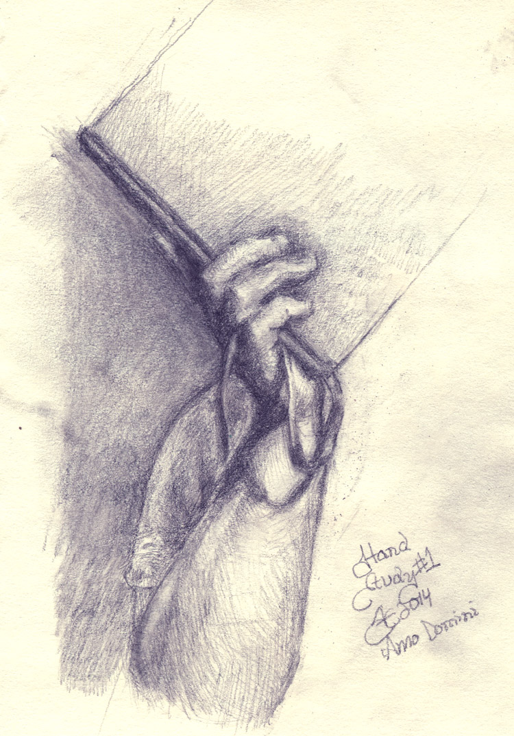
I’m doing a series of studies of hands for an upcoming project, so I’m giving you guys a chance to look at them. Hope you enjoy. Graphite on 94 g/m2 sketch paper pad 9×6 inch sheets.
I’ll be putting these paintings up for sale soon and writing articles about how they were made, here’s just a peek.


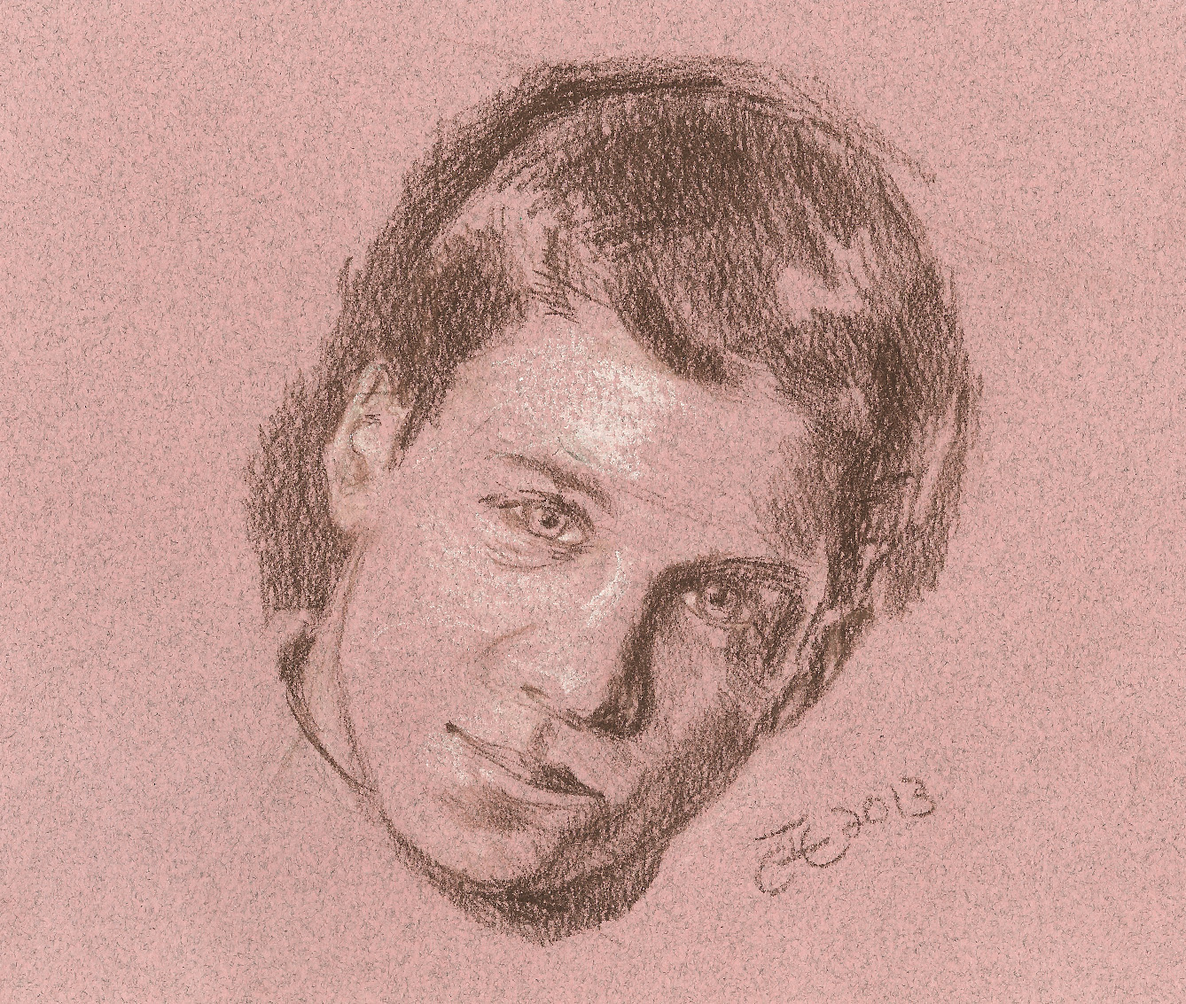
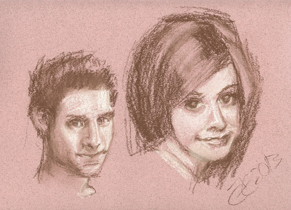
I did these sketches on toned paper with compressed pastel pencil and white chalk. The Riley picture I took time with but I did the Willow and Oz as a quick demonstration for someone just to show them white chalk technique. Oz (which needs a lot more work around the front of the face) took maybe 3 minutes and Willow about 5.
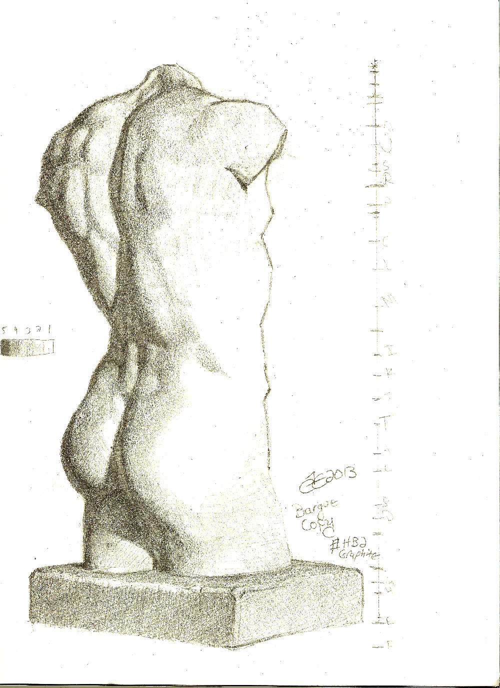 Bargue drawings are used to practice art. I’ll write a more extensive article about them later, but here’s a sample of one that I did recently (uploaded Sep 18th 2013) in graphite.This next one I could have worked on a lot longer to get the shadows under the chin correct and the high tones more perfect, but I had to start on other things. (Uploaded Nov 5th 2013)
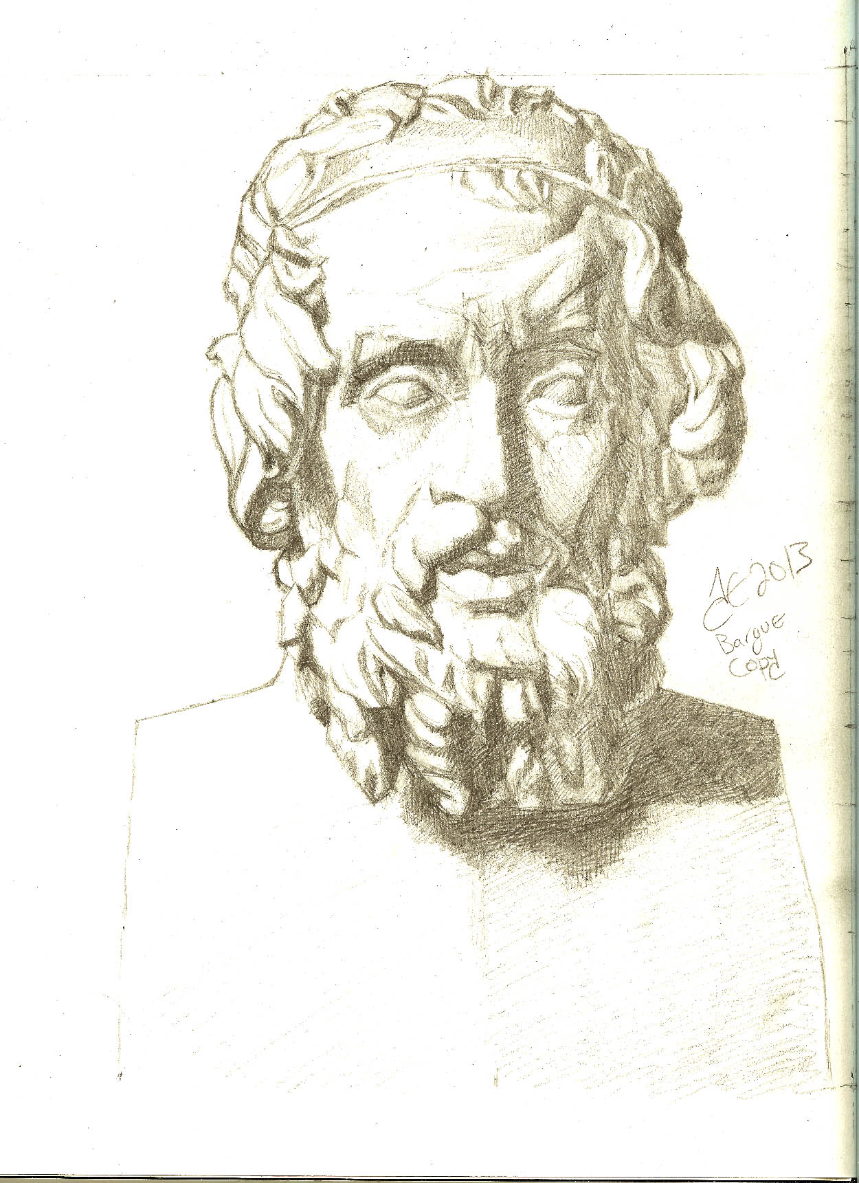
This was graphite (#2 pencil).
Oh yeah, and I miss her too. This sketch was done in about 20 minutes with a Dixon Ticonderoga HB 2 Graphite Pencil on an 8×10 Strathmore Series 400 drawing paper pad. The eyes need more work with a sharp pencil making fine lines to set them right in size, shape, and placement, but this was a good first step without taking any measurements (just eyeballing it). The pencil was about half sharp when I started and completely dull towards the end and I was too lazy to reach for my knife to do a better job towards the end, but like I wrote, it’s a good preliminary sketch and would work just fine for a painting.
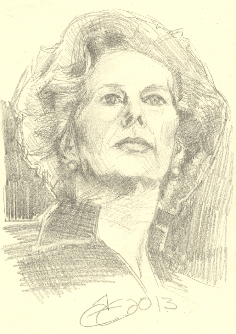
Lady Thatcher
This is a quick charcoal study for a self portrait that I’d like to do some time in the future as an oil. “The Guitarist” shows myself with my backpacker classical guitar on the day I got it as a present from my family on my birthday. It was done on toned charcoal paper with a General Charcoal Pencil in 557-4B soft. I think it would have looked better with either a darker background or a few white highlights added, but it’s a start.
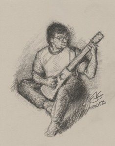
TheGuitaristStudy
How will Obama, a self admitted Moslem, fundamentally transform America? He is following these steps.
Step 1 : Infiltrate
Step 2 : Disarm
Step 3 : Destroy

CommieBama : Our Dear Leader : Sourced From – http://pjmedia.com/instapundit/ Originally Seen on Facebook
Here’s one suited to the task. I traced a photo of a hippo and placed a Santa hat upon him, colored him, and named him in scientific fashion. Now he’s ready for Christmas or the end of the world, whichever comes first. Feel free to pass him around so that everybody can have a hippopotamus for Christmas.

christmashippo
I’m working on the flats for Marvel’s Avengers and Captain America. Little time to blog or paint, but I’ll try to get you guys some pics of my latest stuff. The Chen portrait is done, but I have to wait for it to dry to a rock hard state and then apply another layer of pure oil to make sure the last layer of paint will have a little more gloss to it. It will be available for a charity sale or auction as soon as it’s ready. I’ve also finished an awesome portrait of Jennifer Connelly that will be for sale. I’ll get you guys pics of that as well. I’ve got a great portrait of Avril Lavigne that I’ve been working on but I need to work on the shape of the bridge of the nose before I finish it up. The color looks great. Also I’m mostly done with a portrait of Tom Welling that I’ve done, but I want it to have more flair before I call it truly finished. There’s just not enough time in a person’s life to paint is there?
You may hear artists talking about their “palettes” and you may only have a vague understanding of what they are talking about. This article will explain the concept more fully to you.
When artists talk about their “palette” they may be speaking about two very different things and that leads to confusion. An artist’s “palette” is a piece of wood or plastic or paper on which colors are mixed before being applied to the painting with the brush. I will cover those kinds of palettes in another article. The kind of palette to which this article is dedicated is a “color palette” which is a list of specific colors which an artist uses to paint his picture. Because artists place their chosen paints (their color palette) on a physical palette the two uses of the word seem almost interchangeable, but they are not.
A colour palette is just a pre-selected set of colours that an artist will use to paint his entire picture. For example he might choose nothing more than white and black. He might mix them together to create a series of gray tones, but technically the “palette” he has chosen is white and black.
Some artists are very open about using different colours for different paintings while other artists do almost every painting with the same colours time and time again. Artists that are open about trying new colours are called “open palette” artists while those who never use any colours beyond the ones they are the most familiar with are called “closed palette” artists. However I think that most artists however fall somewhere in between in that they are willing to try new colours if they feel the painting calls for it (or if they are just feeling adventurous), but still have certain colours they like to use very often.
Often artists purposely limit their palette to a few colours in order to force themselves to make the most out of a certain color before reaching for another. This is called a “limited palette” and is the way most classical painting is done. Limited palettes force the artist to focus on creating form through tonal changes and not by way of color. Art students are always encouraged to work in this manner because the best lessons are learned using this method.
I’ve already given an example of a limited colour palette which is only white paint and black paint.
Another limited palette, which is even more simple, is just using one color. For example you may only use blue paint. In that case the whole painting would be blue, but the natural colour of the canvas or paper (usually white or creme or something) would show through anyplace that isn’t painted. The blue paint could be used at full concentration for all lines and shapes as though you were creating an ink drawing or maybe as though you were creating a silk-screen-graphic-print like you see on a lot of T-Shirt designs or the paint could be thinned or oiled down into a series of more transparent versions creating various tones. Remember that technically another color is still being used because the surface being painted on has it’s own color, but we call art that uses only one colour “monochromatic” (meaning one color).
Another sort of limited palette has two colours. Just as with the monochromatic painting we can flux back and forth with two colours, but in this case the second colour is not only provided by the colour of the surface we are painting, but also by an actual pigment we are using. Common colours in this scheme may be things like black and white (as we have discussed earlier) or blue and white or red and white, or maybe red and creme, or blue and orange, or red and green, or black and red, etc. As a strategy we can add the white to the more colorful secondary paint where ever the secondary paint needs to be lighter instead of simply adding oil or thinner to the paint as we did in monochromatic painting. This is a good strategy when getting good coverage of the canvas is important because when white paint is added to another paint the paint becomes more opaque and covers the canvas more easily. It’s also easier to make corrections if you use white paint that can conceal errors, but it slows the drying time and so this method is not normally used for the early parts of the process of painting. In modern technique it is almost never used in water color paint since watercolor paint is supposed to be transparent in most circumstances to allow the color of the paper to show through, but there are a lot of exceptions. I don’t want to get into all of the painting processes available to an artist extensively in this article, but remember that the process determines resulting color just as the desired color determines process.
Another kind of limited palette would be any colour plus black, such as red and black or yellow and black.
I mentioned that another kind of limited palette would be two colourful paints like orange and blue so let’s explain that more explicately. The darker paint (usually the blue) would be used where ever the model appears to be darkest and the lighter paint would be used where ever the model was lighter. Transparency could be controlled with oil or thinner where ever desired and by mixing the two together a series of grays or shall I shall “neutrals” could be created. If the mix has a lot more blue colour in it that area will appear to be cooler for blue is a cool colour, and the areas that have more orange in them will appear to be warmer as orange is a warm colour. This play of warm and cool colours is found in all art as in important to master. Even when working with a single pigment there are ways to make that pigment appear cooler or warmer.
Another kind of limited palette would be one colourful paint such as blue with black and white. This could make blues mixed with white, blues mixed with black, blues mixed with some white and black together, and a mostly neutral grayscale made from only the black and white paint.
We can also group the colours on our palette together by pigment type. For example earth tones all essentially derive their color from the pigment iron oxide and so are chemically neutral in regards to each other and light fast and easy to clean up and are not especially jarring when mixed or viewed in the same picture together. I use a lot of limited palettes with only earth tones. Examples of earth tones would be yellow ochre, raw sienna, burnt sienna, venetian red, indian red, turkish red, english red, caput mortuum, raw umber and burnt umber, etc.
Another possibility for a palette which includes a grouping by pigment type is one of mineral colours. Mineral colours are similar to earth tones as they are crushed rocks but they are not primarily iron oxide. Egyptians used mineral colours for their hieroglyphs crushing rocks like lapis lazuli to make what the Europeans called later ultramarine and malachite from which they manufactured a cool green similar to veridian, and of course mercuric sulfide or cinnabar as it is called was used to make that powerful red called vermilion in the Bible or else by its name of Chinese Red to traders doing business in the east.
We also have mineral colours which are natural heavy metals but which require some extra preparation like lead oxide and titanium oxide and zinc oxide and a red lead oxide etc. as well as the cadmiums which can give us yellows, oranges and reds, and red purples, along with yellow tin, and so on.
We also have organics like ivory black and the modern imitation made from charred cow bone and that most disturbing of anachronistic pigments which is called mummy brown which was made from real mummies.
My most favorite palette usually contains mostly earth tones to which I add the mineral colour ultramarine and the organic ivory black if needed and the metallic titanium white if needed as it usually is in oils. I seldom use cadmiums even though I have many.
MORE TO COME, STAY TUNED, ARTICLE INCOMPLETE, TIRED NOW.

contecrayonsetnumbered
I have one of the Conte A Paris Conte 48 color crayon sets available at dickblick.com, but it didn’t come with a color chart of any type, which is normally fine with pastels since they appear in their fully saturated form just as they are, but the names of the colors are always useful to have, especially when ordering replacements. Dickblick listed the names of the colors and their corresponding numbers on their site so I scanned the sticks and made a color chart. Hopefully this will be an aid to you.
Last time we looked at some earth tones and stressed the importance of categorizing them by their dominant hue. This time we are going to look at how applying the pigments in different ways and in different mediums can affect their dominant hue and tone. Furthermore I thought it would be useful to show you examples of the actual colors we talked about in our last installment.
All pigments when applied as a glaze appear to be lighter if the glaze is applied over a lighter background simply because glazing is applying the pigment in a transparent medium. For example if you begin with a white canvas and apply blue over that as an opaque paint the resulting blue will simply be the blue as it appears when wet in the medium you have chosen, but at full concentration. However if we apply that some pigment over the white canvas as a glaze by adding a lot of medium so that the paint is not at full concentration in our mix the light will not be reflected by the pigment at all points but will pass through the transparent medium reflect off of the canvas and shine in our eyes. If the pigment is itself transparent or semi-transparent some of the reflected light from the canvas will scatter at odd angles and pass behind some of the pigment and pass through it before entering our eyes back-lighting the pigment like sunlight when seen through stained glass.
This means that glazes have two optical effects. Firstly a glaze allow the color that is underneath the pigment (in our sample case it would be the white of the canvas) to be seen when it would not have been. That white light will mix together with the light reflected off the pigment (in our sample case it is a blue pigment so the light is blue) making the pigment to appear to be lighter even though no change to the light reflected off the pigment has occurred. Secondly if the pigment is semi-transparent or transparent the pigment itself will be lit from behind making the pigment glow.
The glowing effect that can be achieved with glazing is the primary reason masterwork paintings, especially those in the watercolor medium, appear to be so lively. The effect of back lit pigment is exactly that of a transparent jewel being set in silver. When a jeweler sets a stone in that manner the jewel appears to glow as though it is being held up to the sun even when the jewel is being lit from above. The master uses a dual effect to draw the attention of the viewer first drawing their eyes to the piece by the strong reflected light caused by the polished surface of the stone capitalizing on tonal contrast and then using the light from behind to create luminescence enhancing the color of the rock. We artists use pigments made from some common and some rare crushed rock, color-rich mineral stones, and common and precious metals, which are identical to those jewelers use we can look to the jewelers for inspiration and understanding as we develop our craft. Just as the jeweler uses the dual power of tonal contrast and color enhancement we too must do the same when painting. Glazing helps us accomplish this task because it allows opaque pigments to appear to be lighter than they are and it helps transparent and semi-transparent pigments to appear to be more colorful than they are. There are other important aspect of glazing, but they deserve their own articles.
To help you understand how dramatically hue and tone can shift when using glazes I have prepared a chart for you. For example I used six of the eight pigments from the Sinopia Historical Pigment Set available at Dickblick.com. The chart shows the differences of color and hue of each of the pigments when used in four different ways. Firstly as a dry pigment, secondly in a simple watercolor medium, thirdly in an opaque linseed oil, and fourthly the color seen when the pigment is in an oil glaze. Photographs of swatches would have been more illustrative than solid colored circles, but my scanner is not terribly accurate at replicating color. It picks up a little too much cool yellow light from the lamp. I created these from photographic samples available at sinopia.com. I encourage you to check the photographs there to see the full hue and tonal shifts seen when using pigments in different ways. However I think that this chart proves the point well enough.

Earth Toned Pigments in Various Applications
The vast majority of the time I paint with nothing more than earth tones to which I add mineral colors when needed. Philosophically I consider mineral tones to be earth tones because they are both crushed rocks, but technically earth tones are clay pigments containing iron-oxide and mineral tones derive their colors from other compounds. In constructing my palette I use both earth and mineral pigments simply because it is hard to get a strong blue without lapis lazuli (ultramarine), but there are some blue earths. A strong green is also a bit difficult to obtain from earth without malachite (which was the classical choice), but there many choices of muted and stronger green earths which while not as strong as malachite or chromium green will suffice. The strongest reds can be obtained from cinnabar (vermillion), which is a mineral tone, but because it is regarded as highly toxic it is important to know that a very good strong red can be also obtained from burnt sienna. If an artist uses both of these, as the old masters did, modern strong red pigments such cadmium, pyrrole, napthol, etc., are not needed.
Modern artists often neglect studying earth tone and mineral tone palettes because mastering them is difficult, but if you can master them color handling becomes rather simple and so I will try to help you understand these colors better in a series of posts.
A pigment is the portion of the paint that gives the paint its color. It may be an organic dye such as found in the madder plant (which makes a cool red rose color) or it may be a metal such as cobalt (which can produce a number of colors, but is usually used to make a strong-fast drying blue) or it may simply be a crushed rock (which is usually used for muted yellows, oranges, reds, red-violets, and greens all within a broad spectrum of what we consider brown.
As I wrote before, I consider all crushed rocks to be earth tones including lapis lazulli (ultramarine blue), malachite (green), azurite (blues and turquoises), cinnabar (vermilion red) and so on, but most artists don’t consider those earth tones, but we will regard them as being part of an earth tone palette for the sake of discussion.
Most earth tones, except the mineral tones, are “complex colors” which means they are difficult to describe. Non-complex colors are colors that most people recognize by sight and by name such as red, orange, yellow, blue, green, violet, etc. We’ll call these “simple colors”. Simple colors are fully saturated (contain very little gray) so they are easy to describe and easy to learn how to properly mix and modify. Earth tones are generally the opposite. They are difficult to understand, difficult to describe, and difficult for beginners to modify or work with.
There is a trick which can help you to understand complex colors however. You simply need to associate it with a more highly saturated version of itself. This will help you to classify the color and understand its proper use in your palette and in your painting and you will understand how to mix it with other colors and how to modify it rather easily.
For instance yellow ochre is a complex color. It is difficult to describe. It is not exactly yellow as we understand the word today. Some shades are cooler (containing green) and some are warmer (containing orange) and yet usually you can use it either way in a painting. It is neutral enough that it can appear as a warm or cool in most landscapes. In flesh it appears to warm, but can be mixed with white to create a flesh tone lit by cool light making something akin to a muted naples yellow. In all cases we can replace a strong yellow with yellow ochre to make the yellows in our painting less intense than if we had used something like hansa or cadmium yellow.
Because yellow ochre is semi-transparent its use in glazes affects its temperature even more dramatically than it would with an opaque yellow like cadmium. If you apply it thickly with a lot of oil over a over a bright white ground and then wipe it away so that only the stain is left behind remains it can be so bright it can hurt the eyes.
Properties like those yellow ochre displays make certain pigments desirable because they increase the applications they can be used for, but pigments that have strange properties like that can be hard to explain to other artists.
If I wanted to teach another artist about yellow ochre I could simply tell him that he should try to replace his regular yellow (cadmium yellow, or hansa yellow, or lemon yellow, or whatever yellow he normally uses), with yellow ochre and try it out.
Another way to teach the artist would be if I see that his model has some yellow in it where the light is hitting it I could suggest that he try to glaze some yellow ochre over the white there and see what happens.
In that fashion through practice we are able to understand our complex colors. It’s accomplished by simplifying the color to nothing more than a replacement for a more saturated version of the same color.
Most artists can understand that yellow ochre is just a complex yellow because of its name, but other colors offer no clue as to their more saturated version.
What we are trying to find then when understanding a complex color is the dominant hue. For example yellow ochre’s dominant hue is yellow. Indian red’s dominant hue is red. But what about Raw Sienna? The name doesn’t offer any clues. So then how do we find the dominant hue?
If your eyes are very sensitive to color you may be able to see the dominant hue, but the hue shifts dramatically depending on the colors use, especially with the transparent pigments. Also the hue can appear to shift by when compared to surrounding colors. Also some pigments look very different in powdered form than they do as a paint. Also some pigments appear extremely different in watercolor than in oil.
If you are having trouble understanding a color try to paint a transitional gradient going from opaque to completely transparent. As a general rule colors are always more cool when they are more transparent and more warm when they are more opaque (this rule is usually only broken when the color is glazed or washed over a warm colored ground). Because of that rule when comparing two colors they may appear very similar at one level of transparency or as a dry powder, but will appear quite different when oil is added or when they are very transparent or even after they have been left to dry. That means that the process for finding a color’s dominant hue is not always straight forward. You may need to experiment to understand the differences between two colors that are very similar.
While a lot of theorists compare colors by way of computer it can be done with the eyes if the eyes are trained even by those who have some color blindness. In the same way that a professional piano tuner can adjust the tones of the notes produced by the strings of the piano using nothing more than a pitch pipe you can find the dominant hue of a color by comparing it to another color.
For example if you are trying to determine yellow ochre’s dominant hue you could pick some paints out of your collection and compare it to those. If the color most similar to yellow ochre is labeled yellow then you know that yellow is the dominant hue in yellow ochre. If you don’t have a large collection of paints you can use a color wheel or a color chart from the internet displayed on your computer monitor. These aren’t perfect solutions because color wheels are usually printed from the limited printer’s palette of the CMYK process colors so some colors don’t look correct on that type of color wheel and computer monitors don’t display color perfectly, but both are still very good resources that you may already have and so you should make use of them as much as possible. When using them just find the color swatch on the color wheel or monitor that most resembles the yellow ochre and you’ll have a good idea of what the dominant hue of yellow ochre is.
In our example for instance; it turns out that blue doesn’t look anything like yellow ochre so that’s eliminated, and red is also nothing like yellow ochre. So then we know that the dominant hue of yellow ochre is not blue or red. Green is similar and orange is similar to yellow ochre, but between those two we find the color most like yellow ochre. Yes. Yellow is the hue most like yellow ochre and therefore yellow ochre is a type of yellow.
If you have a color wheel or a collection of color swatches you may be able to find the exact color matching yellow ochre or something very very close and you can mark that spot on the wheel or that swatch as being yellow ochre and you can keep that for reference, but either way, you now more fully understand what yellow ochre really is.
Once the dominant hue of any color is known you can treat it as though it were that color. For example because yellow ochre is a type of yellow you would know that if you want it to become warmer you could add orange or if you wanted it to become cooler you could add green. If you want to dull the saturation down a bit and darken it you could add violet. Those modifications follow the same rules as working with regular yellow.
Also because you now know that yellow ochre is a type of yellow you would also know that in any place that you see that your model contains yellow you could substitute yellow ochre there. Why would you do that? Well perhaps you don’t have the exact yellow you need, but you have yellow ochre, or perhaps you just want to limit your palette to colors less intense so that the painting is not so garish. These are common strategies that artists use when working with color. That sort of flexible approach to color is why color is a difficult subject to teach art students. They don’t understand that color is not all that important as long as it’s close to the intent of the artist. What is very important however is the “tone” or “darkness” of the spot being painted. We’ll cover that in another article extensively, but for now understand that tone is of primary importance while color is of secondary importance, but that the concepts are interchangeable because colors have tone so when you paint with a color you are adding or subtracting tone and there are no tones that are entirely colorless.
I will now list some earth tones and explain their dominant hues as I often use them.
Yellow Ochre – Yellow
Raw Sienna – Yellowish Orange
Burnt Sienna – Reddish Orange
Indian Red – Orangish Red
Turkish Red (or Mars red) – Cooler Crimson Red
Caput Mortuum – Violetish Red
Now you can see that even complex colors can form a scale or wheel making their classification rather simple. We went from yellow, to orange, into two kinds of red and into the redder violet.
A complete scale like this can be made for reference with whatever colors you have in your collection, but the umbers present some difficulty when trying to classify them. One such difficulty involves the non-standard naming conventions.
As an example of the confusion that can arise from non-standard naming conventions I leave you with this; Umber, when burnt, is called burnt umber. So usually if a paint is called simply “umber” it is probably not burnt umber. However plain umber is sometimes also called “raw umber”, not merely “umber” so a company may offer a paint simply called “umber” or perhaps one called “raw umber”, but sometimes they offer both.
In many cases “raw umber” is different than “umber”, even though they are both unburned. When a company distinguishes between the two they are indicating that what they offer as “raw umber” is a type of umber that is generally lighter than what they offered as simply “umber.” So that means that if they offer both the “umber” will be darker and the “raw umber” will be lighter, but in both cases they will have very little red in them because both are unburned.
Furthermore there is an umber which is always very green called “green umber” and then there is “raw umber greenish shade” which is more green than normal umber, but not always as green as green umber.
The green hue in umber arises from the presence of a metal called manganese whereas the presence of the red in the pigment is from iron oxide (the same thing that in various forms colors most earth-tone pigments).
Because manganese gives umber its green undertone if more manganese is present the umber becomes more green. And if there is more iron oxide present the umber becomes more red. The red becomes more intense by burning.
Because red and green are complimentary colours or near complimentary colors the presence of both in one pigment, as we find it in the umbers, make umber a more neutral colour than we find in the siennas and ochres. Also remember that the more colorant is present in the pigment the more dark and opaque the paint becomes. Umber that contains more clay and less colorant is generally lighter overall and that sort of pigment is what most companies call their “raw umber” rather than simply “umber.”
I believe that the industry should not distinguish between umber and raw umber but should only list umber as being dark or light and use the term umber and raw umber interchangeably in the same way that they do for sienna and raw sienna. This would clear up a lot of confusion. For example notice the differences between how sienna and umber has to be approached in these two Wikipedia (yuck) articles (http://en.wikipedia.org/wiki/Umber AND http://en.wikipedia.org/wiki/Sienna). Those pages are perfect examples of why it’s so hard to teach colour to students and it has to be stopped!
To their credit the company that I like to order earth tone dry pigments from, Sinopia.com, handles the names of their pigments very well. They give the name of the pigment (just called Umber, Sienna, etc), whether it is burned or not (always calling it “raw” if it’s unburned and “burnt” if it is burned to avoid any confusion), and then listing its darkness and often its color temperature in comparison to the average temperatures of that kind of pigment, and sometimes its dominant hue.
For example in my collection I have these Sinopia siennas: Raw Sienna Warm Shade PC206RS, Burnt Sienna Deep Warm Shade PC316BS, Raw Sienna Deep Orange Shade PC210RS, and Burnt Sienna Warm Shade Light PC310BS.
And in my collection I have these Sinopia umbers: Raw Umber Very Dark Neutral Shade PC414RU, Burnt Umber Very Dark PC524BU, and Burnt Umber Reddish Brown PC510BU, Burnt Umber Brownish Warm PC502BU, and Raw Umber Greenish Dark PC402Ru.
Because there is often confusion between colour names it is best to use a manufacturers colour chart usually available on their website to see samples of the color before you order it to make certain it’s the colour you need. It’s also advised to check a few different manufacturers to see what they have to offer. There is absolutely no problem mixing paints from different companies as long as they are paints of the same medium (oil paint with oil paint, watercolours with watercolours, etc).
In another article we’ll explore paint purchasing more extensively, but a little tip for now is that if you always use a dark umber you’ll find that you save time and probably some money by choosing a darker umber to begin with rather than mixing another colour into your umber to darken it. Avoiding using two pigments together helps keep the colour more pure and it keeps your glazes more transparent.
Because great painters master the optical effects paint can achieve great companies like Sinopia.com offer a wide range of earth tones in a dry pigment form where another company would only offer one or perhaps two at the most in a ready-to-use paint form. Because I usually paint from pigment and not from pre-mixed paints I like to have a lot of pigments on hand to give me the exact effect I want, plus I’m a pigment piggy. Oink Oink!
A lot of artists only include one type of brown on their palette at a time. Raw umber is a common one to use because it can be modified to resembled burnt umber pretty easily. For warmer paintings an artist may choose to begin with burnt umber to save time and maximize transparency which would be diminished with a mix. If the painting is very warm burnt sienna may be chosen. I personally use a lot of browns on my palette all simultaneously, but that’s not uncommon to portraiture work when working in a classical method. It’s more uncommon in landscape painting in the way that the impressionist’s did things and uncommon in many modern palettes for reasons that I feel are hard to justify, but we’ll cover those things in other articles.
To make understanding the most common browns that you may find on many artist’s palettes easier you can organize the siennas and umbers by their dominant hues like this:
1. Raw Sienna – Yellowish Orange or Orange, medium darkness
2. Raw Umber – Medium Orange or Reddish Orange with a green undertone which keeps the color neutral and very gray making umber a good color to mix with white or black to produce gray tones. The darkness varies a lot depending on maker, if it’s just called “umber” it’s usually pretty dark, if it’s called “raw umber” it’s usually lighter. You can consider raw umber to be a “cool brown”.
3. Burnt Umber – Orangish Red or even redder in the “Reddish Brown Shade.” It is usually dark except for “Reddish Brown shade” which is lighter. You can consider burnt umber to be a “warm brown”. Burnt umber is usually very transparent. The transparency of raw umber varies a bit more from company to company but burnt umber is usually always very transparent.
4. Burnt Sienna – Very Reddish Orange. It’s a little darker than its raw version
5. Raw Umber – Cool Slightly Greenish Red-Brown
6. Venetian Red – Orange-Red in a very warm Red-Brown. Transparent. Very good for making flesh tones that are a bit reddish.
I hope this gives you an idea of how to use earth tones in your paintings. I’ll try to explain more about these colors in other articles.