
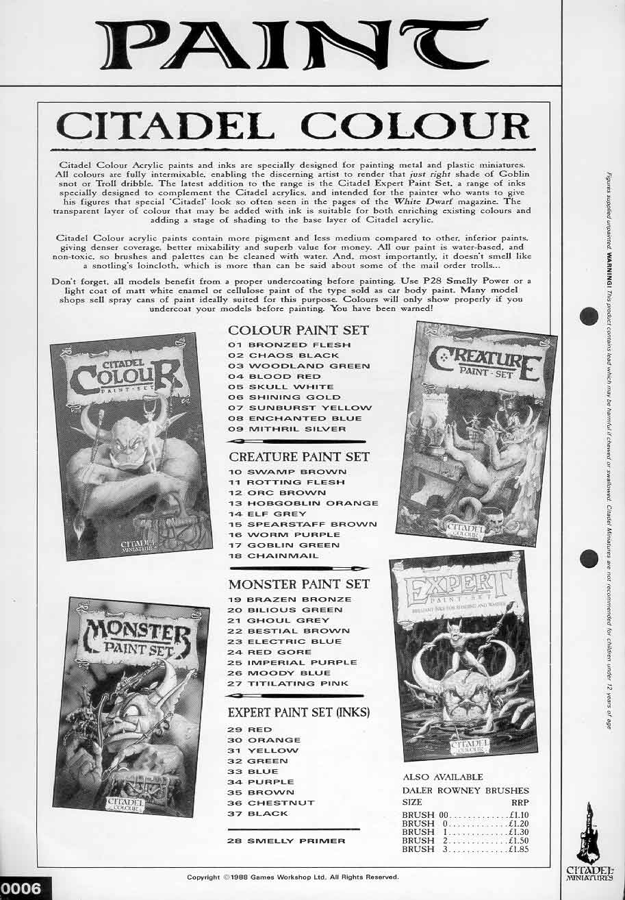
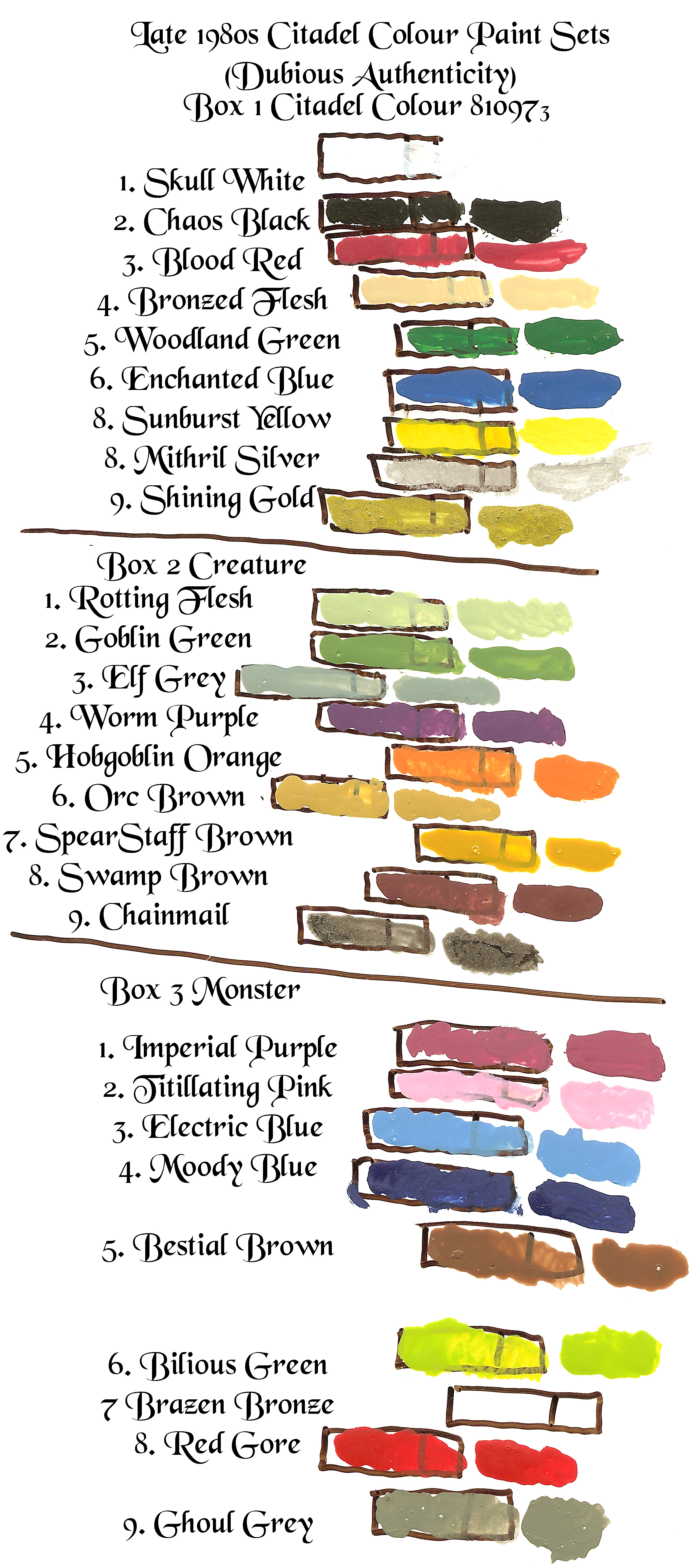
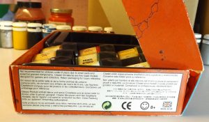
The boxed sets were these:
Skull White, Chaos Black, Blood Red, Bronzed Flesh, Woodland Green, Enchanted Blue, Sunburst Yellow, Mithril Silver, Shining Gold in the Colour Set;
Rotting Flesh, Goblin Green, Elf Grey, Worm Purple, Hobgoblin Orange, Orc Brown, Spearstaff Brown, Swamp Brown, Chainmail, in the Creature Set;
Brazen Bronze, Bilious Green, Ghoul Grey, Bestial Brown, Electric Blue, Red Gore, Imperial Purple, Moody Blue, Titillating Pink, in the Monster Set.
Red, Orange, Yellow, Green, Blue, Purple, Brown, Chestnut Brown, Black in the Expert Paint Set (all inks)
Salamander Green, Salamander Black, Ultramarine, Marine Dark Blue, Space Wolf Grey, Blue Grey, Blood Angel Orange, Terracotta, Bolt Gun Metal in the Space Marine Paint Set
Bad Moon Yellow, Go Fasta Red, Ork Flesh, Snake-Bite Leather, Fire Dragon Crimson, Striking Scorpion Green, Hawk Turquoise, Bleached Bone, Tin Bitz in the Ork & Eldar Paint Set
Fire Orange, Jungle Green, Sulphur Desert Yellow, Codex Grey, Battle Green, Horizon Blue, Nightworld Blue, Ash Waste Grey, Imperial Strike Green in the Epic Battle Paint Set
Dwarf Bronze, Beaten Copper, Glistening Green, Burnished Gold, Polished Blue, Amethyst in Metallic Paint Set
Mithril Silver, Ruby Red, Lightning Bolt Blue, Elf Grey, Elf Flesh, Armour Wash in High Elves Set
Bleached Bone, Liche Purple, Brown Wash, Rotting Flesh, Vomit Brown, Deadly Nightshade in Undead Paint Set
Blood Red, Bad Moon Yellow, Enchanted Blue, Snot Green, Orc Flesh Wash, Bubonic Brown in the Orks and Gretchin Paint Set
Chaos Black, Blood Red, Sunburst Yellow, Mithril Silver, Lightning Bolt Blue, Snot Green in the Titan Legions Set
Update: Spear Staff Brown and Orc Brown – The original citadel paint called “Spear Staff Brown” appeared to my eyes to be a greenish shade of yellow ochre. From what I can tell by comparing dried swatches that I had placed on the lids of the two paint pots I had the Coat D’Arms paint “Tanned Flesh 115” appears to be the correct match for it. Although I haven’t made a direct comparison on paper that is my suspicion and best lead so far. Only a bit more investigation is needed to confirm. The color which seems to match “Orc Brown” is “Festering Brown 126”. Again I need to confirm, but it’s pretty close.
Update: Electric Blue – Matches Coat D’Arms Bavarian Blue
Update: Ghoul Grey was an warm reddish umber gray, fairly dark, very grainy, dried out easily, but can be reconstituted in most cases with two mixing balls and a shaker. There is no similar color in Coat D’Arms line. All of their greys are way too cool.
Update: Elf Grey was darker than Coat D’Arms Elvish Grey, and was lighter than their next darkest grey, it was warmer than their other greys. No matching color in their line. Closest would be if you mixed their Grey Primer with Elvish Grey and added a touch of brown.
Update: Brazen Bronze is EXTREMELY rare to find in good condition. It usually dried out. It can be recognized by that fact and that it has chunks of blue in it and it usually smells a bit acidic maybe from copper being present. Although I haven’t been able to compare directly since I don’t have an intact Brazen Bronze I suspect Coat D’Arms Bronze 232 is a match. I also suspect that WarColours Nostalgia ’88 number 19 Brazen Bronze would be a very close match as their metallics do seems to be very close to the originals though most of their other colors are pretty far off. https://scalecreep.com/product_info.php?products_id=40 or https://www.warcolours.com/index.php?route=product/product&path=76&product_id=146
Update: Imperial Purple in the original was a lot more a mixture of lavender and magenta, very cool and neutral and is nothing like the Nostalgia ’88 version which is very warm having a lot of red in it.
Update: Bestial Brown was closest to Coat D’Arms Barbarian Leather, but it was more dull and whitesh, but had the same value, if white were added to Coat D’Arms wood brown it would probably be the same color which suggests they use the same pigment for both paints.
Update: Enchanted Blue – In the original citadel paint set there was a color called “enchanted blue” which in my opinion was basically a perfect blue to use as a primary in miniatures painting. It went through revisions through the years with the first major change being when the soft plastic hexpot was introduced. At first it had a lot of white added which would separate from the blue pigment so that three distinct layers or marbling could be seen in pots that had sat for a while. When the hexpot was introduced the mix was darker with less white and a chemical was included which made it flow well, but was later deemed toxic and so was not included later. This dark toned version of Enchanted Blue was quite similar to what was listed in the original boxed sets Citadels as “Moody Blue”. It had the same intensity, moodiness, and transparency. Later in the 1990s and early 2000s when the stiff plastic hexagonal pots were introduced the color changed drastically. The paint took on a plastic finish when dry and became what I consider a more plastic blue color and finish. It was perhaps less useful artistically with more traditional artists pigments, but it perhaps more perfect color-wise if using dyes like arylides for the other primaries which at that time started becoming the standard for miniature painting. It was almost certainly a phthalo-cyanine blue whereas before it may have been, but my comparisons have led me to believe that before the pigment used in the earliest versions of the Citadel blues was an iron pigment like that used in Prussian Blue paint. The newer Enchanted Blue was a bit difficult to control because the pigment is so strong, but the transparency if washes were done correctly looked wonderful and bright. After Games Workshop redid their entire line this was later renamed to “Caledor Sky” the naming convention indicating that it is a cyan sky-blue color. And so I can make a recommendation as I think every miniature painter should have Caledor Sky in their box of paints. I also recommend having the first edition Enchanted Blue. The problem of course is that they don’t make it anymore. But there is good news. Coat D’Arms still makes this color as “Light Blue 206”. I had trouble finding a match because my sample of was made from a pot that wasn’t mixed well so the white was not fully incorporated in the mix so the shade was too dark in the swatch card I had. After remixing the paint by sitting the pot upside down over the period of a few days, shaking, turning right side up few another day, shaking, then upside down again, shaking, and then on it’s side, shaking, etc. and then using a toothpick for the last mixing before a new sample was taken I matched the color immediately to the Light Blue by Coat D’Arms in my collection. After getting an electric paint shaker and a rust-free ball bearing (shaker beads) and putting that in there and shaking again it matched Coat D’Arms light blue precisely. There is quite a bit of drying shift with the old Enchanted Blue by the way. It always dries much darker than it looks when you apply it. Still I love it and I’m glad I can get as much as I want from Coat D’Arms. I suspect that Bavarian Blue is the closest match for the old “Electric Blue” but I’m still figuring that one out.
While I think the modern Games Workshop paints are overpriced and their latest pot design still isn’t as good as the traditional Citadel pots still used by Foundry, Coat D’Arms, and P3, the pots are better than they used to be and as long as you are careful to press the backside on the lid down especially well (since they often appear to be closed in the rear but are not) they should last for a while unlike the late 1990s and early 2000s pots which had a screw on lid which didn’t work well at all.
Update: I ordered some Coat D’Arms paints but from Black Hat Miniatures website this time. They took a while to get here and the shipping was expensive, but the paints themselves were cheap and the packaging was very good and the paints arrived safely so the company did well in that regard. Now for… the swatches!
Coat D’Arms Metallics – The metallics offered by Coat D’Arms are similar to the old Citadels, but the old Citadels were much thicker and had a distinct plastic odor. They were better for dry brushing. The Coat D’Arms metallics are very nice however. Some of the Coat D’Arms colored metallics are called “Enchanted” Blue, Green, etc. which makes the blue easy to confuse with the Citadel’s “Enchanted Blue” which wasn’t a metallic. The terrible naming conventions is what makes collecting miniature paint so difficult and unrewarding, but I won’t digress into that for now other than to say that the metallic purple available from Coat D’Arms unsurprisingly differs from the others in its naming convention being called “Amethyst Purple” instead of “Enchanted Purple”. It’s a beautiful paint though. But most people won’t use the colored metallics much and will only be interested in the grey metallics. These are four in number ranging from darkest to lightest. The color called “Magic Metal” is a black metallic. It has a slight copper brown under-tone and should be mixed thoroughly with a toothpick before using as it is made from heavy particles. The others didn’t seem to require as much mixing and probably when new would only require a thorough shaking for a few minutes as I did with mine. The “Gun Metal” is a dark grey. The “Chainmail” is a medium grey. And the “Enchanted Silver” is a light grey. If you have to choose only one probably the “Chainmail” would be the most useful with the “Enchanted Silver” being a good second choice. In the swatches below you can see them.
Lupin Grey is probably the replacement for Space Wolf Grey since Lupin means wolf. Angel Green appears darker in person (almost black), but when making the swatch I left it a bit transparent so the color would be visible when scanned.
More Coat D’Arms Swatches
Additional Note: The Coat D’Arms colour “Linen” seems to be a perfect match for the old Citadel colour called “Bronzed Flesh”. I’m still looking for a replacement for Hobgoblin Orange though. I’ll keep everybody updated as I experiment.
Below are even more swatches from my Coat D’Arms collection. Note how the current “Enchanted Blue” is actually a metallic and not a flat paint. The Enchanted Green and Dwarven Bronze and Beaten Copper are also metallics. The Enchanted Green is a very transparent paint. Field Blue is actually a cool grey whereas Coat D’Arms Field Grey is a warmer grey. The Grey Primer is the closest replacement for “Smelly Primer” that you can probably find. I haven’t experimented with Coat D’arms Grey Primer yet, but I have a feeling I’ll still like Vallejo’s Game Color White Primer better since I like it so much.
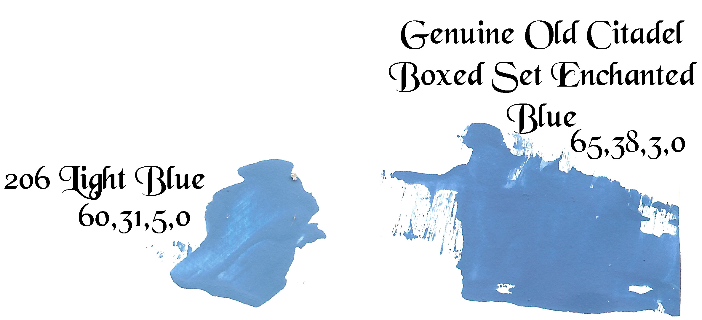
 Below I have swatches from the current Coat D’Arms “Light Blue” and a scan from a known to be genuine old Citadel boxed set of “Enchanted Blue” and their respective CMYK codes as the scanner picked them up. The older paint was a tad bit darker. At one time I thought it was significantly dark because the white pigment in it had separated from the blue and so the mix wasn’t as light as it should have been. Even now I suspect the white could be mixed into the blue a bit better. But for all practical purposes it appears that I have identified the correct replacement for the old Enchanted Blue in the boxed sets of Citadel Colour. It is Coat D’Arms “Light Blue 206”. My primary goal is complete, but I still need to figure out how to manufacture “Titillating Pink” and “Hobgoblin Orange” or find perfect replacements.
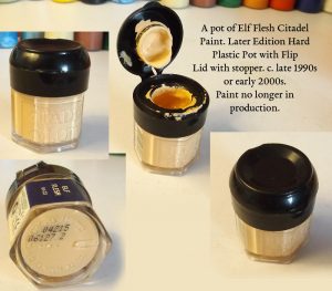
Update: Let’s talk about Elf Flesh – The later 1990s Citadel paint called “Elf Flesh” was a flesh color in the orangish range similar to maybe a slightly reddish naples yellow in tone, but color-wise like a cadmium red light (which is red-orange) mixed with white. Elf Flesh appears to be the same color as what is included in Reeves watercolor paints sets as “Flesh Tint”. The word “tint” in that case indicates white is mixed with a base color of some sort. To make it myself I tried a number of reds in the Reeves set with white and they all turned out too cool (pinkish). I also tried the orange in the set and that seemed to be much closer and would substitute pretty well, but the color saturation was a little high, but when I used the warmist yellow in the set called yellow deep and mixed it with white it came out pretty much perfect. I’ll scan in the results later. But I have a feeling it’s just the warmest yellow or yellow ochre and white which is a common starting point for making flesh tones that I use a lot in oil painting. There are lots of options for a warm yellow or yellow orange in mainstream paint lines. So elf flesh shouldn’t be a problem to make yourself. Also the Coat D’Arms paint called “Flesh 213” is pretty darn close to it. The other Coat D’Arms paints I’ve checked which are labeled flesh and Vallejo’s Elfish Flesh (which is a great paint by the way, just too pale to substitute for the original elf flesh) and Elfish Skin Tone (Elfish Skin Tone is darker than Elfish Flesh and is used to shade with) aren’t even close. So just use “Flesh” from Coat D’Arms if you want to match the late 1990s Elf Flesh or get some medium toned yellow ochre or some warm deep yellow and mix it with white.
I have a feeling if the yellow ochre is too green it wouldn’t look right, but as long as it trends red it should be fine.
The closest match to mid 90s hard hex pot Elf flesh made today that I’ve been able to find so far is not Vallejo’s Game Color Elfic Flesh (that’s too white) and not the New Game Color formula 72.099 (a very nice color in it’s own right), but instead Vallejo’s Nocturna 74.007 Fairy Flesh and Vallejo’s Model Color Beige 70.917 which both seem to be a perfect match.
The nocturna sets are very nice by the way. Here’s a link about the flesh sets. I also have the nocturna crimson and purple sets. I just wish they sold the colors from the nocturna sets individually. The palettes are amazing and the sets are very hard to find so individual bottles would be the right move for the company.
Now if we look at other brands and types of paint that contain a flesh tint, looking at cheaper brands, which is a good idea when trying to find pigments that are likely used in hobby paints, Daler-Rowney has a Cryla Acrylic Paint called “Flesh Tint” and the pigments for that are PY42 / PR101 and PW6, which are a synthetic yellow ochre AKA a transparent yellow oxide, a indian or venetian red, and titanium white. That would make sense. I would think it’s not a natural hematite and indian red can trend a little too cool, so venetian is very likely that PR101 being used. So we can mix a replacement for Elf Flesh pretty easily from commonly available pigments. Here’s a color swatch from another site of Daler-Rowney’s Flesh Tint. It looks right, but I don’t have a sample. Someday I’ll buy a sample to compare.

Daler-Rowney Cryla Acrylic Paint – Flesh Tint PY42 / PR101 / PW6
Update: P3 Paints – I ordered P3 paints online quite a while ago, and the first paints I ordered were great, but they changed their entire paint line, making the new paints available in dropper bottles for a while and before the switch the second and third orders I got from them were like water. I’m not exaggerating. Completely useless. I had to leave the flesh open for over three hours to get it to thicken up. Such a shame. I’ll never order from them again. I need a company that doesn’t change anything and has thick paint, not water. I’m not an amatuer and I don’t appreciate that kind of crap. And like I said it’s such a shame since they were made by HMG paints in the UK and came in the same pots. And the new constitency was terrible, because I loved the palette, especially that they have a yellow ochre called “Moldy Ochre” and a sienna ochre called “Meaty Ochre” and a dark umber called “Umbral Umber”. Those colors were great and the first batch I got were amazing. So thanks for the water guys. Great way to ruin a company.
Vallejo also has a yellow ochre and a heavy ochre which are probably similar (modern citadel has a yellow ochre as “tau light ochre”). There is a great chart for P3, Vallejo, modern Citadel, Vallejo, and Army Painter here… https://redgrimm.github.io/paint-conversion/p3.html
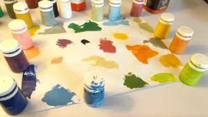
Update: Adding Color Swatches
I’ve been scanning color swatches and I’ll be adding as many as I can. Be warned however that all of these colors appear lighter in the scans than in person as the scanner throws a lot of light and isn’t all that great at presenting the colors as they truly appear. I will make a tone adjusted version later, but these charts will be good for comparison.
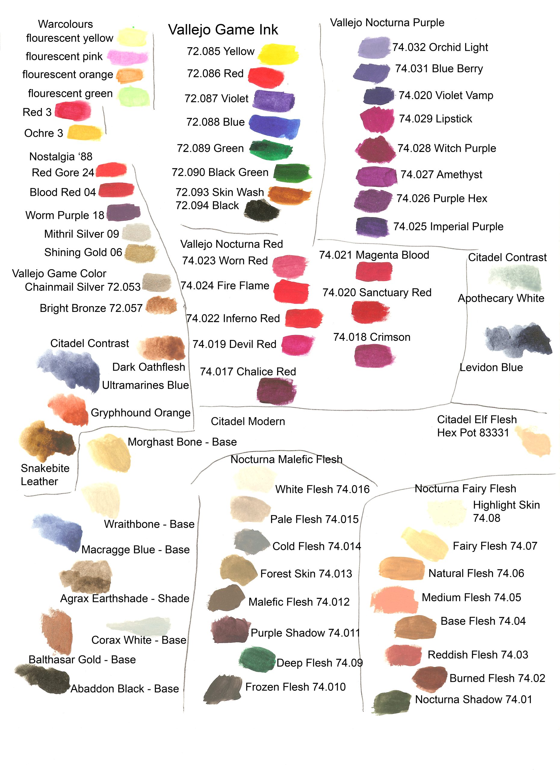
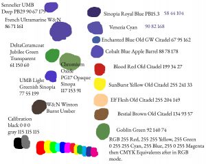
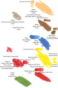
This first set includes some Vallejo Game Color swatches and swatches from the FIRST generation Citadel Colour Boxed Sets from England from my father’s generation. I still have not positively identified which of the reds was Red Gore or Blood Red, but I have an idea that the cooler of the two was actually the Blood Red. This scan does not include the Bestial Brown as I have not made a swatch of that yet, but I will do that soon. It also includes the Enchanted Blue which was available in the EARLY hex shaped pots for comparison. As you can see that was significantly darker and more intense than the ORIGINAL Enchanted Blue available in the boxed sets. Also the Titillating Pink appears MUCH more fluorescent in person than in the scans (the Bilious Green is also a bit fluorescent) but Titillating Pink is basically highlighter pink. Note how dull the original Hobgoblin Orange was. It was not like a modern orange at all. I have theorized that the pigment was a unburned sienna or a dull yellow ochre and this may have been true also of Orc Brown. Spear Staff Brown also seems like a yellow ochre. You’ll note that Worm Purple doesn’t match Warlord Purple or Hexed Lichen. Color-wise it is closer to Hexed Lichen having less magenta and more cyan than Warlord Purple. This probably means that Warlord Purple is a magenta pigment and that Hexed Lichen and Worm Purple are violet pigments. Below I give a recipe for making worm purple. Color swatches of that will also be forthcoming. Note also that the earliest versions of Electric Blue were lighter than Vallejo’s and that their Electric Blue is very close to the earliest versions of Enchanted Blue. I have began tho think that Citadel changed their blues by calling their light early Electric Blue “Ice Blue” and continued making Enchanted Blue under the title of “Electric Blue” and used the basic “Moody Blue” for a later version of “Enchanted Blue” by the time the early Hex Pots came out adding less white so that it remained a bit darker and more transparent. These changes could be why no compatibility chart works when trying to match the old paints. The Ghoul Grey and the warmer red were mostly dried, but I got samples from them. Woodland Green is a medium cool green, but in person when still wet it appears very dark indeed. It dries lighter. Swamp Brown is probably just Indian Red Hematite. Elf Grey here appears lighter than in person so don’t be deceived by that. Bronzed Flesh ranks about 30-50% printer yellow so could probably be replaced with naples yellow or a cool arylide yellow lightened with white. Rotting Flesh is probably an greenish or plain unburned umber (which is neutral in color) with white.
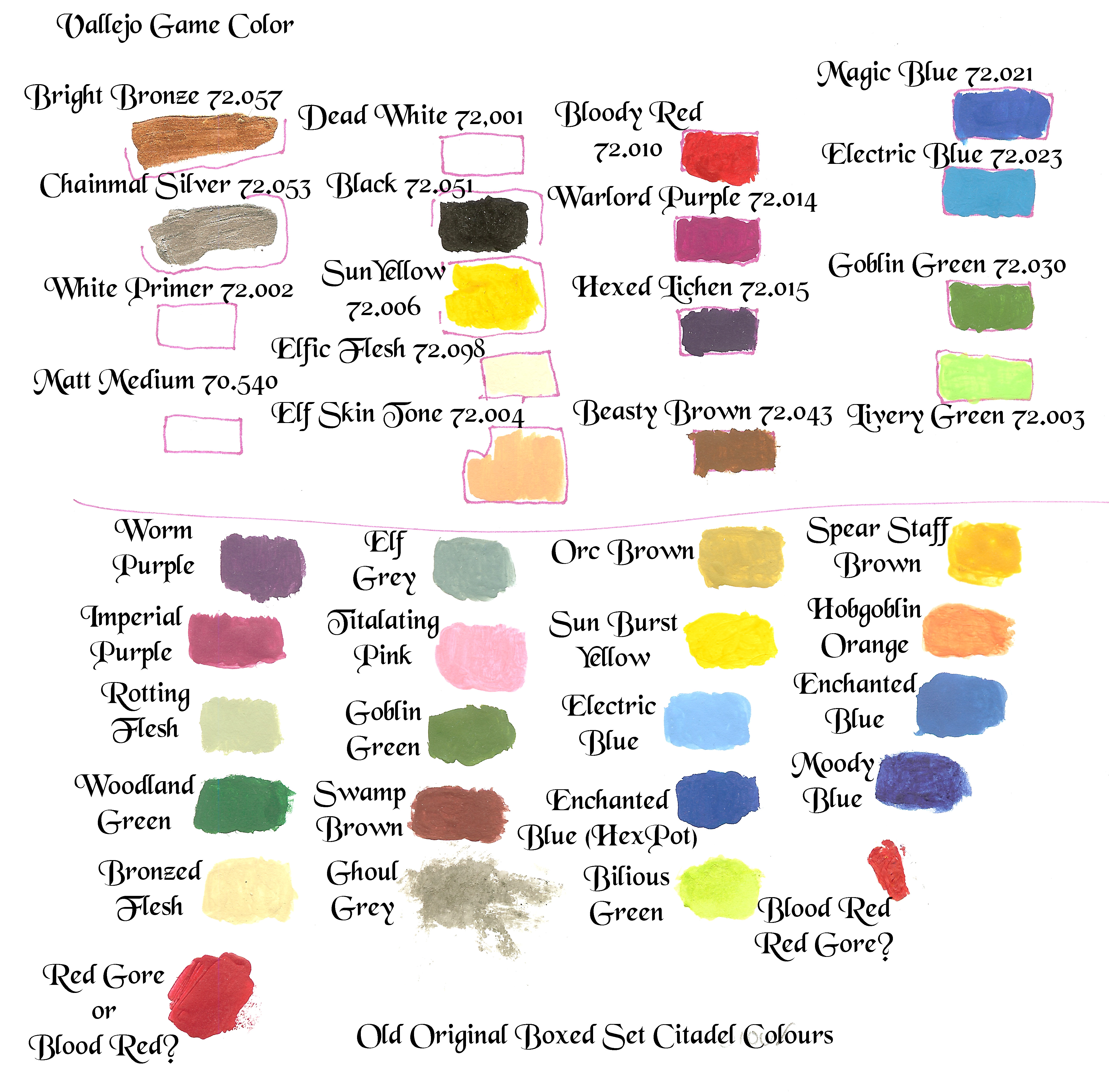
Old Citadels Compared with Vallejos
This next set of swatches below is from three sets I purchased on Ebay. They were shrink wrapped but I have some concerns over their authenticity. I somewhat suspect they may be reconstructed sets (forgeries). I don’t know for certain as I have little experience with these more American sets, but either way if they are authentic they are only the later boxed sets that were at least partially made in America and so aren’t good examples of the oldest colours. I won’t go into what makes me suspicious of these paints for if forgeries are circulating I wouldn’t want to tip people off as to how to make better ones. But take these swatches as perhaps dubious. Either way I got samples from most of the paints. The bronze was dried out so I wasn’t able to get a sample from it, but I was able to get one from the gold, chainmail, and silver. The chainmail was an interesting paint. It was transparent and almost like a wash having darks that would sink into grooves. Good for painting… chainmail. Imagine that. But what you will notice is that the cooler red is what was in the boxed sets “Blood Red” and so if it weren’t for my concerns that these sets may be reconstructed sets it would confirm that at least the cooler red was the Blood Red and the warmer red was the Red Gore. I think this is probably true, but I won’t know for certain unless I locate the EARLIEST boxed sets sealed from England. They are INCREDIBLY rare. Even these boxed sets cost me a small fortune (colouring is my profession) and they are at best later sets.
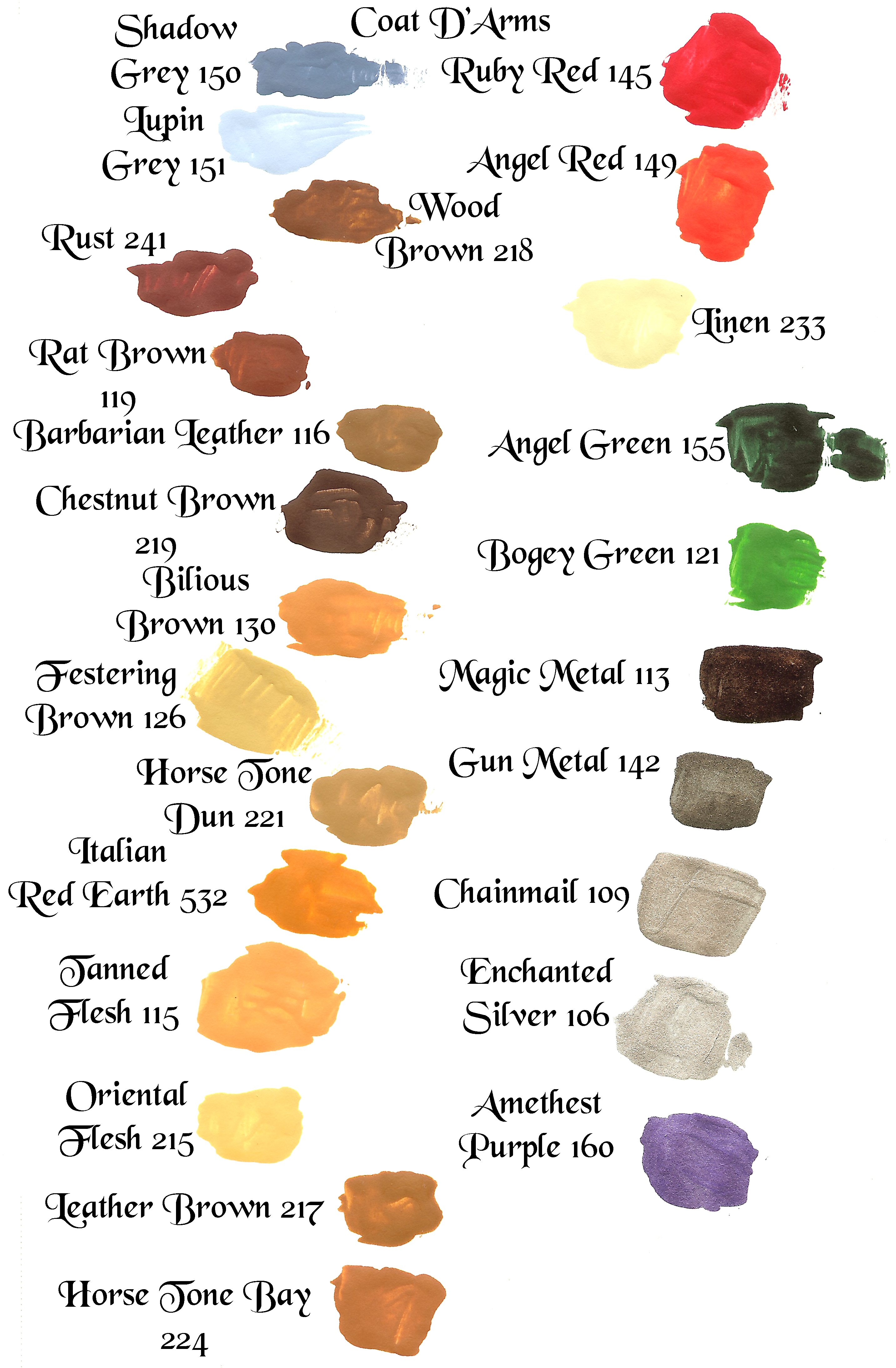
The next set below is from Coat D’Arms. These paints are still in production.
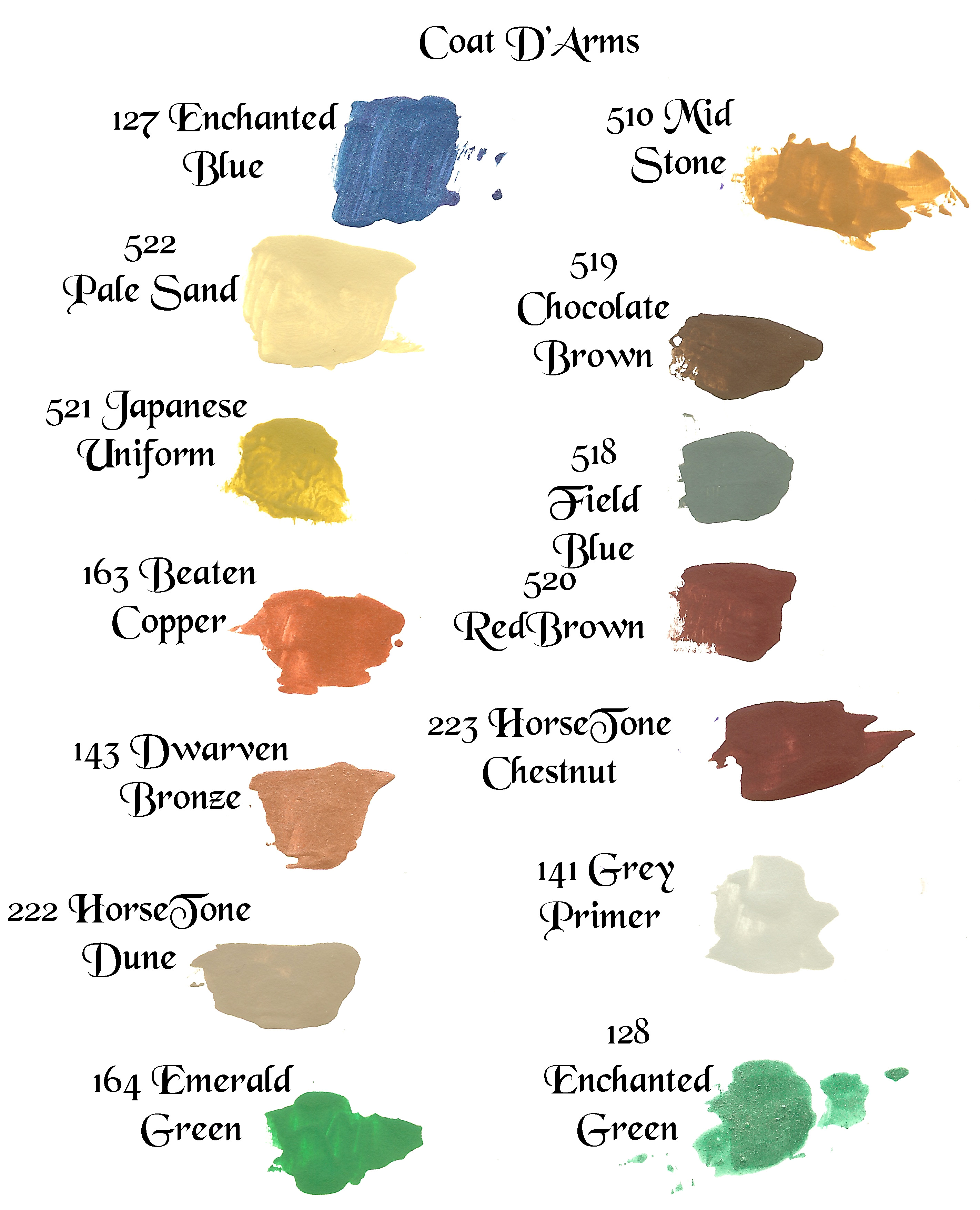
The next set below is just more Coat D’Arms.
Next time I’ll upload some new Citadels still in production, but I’m out of time this time. I’ve got to get back to comic book restorations. Enjoy!
I haven’t bought any of the new Citadel greens but looking around to replace the Goblin Green from the late 1990s-early 2000s Citadel Colour Games Workshop paint sets that came in the hard hexagonal twist-top pots it looks like either Warpstone Glow or Castellan Green will work. I’ll probably buy both eventually and see which is closer. I happen to have a ton of Goblin Green from different eras and manufacturers so I’m not that worried about it, but curiosity always breaks my budget.
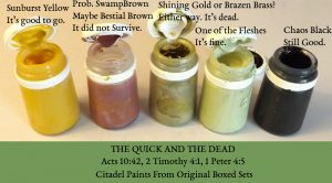
I recently purchased three sealed boxes of the later 1980s Citadel Colour paint set line. From these I was able to verify some of my findings and make one correction about the reds.
The Correction: The color known as Red Gore which was available in the “Monster” box was in the box was the WARMER of the two reds offered and the color called “Blood Red” which was available in the “Citadel Colour” box was the cooler. This is counter intuitive because usually primary colors are warmer shades and Blood Red was offered in the first boxed set known as “Citadel Colour” so you would figure they would offer the stronger more warm primary red in the first boxed set, but no. That’s not what my information has led me to believe. Later perhaps the colour names changed after individual paints were sold (perhaps after “go fasta red” or some other red was offered) but it appears that in the earliest boxed sets the cooler of the two reds was called “Blood Red” and the warmer the “Red Gore”. I’ll have color swatches for you all very soon. :) But be it known that as of now my information is that the cooler, duller red was the one used in the original sets as Blood Red and was in the Citadel Colour box and that the warmer red was called “Red Gore” and was in the Monster box. Ugh. That means I’ll have to go back and change a lot of things in this article before this information become definitive. The struggle is REAL!
I’ve been trying Coat D’Arms pots to see how they fair against the old Citadels and I really really like them. I’ve been ordering them from Scale Creep Miniatures. They have good prices and reasonable shipping. The only problem is the stock is always low (usually no more than a few bottles of each colour) and sometimes they don’t have the particular colours I want at the time. They are slightly thinner than the Old Citadels, but not as thin as the dropper bottle brands like Vallejo, but they are really good paints. They come in the original pots like the old paints did which allowed them to last forever and I am trying to get one of each of their colors in my collection. I have all the blues already. I greatly prefer the experience of using pots over dropper bottles. I want to see and touch the paint you know? I want to smell it. I want paint like I did when I was a kid in the most intuitive way possible and for me that means pots, not dropper bottles. That being said dropper bottles aren’t bad. They prevent spills and some artists find they prevent waste and they do prevent drying and as long as you keep the tips clean and they aren’t cracked they paint will for sure last longer than hard plastic type pots. But for the longest lasting option the old style pots like those still offered by Coat D’Arms and P3 are the best option by far (that is if you are careful to close them well after use).
[the best option are these traditional polypropylene pots with bodies and polyethylene caps which are magical!
https://www.theplasticbottlescompany.com/product/20ml-natural-paint-pot/
https://www.shcweb.co.uk/store/20ml-plastic-paint-pot-with-white-flip-top-lid.html
https://www.ampulla.co.uk/product.asp?P_ID=1511
http://www.warcolours.com/index.php?route=product/product&product_id=90
]
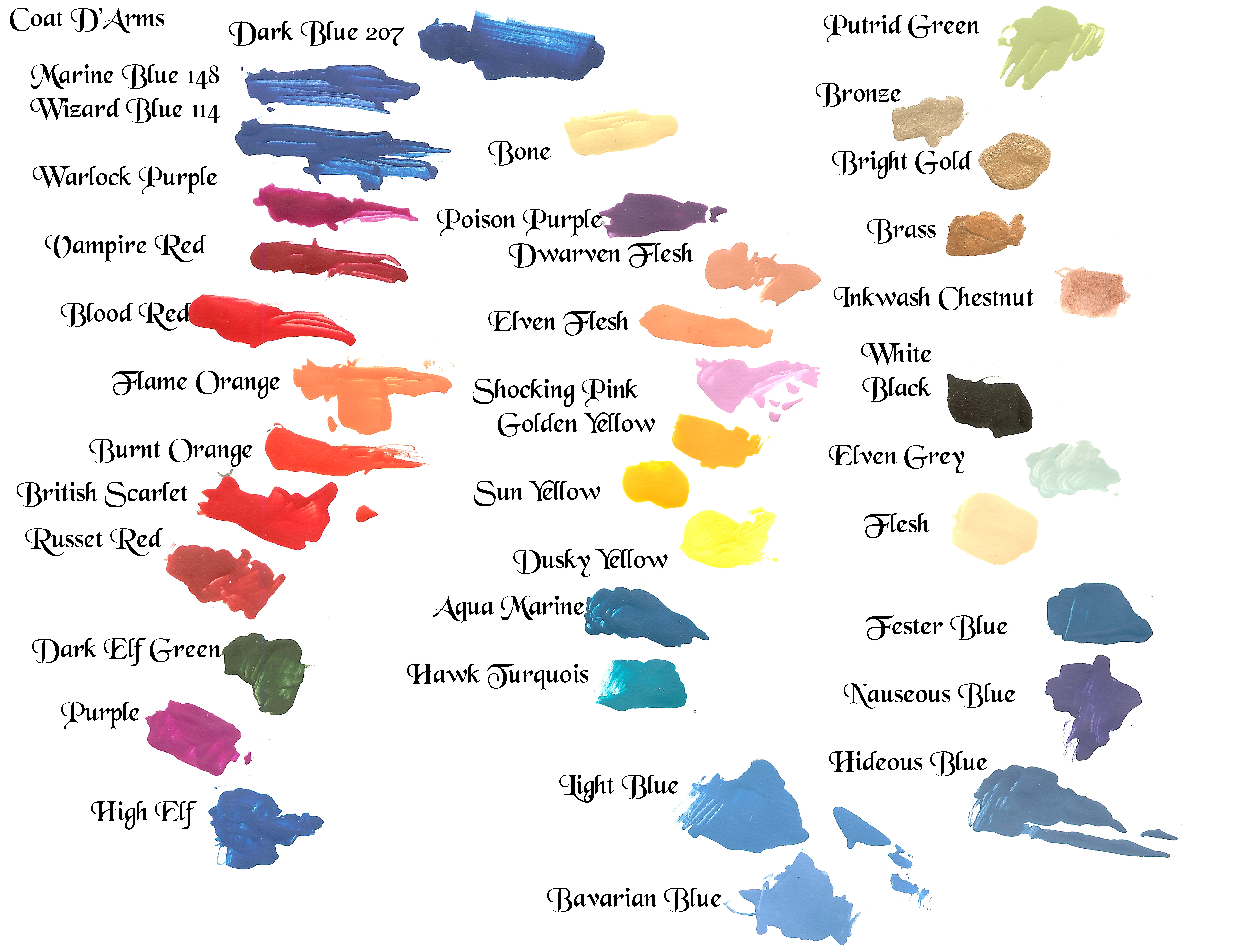
The closest Coat D’Arms colour to the original “enchanted blue” (not the later enchanted blue) in the fantasy line is probably “High Elf Blue”, not the “wizard blue” but none match it exactly. If you want an exact matcth get light blue from their military line. Sometimes the old paint wouldn’t have as much white in it or be as well mixed with the heavy white pigment and so would look a little darker than the light blue from coat d’arms but it is clearly thesame pigment and heavily settling mixture which separates the same way. Also the old electric blue is in the military line as bavarian blue and is just a lighter version of the same white and blue paint. But you should be aware of that the current Coat D’Arms colour called “Enchanted Blue” is actually a metallic so don’t confuse the two. (Will the insanity of changing naming conventions ever end?)
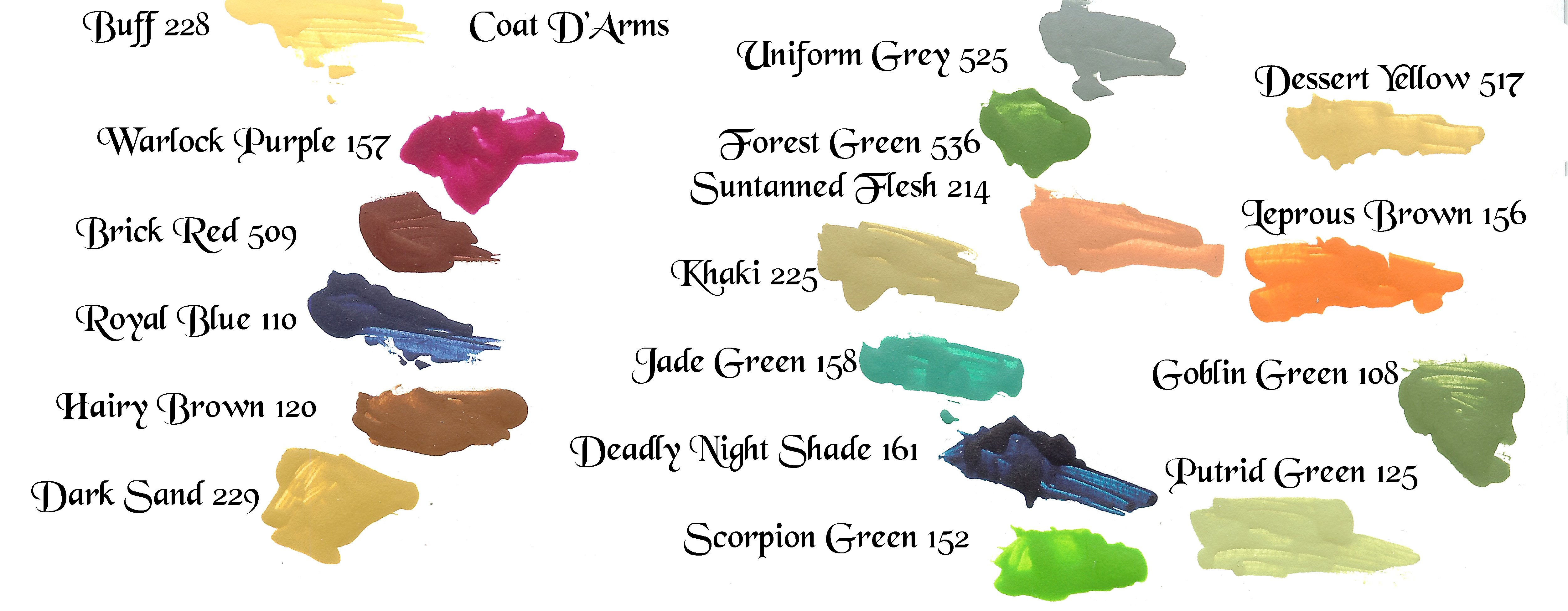
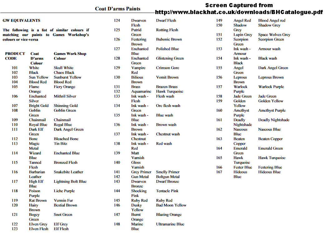
Coat D’Arms online catalogue has a list of recommended replacements for the Games Workshop line, but honestly I have not found it all that useful. It doesn’t include some of the more obscure colour names from the early boxed sets. It recommends “wizard blue” as the replacement for “enchanted blue” but as mentioned to my eyes “high elf blue” is closer than “wizard blue” to the early “enchanted blue” as wizard blue is too transparent and dark. Perhaps that’s the right pigment, but enchanted blue was a mixed colour from what I can tell. It had a slight, slight amount of white in it (and was possibly the pigment PB27). But the chart says that “high elf blue” is a replacement for “lighting bolt blue.” This again confirms my suspicions that the earliest paints were named one thing initially and then were replaced by paints using different pigments or formulations only to be later re-released under different names. But for what it is here is the list. Two other colours; that of hobgoblin orange and worm purple are not listed at all and the equivalent colours that would seem to be the most likely based on naming conventions or just mere guesswork are not the same. And the colour currently offered as blood red is not the same either. As another example of the inaccuracy of the chart smelly primer was white unlike the recommended replacement which is grey primer. Also instead of hawk turquoise they recommend aqua marine, but they have a hawk turquoise in their line so the chart may simply be out of date. But for what it is here is the list as a screen capture from the online catalogue:
However the really great new is that after some research I believe I have identified the pigment used in the original Citadel Colour boxed sets for “Enchanted Blue”. I believe it was PB27 also known as “Iron Blue”. It is available as commercial paint under names like Prussian Blue, but the particular shade appears to be what is available as “Antwerp Blue” mixed with just a little white.
It is my belief (after much grief and pigment comparison and experimentation) that the original Citadel boxed sets used the same pigment; which was PB27, for all THREE of the their blues (Moody Blue, Enchanted Blue, and Electric Blue).
Clues indicate this for: PB27 produces “produces very moody darks” according to https://www.handprint.com/HP/WCL/waterb.html. and so perhaps this was the best candidate of what could have been the correct pigment used for “Moody Blue”.
Also in my collection of paints I have some “Antwerp Blue” water colour paint from Winsor and Newton and when a small amount of white acrylic paint is added to it (the white from the Coat D’Arms brand) it produces a colour I can not distinguish from the ORIGINAL boxed set Enchanted Blue. And when a larger amount is added it appears to be like the original “Electric Blue” as well.
PB27 is considered non-toxic so it is a more likely candidate than genuine Cobalt Blue which even in a deep shade appears just a little too intense and a little too blue without enough purple. Cobalt Blue is also considered toxic and while they may not have known about its toxicity early on it is more likely that Citadel would have used a paint whose properties and toxicity were well understood and whose production cost was low since they were making a non-toxic commercial paint set.
And so from early visual clues and some naming conventions I am fairly confident that PB27 was the pigment used in the three blues of the set. I believe that the pigment when pure was used for “Moody Blue” and here the maximum transparency was seen, and with some white it produced “Enchanted Blue” and more white to produce “Electric Blue”, neither of which are transparent.
Another clue is that the current Coat D’Arms paints includes two colours called “Light Blue” and an even lighter version called “Bavarian Blue. They seem to have all properties of the old Enchanted Blue and Electric Blue. They seem to have the same white streaks and if the white is allowed to settle it can clearly be seen at the bottom just as it could with Enchanted Blue and Electric Blue. All four of these paints seem to have the same colour frequency to my eyes.
Since the word “Bavarian” is similar to “Antwerp” and “Prussian” it is likely “Bavarian” is a proprietary name used to indicate that is has the same pigment as the other paints.
Since PB27 is used in Antwerp Blue and Prussian Blue paints and the people at Coat D’Arms used to manufacture the Citadel line there is a good chance we are on the right track.
However the old Electric Blue was lighter than the current Coat D’Arms Bavarian Blue (the lightest blue still available) and Enchanted Blue is darker than the Light Blue (which is the darker of the two blues available).
By adding a small amount of white to the Bavarian it would be easy to obtain Electric Blue from Bavarian Blue, but obtaining Enchanted Blue would require going back to the pure paint first.
Luckily “High Elf Blue” is very close to the old Enchanted Blue and is probably the closest match that Coat D’Arms makes. It’s similar enough that few people, except those like a professional colorist like me could probably tell the difference, and on a miniature any difference would very unnoticeable.
I will take some time to look through the other blues from Coat D’Arms and see if I can identify the equivalent to “Moody Blue”. (I already have a suspect. The color “Wizard Blue” by Coat D’Arms seems to match the old “Moody Blue” but I have to do some testing to be certain.)
I will need to order “Angel Red” from Coat D’Arms however to see if it matches the original “Blood Red” as it appears the current equivalents that I’ve tried are all too warm for the old Blood Red available in the first boxed set of Citadel Colour. That colour was a cool pale red, not the intense reds I’ve tried so far.
Another piece of good news is that I’ve formulated a way to create “worm purple” which to my eyes is spot on. First you will need to purchase “poison purple” from Coat D’Arms and “Warlord Purple” 72.014 from Vallejo’s Game Color line. Use about 4 or 5 drops of Poison Purple and about two drops of Warlord Purple and that’s what “Worm Purple” looked like. I think I understand why “Worm Purple” was only offered for a while. The pigment used in “Poison Purple” is very transparent and so while it makes a good shader it’s not great for coverage. I suspect that in the earliest Games Workshop boxed sets that the color “Worm Purple” was formulated out of the pigment used in “Poison Purple” but that a little bit of a secondary purple which was slightly red or else just a muted red was added to it to make it opaque. I’ll try to find an exact ratio later for you guys since you don’t have any original Worm Purple to visually check against but I can tell you that those two pigments seem to work at achieving a colour with all the properties and undertones and overtones of “Worm Purple. And so even though I’m continuing my searching searching for a single pigment that matches “Worm Purple” as I have in my notes below I am now more inclined to believe it was a mixed colour. The fact that there are reddish streaks that are separated from the more purple bulk in my original sample of it indicate that this is so.
https://www.blackhat.co.uk/product-category/coat-darms-paints/coat-darms-paints-fantasy-range/ [United Kingdom supplier/manufacturer]
https://www.essexminiatures.co.uk/collections/coat-darms-paints [United Kingdom supplier for some of the colours – they don’t seem to have all the fantasy colours and instead mostly have the military colours]
https://www.hfminis.co.uk/shop?category=accessories~paints-%252d-coat-d%27arms United Kingdom Supplier – good color swatches on their webpage for comparison! They also have an equivalency chart, but it suffers from the same problems as the others https://www.hfminis.co.uk/shop?product=coat-darms-paint-information~cda000&category=accessories~paints-%252d-coat-d%27arms.]
http://www.scalecreep.com/catalog/index.php?cPath=2501_2502 [American Supplier – this is where I’ve gotten mine. Good service and inexpensive shipping – just unfortunately low stock]
http://www.battlezone-miniatures.co.uk/shop/category/28?source=breadcrumb
http://www.olympiangames.com.au/c/4560348/1/paint.html [Australian Supplier]
http://www.timecastmodels.co.uk/paints/paintsbrushes.html [United Kingdom Supplier]
https://www.oldschoolminiatures.co.uk/coat-darms-paint-34-c.asp [United Kingdom Supplier]
https://tabletopshop.ch/shop/Coat-darms-c10943635 [European Supplier – Switzerland I think]
[Embs Note for later use: Insert a section to this article just for online Comparison Charts like…
https://docs.google.com/spreadsheets/d/1xl-x9eW3bLw5eqDeNUG2JUwn2EZwn34TDKfNIg5uul4/
https://docs.google.com/spreadsheets/d/1uvemxtbv9xpyiT9Ps3lWZDFW4Cr-P-UenqP4tKv_050
http://nesbetminiatures.blogspot.com/2010/02/resource-paints-equivalence-charts.html
https://www.hiveworldterra.co.uk/Article/view_CoatDArmsConversionChart.html
]
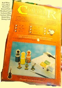
I got some epoxy on the cover a long time ago, which obscures some of the color names, but here they are. Skull White, Chaos Black, Blood Red, Bronzed Flesh, Woodland Green, Enchanted Blue, Sunburst Yellow, Mithril Silver, Shining Gold. Note the a light blue, not a dark blue is depicted as Enchanted Blue and a dark green as Woodland Green and a regular red as Blood Red.
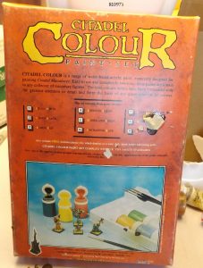
Again under better light. Note the model number 810973 with the 3 in small type.
Closeup
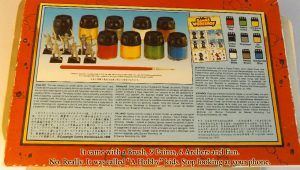
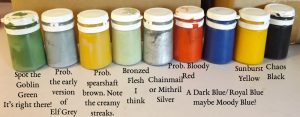
One side of the box advertised the next set which was “Creature” which had the colors: Hobgoblin Orange, Spearstaff Brown, Orc Brown, Rotting Flesh, Goblin Green, Elf Grey, Worm Purple, Swamp Brown, and Chainmail.
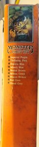
The other side advertised the Monster Set which had Imperial Purple, Titallating Pink, Electric Blue, Moody Blue, Bestial Brown, Bilious Green, Brazen Bronze, Red Gore, and Ghoul Grey.
[This article is incomplete and still in rough draft, but the information on replacement pigments and modern alternatives for the old paints is being made available as I compile it so as to expand the lines of investigation available to the community of collectors and researchers. Also I wanted to get some of the pictures together so I am getting them put up here as I write the article but will revise them as I go along.]
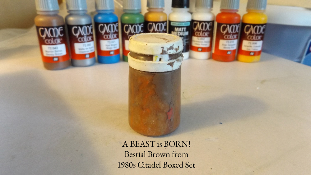
UPDATE: BESTIAL BROWN LOCATED – PARTS OF OLD CITADEL BOXES LOCATED IN WORKSHOP. Cleaning up does wonders! I found parts of my old boxes and they are in bad condition, but I will photograph them. Inside the tray of one of the boxes was the unphotographed bestial brown. It might even be recoverable as it does not smell bad but I have not messed with it yet as I want to take photos first. Good news is that there is some paint on the outside of the pot so the dry color will be visible when photographed. If I can recover the paint and some of the pigment we will have a color sample from an original boxed set version of bestial brown!
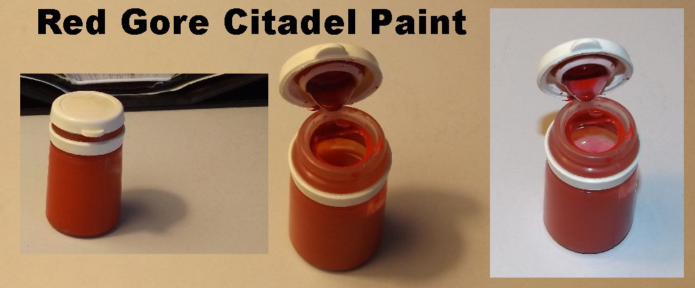
UPDATE: RED GORE LOCATED – SET NOW COMPLETE – The paint is still wet. I got a sample from it. A good one!
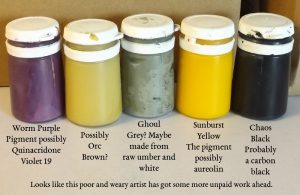
Red Citadel Paint Perhaps Blood Red maybe Red Gore – Still Researching
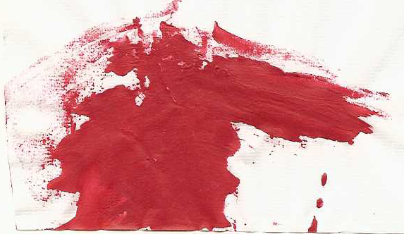
Citadel Red Paint Sample – Is it Blood Red or Red Gore?
I used to do a lot of miniature figure painting of the Games Workshop, Citadel, Ral Partha, etc. type lead, pewter, and plastic figures that are used for table top games, RPGs, etc., and I did a lot of model painting as well. I am planning on doing a series of youtube videos wherein I paint antique Ral Partha figures with the classical Citadel palette which was available in the old boxed sets. Where the same color paints are not available I will make them from pigment and where they can be purchased for a reasonable price I will do so.
I have been interested in the topic of the old citadel sets for some time and have decided to devote some of my energy towards it.
I still have a number of lead and pewter figures including Ral Partha Gremlin with Sword with is the version 3 of number 01-005. It is an ES marking so I think that means it was molded prior to 1980. It looks like this one (http://www.miniatures-workshop.com/lostminiswiki/index.php?title=Image:RP-01-005v3.jpg), but is painted (I’ll probably do a repaint soon, but the paint is good, I’ll photograph it for you all soon). I also have a very nice Ral Partha Armoured Minotaur 02-406 with spear painted that looks like this one (http://www.miniatures-workshop.com/lostminiswiki/index.php?title=Image:RP-98-011e.jpg) that belonged to my dad and I painted after he died. And I have some Asian Archers (I think four or six) which can still be bought through Ironwind (DH-083 Asian Archer [DH-083] http://ironwindmetals.com/store/product_info.php?cPath=47_49_52&products_id=2843) but if memory serves the markings show they were from 1979. I also have a set of three Napoleonic Soldiers, but I haven’t done much research on them and I based them so I can’t see the bottoms. I also have an unpainted goblin that I just love and I’ll photograph all these for you to see.
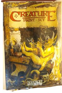
The cover to my Creature set. It’s covered in a gross oil so it’s not usable, but I photographed it for you all just for documentation purposes. Unfortunately I do not think I have the back of the box.
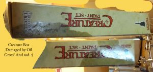
Oil Damage. Makes me cry. The box was so beautiful. But things happen. The paints were safe as they were in another location when the damage occurred.
Because of that I have a number of classic figures that I would be able to paint as a demonstration for you of the way a professional colorist would approach miniature painting and I hope to do be able to do that soon and put the video on you tube.
Both Vallejo and Coat D’Arms makes replacement paints for the old Citadel line and I have ordered some Vallejos and plan on ordering some Coat D’Arms if I can find the colors I will need. And so this series of articles and videos will also serve as product reviews. I also hope to make the videos and write the articles in such a way that you will also learn about how a professional artist goes about constructing a palette and hopefully my readers will learn about how to paint miniatures using a classical citadel palette.
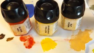
Here we see what was the later 1990s or early 2000s pots of mine which dried out. These style pots were notorious for being bad being made of hard plastic which did not seal well. I was able to extract some pigment from each and make a sample. The sample from the elf flesh is from a backup pot I had purchased that had a different style top. The colors shown are Blood Red, Sunburst Yellow, and Elf Flesh. The paints from this era differed from the early boxed set era. Pigments that were brighter were being used in the later era and the film made by the medium seemed much more plastic. The yellow of this era was cooler and not as rich as the classical era. None of the paints shown are in production today, at least not by name, nor by color according to reports.
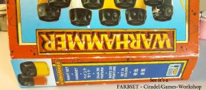
While I have no painted miniatures for many years I decided to explore the medium of miniature again since I’ve been sculpting a bit. I was studying some statues, models, miniatures, and collectibles I have when I decided to pull out some of my old paints and was aghast when I saw the my old games workshop paints (a simple Warhammer Set that came with six plastic archers) were dried out.
This unexpected drying is a well known and serious problem with the citadel type pots being used at that time, but considering their age (probably fifteen years old or so) they lasted a while. Every so often I’d open the pots and add water and stir them, which helped, but nothing lasts forever and knew I’d have to buy more paints, but games workshop paints are very expensive and I am cheap. After I lamented the fall of the citadel I decided to reconstruct the kit to the best of my ability within a reasonable budget.
Color Swatches from the Vallejo Game Color Paints I ordered compared here and there against the 1990s-2000 Citadels
I received my Vallejo order on Saturday May 21, 2016 on schedule, two day priority mail. It did not include the chaos black, skull white, or the bronze I ordered but there is a note about a credit so I’ll check to see if that is refunded to my card or just a credit with the store, or if they will ship the paints when they are ready. UPDATE June 04 – I hadn’t received my back-ordered paints but I had received my bill from the credit card company and I was charged the for the paints which had not shipped so I contacted Neal at the thewarstore.com to ask him to refund that amount and he said he would either do that or I could wait and see if the paints would come in as he was expecting a shipment from a supplier. I let him know I’d rather have the paints and the next day (1st of June) I got an email saying my paints had shipped and they arrived on the 4th, which was a full three days before they were scheduled to arrive. I HIGHLY recommend thewarstore.com for your painting needs. They carry the full line of Vallejo paints and their service has been excellent at each step of the transaction. Their system sends you emails and itemized receipts to let you know that your order was received and which portions have been filled and when things are shipping and their shipping is amazingly reasonable which is a big plus! They shipped my first order out as soon as they had stock and shipped 2 day to help me out since there was a delay and when I contacted them about the still unfilled portion when I thought it might be a problem they emailed me right back and Neal was incredibly polite giving me lots of options to make things right and they made sure I had my paints as soon as they could which happened to be immediately. I have decided to order a few more paints from them and so you know I can recommend thewarstore.com as a good source for miniature paints. Check them out.
I immediately examined the Vallejo paints and they were well packed in a plastic bag, surrounded by styrofoam popcorn inside the good sized postal box. Nothing was crushed or damaged. I photographed the paints and shook them up. They were very liquid and easy to mix inside the bottles just by shaking but I noticed some of the caps were not on very tight when I was shaking them and that made a bit of a mess as it allowed some of the paint to ooze around the nipple which I noticed when I took the caps off a few of a the paints. A little water cleaned them up, but I noticed that one of the nipples is slightly cracked. That is likely going to be a problem as the crack will only get larger in time and so the durability and seal of the drop bottles is not as good as it should be and the paints will not have the shelf life of the magical pots from the old Citadel line. I tested the colors and found they were very liquid, much more so than the Citadels of any era I have used. This formulation is probably to help them flow out of the dropper bottles easily. The colors were vibrant and the pigmentation seemed good considering the low viscosity of the paint but I have not painted with them yet so I will let you know how that goes. I have a feeling the low viscosity may mean that the pigment will settle easily and making sure I shaking the bottles before I put more drops on the palette may become important.
I made swatches and immediately knew even without seeing them side by side that the magic blue and most of the other colors would not match my classic Citadel Colours but that it would match my 1990s-2000s set more so, which they did. In fact these colors seems to use that color scheme and not the classical. That means vallejo are not a good choice to reconstruct a classical palette. The magic blue was an exact match for the enchanted blue being made during the later citadel era but the Vallejo’s medium seems less plastic, probably due to the low viscosity. The Goblin Green was also an exact match for the 90s-2000s color by the same name from Citadel. The Bloody Red dried a bit darker (hard to tell from the swatches since the comparative Citadel paint had to be made from the reconstituted stuff I made with a little Vallejo Matte Medium, but I have the more plastic dried paint still in its pot so I compared them by overlapping a chunked and flattened sample of the dried paint from the pot) and was a bit more yellow and so less cool. It is not a match, but it is close. The difference could be the medium as using the Vallejo Matte Medium to make paint from the dry Citadel stuff darkened it a bit. The Beasty Brown was cooler, more grey, and less yellow than the Citadel stuff I had (which fared better than most of the other paints and I can take samples from pretty easily). It’s close, but not a match. The Sun Yellow is much warmer and darker than the Sunburst Yellow from the 90s-2000s and matches the classical sunburst yellow more closely, which I believe it is designed to do for Vallejo has a cooler yellow that looks like it would be closer to the 90s-2000s yellow called Bald Moon Yellow which is supposed to match Bad Moon Yellow. Bald Moon Yellow is a lemon yellow as is the 90s-2000s Sunburst Yellow so that would be a better choice when comparing lemons to lemons. The chainmail silver is just a typical silvery metallic but I found it funny that the label says Chainmal (bad chain I guess). The color of it is a cool brown, not a cool grey, basically a raw umber. The Elf Skintone however is the most mismatched. It is much darker and warmer than the 90s-2000s Citadel. It looks more muddy and not as cool and clear. Most likely Vallejo’s Elf Skintone is used for shading their other color “Elfic Flesh” 72.098 and “Elfic Flesh” is closer, but still not right. It is too light. What appears to be the correct replacement for Citadel’s late 1990s “Elf Flesh” is Coat D’Arms “Flesh”. I’ll do a more exact comparison sometime, but to my eyes they are the same color.
Now as far as the usability of Vallejo’s “Elfish Skintone” I’m pretty impressed. It looks good as a thin coat over white and looks good fully concentrated. It flows nicely, which is important when doing faces and hands and overall I would say I like the paint. It is too thin to dry brush with unless you give it a little time to dry and brush it out on a paper palette as you pick it up onto to your brush, but that’s the nature of the Vallejo paints right? They are designed for thin washes, not dry brushing.
I suspect that Elf Flesh will require all my skills as a portrait artist to replicate on my own. I will also have to try Vallejo’s Pale Flesh as that is probably a closer match to Elf Flesh but is also somewhat like the original boxed set Citadel color “Bronzed Flesh,” but I can mix my flesh tones.
I still need to get my black and white and bronze, but I have cheap acrylics already for mixing and I have pure pigments and medium now so I can make the black and white. I am ready to paint, but it was disappointing that those colors were not shipped and I’ll have to look into why and how I can get them, but I have successfully gotten the colors I used to have in my 90s-2000 kit more or less (still need a cool yellow since the vallejo was warm) and so can paint. I have cheap black and white paint and can make better stuff from pigment.
I ordered a classic Citadel paint pot of Swamp Brown to confirm my suspicion that it was Indian Red. It is. So if you want to make some Swamp Brown just get Indian Red which is natural hematite and use that. Easy.
I should get the cool yellow, but for now I have what I need except the bronze which I can not make. I have pigments which I can use to make more colors and the dropper bottle will make using them easy without a lot of waste and the need to store a lot of unnecessary paint. I will now turn my attention to the company Coat D’Arms whereby I hope to reconstruct my classical boxed Citadel Colour sets. Do they have a replacement for worm purple and the old imperial purple and what is the blue that matches moody, enchanted, and electric of the original sets? I have enquired of an official United States distributor so we will see if I get a response.
Identifying the original colors by their silly (but fun) names is hard enough, but I want to make some perfect replacements for certain colours and not just buy them and so I want to discover the pigments used so that artists will never have to go without without these classic paints. This is my epic quest! Will I be rewarded? Unlikely. Life and God’s word has taught me that heroes get punished, not rewarded, but we live our natures do we not?
So I wasn’t sure whether I’d go with games workshop, reaper, or vallejo, or Coat D’Arms or Foundry. But I learned games workshop does not make most of their original colours anymore and that the whole system has changed. And so I started looking into the replacement makers instead.
At first I was tempted to try vallejo since they claim to have exact equivalents for the old citadels, but some reviews said the consistency is bad and since I have to order them I wasn’t going to be able to look at them in the store to see if they have separated from the medium badly so at first I thought that I’d go with reaper or as I said games workshop and just try the best equivalents I could find.
But the reaper library of colours was a bit confusing and I did not like the sets so I opted out of that.
When it became apparent that caldeor sky was the modern color equivalent to the older enchanted blue of mine I became interested again in the citadel line, but the price again drove me away. I was looking at a hundred dollars for a few paints and medium and primer spray. That’s outrageously overpriced. However I did like that I could order direct from the company but if direct ordering does not translate into savings then what is the point of cutting out the middle man?
So deciding I would stay away from citadel my next problem became a finding an online distributor for the other brands. After a lot more searching than seemed reasonable for such a well known product (two days worth of looking – apparently search engines do not work anymore – thanks Obama) I found thewarstore.com which carried the Vallejo line but had a few out of stock colours that I probably would have picked up if they had been available when I eventually placed my order.
I can not identify some of the colors. Some are dead and another is mysterious in the photo. I’ll study this color in the article. I think it’s spearstaff brown which I believe was a yellow ochre. The red is dry, but plastic; it appears to be blood red, not red gore. Blood red from this early period was cooler than the later period from what I can tell. The skull white is dry and almost empty. Imperial Purple back then was reddish and not a dark purple from what my research tells me and it was probably made from a magenta pigment.
Another source I found which was a little cheaper per item, but of which I had no recommendation from other customers, but was easier to find online, was miniaturemarket.com.
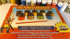
My dried up Warhammer Paint Kit. I painted so many figures with this kit. Troubadours, will you sing me a lament for the fall of the Citadel?
Product Title – Multi Warhammer Fantasy Paint. I got this at a local hobby shop years ago. I was broke (as artists always are) and I needed a basic set of acrylic miniature paints and it was the perfect solution at the time. It came with six archers to paint which I still have.
Other Side. Don’t eat the pieces kids. Why am I photographing all this? Apparently this variant of a paint kit is lesser known so I am documenting it for… posterior? wait… no… posterity! Ya, that’s the word.
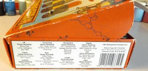
These small painting kits are known to collectors as Farbsets (German for Color Set). There were different kinds that came with different figures. Check out the labeling. International as all get out (of my country) huh? Well you take the good with the bad sometimes (or build a wall and take your country back).
Yes hobbies. I miss them. You do them (fun – messing with real things). They don’t do you (work – messing with computers).
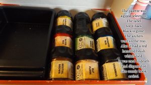
The pallete was Chaos Black, Skull White, Sunburst Yellow, Blood Red, Enchanted Blue, Goblin Green, Bestial Brown, Elf Flesh, and Chainmail (a metalic). There was a brush and 6 archers in the tray. My memory tells me the archers were surrounded by a foam insert. I’ll show you the archers when I photograph them.
You can read the rest of this extensive article to learn more about my thinking when it came to paint selection but in the end I decided to go with Vallejo for my basic palette. Their paints are much cheaper than their competitors and their library of colours is excellent having both a game color line for miniatures and a model line. The model line is compatible with the game line, but it has the range typically used by those who make the typical military model type stuff.
And in the end I placed my order with thewarstore.com and I’ll let you know how fast they arrive and in what condition, and I’ll test them out and compare to my old colours etc. so that this article can serve as review as well as a general interest art article.
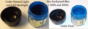
This is what Enchanted Blue from Citadel from the later period (around the turn of this century) when dry. A great color. These pots were cursed and destroyed a ton of good paint. Finding an EXACT replacement for this color is important to me. Blue pigments however come in many varieties and much investigation will be required to nail it down.
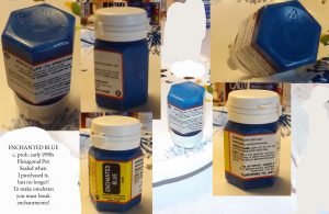
Hexagonal pot of Enchanted Blue. Sealed when I purchased it. Seal broken by my hands. Sacrificed as part of my project of collecting color samples from the Citadel line. Do not worry. It will last a long time even with a broken seal if well cared for. It does not match any of the former blues I had precisely. Ugh! Why must color allude me? Is this some sort of enchantment?
I should begin that process of review now by explaining my experience with the ordering so far. I had no trouble finding the stuff I wanted on thewarstore.com, although I think their website could be a little better laid out it was no trouble at all and although a few colours I wanted were out of stock the palette I had planned out was available. Update: I just got an email saying my backorders have been filled and my items are shipping. (May 18th). Very good service so far.
I had some trouble processing one form of payment, but another went through fine and after placing the order I immediately received a number of confirmation emails and itemized receipts. That is good.
The total was $42.83 with shipping which was $6.95. Reasonable shipping costs like that is a good sign you are dealing with a good retailer as a lot of little shops and even major distributors screw you over in shipping and even escalate the shipping costs based on the total cost of your order (the worst possible business practice as it discourages large orders). So I am hopeful.
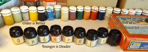
Even with a good amount of care the later era paint in the foreground paints all dried up almost immediately after purchase. The edges of the lids had to be scraped constantly and fresh water added and stirred in and they are still dry after being neglected for a few years. Most of the older paints in the background survived without any long term care and most of the ones that perished was due to mishandling, not the pots or the environment in which they were stored being at fault. Their storage environment was an extreme environment to say the least. You have no idea.
I’m pretty frugal and I hate spending money so I did not go crazy with my colour selection. After all I have a lot of paints and pigments already, just not the exact ones I wanted for miniature painting. I’ll discuss my selection in a bit.
I got 17ml of each colour for $2.99 each. The citadel line is $4.25 each for12ml from gamesworkshop.com. I’ve always been impressed with the high pigmentation of citadel paints, but the difference seems obscene. I’ll review and see if the price of citadels are worth that by comparison whenever I next get a fresh pot of their paint which may be a while, but since I’ve had good results with very very cheap paints for certain purposes I have a feeling the Vallejo are just fine for my general miniature painting purposes.
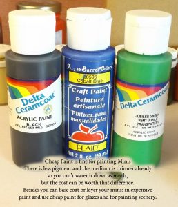
Use cheap paint for as many things as you can. Citadels are very expensive at $4.25 for a small pot while Vallejo paints are only $2.99 and contain more paint per bottle it is still an expensive paint and precious as supplies are hard to come by and have to be ordered most of the time as it is an import. Use your expensive paints expensive stuff for detail work and base coating (since cheap paint is so transparent it is hard to get a nice thin coat which is important when laying down the initial colours or priming) and use the cheap stuff for everything else including scenery. Make color swatches of your good paint to take to the big stores and pick up cheap paint that matches.
The palette I will have available to me based on my order alone, and not the paints I already had or can make myself, will be a primary palette with a green which saves me time and a brown which is always useful and two metallics.
I designed this palette around the idea of rebuilding my little citadel set which had dried up and Vallejo made this easy as many of their colours are replacements for the old citadel paints, which is the primary reason I ended up going with their paint. To the replacement colours I added a bronze since it is so useful and I have certain minis that need it.
This little palette of mine that will be arriving includes magic blue (enchanted blue in citadel), goblin green (same title as the old citadel line), beasty brown (bestial brown in old citadel), chainmail silver (chainmail in old citadel), bright bronze (Brazen Brass (or bronze) in old citadel, bloody red (blood red in old citadel), sunblast yellow (sunburst yellow in old citadel), dead white (skull white in citadel), chaos black, elf skintone (elf flesh in citadel).
And I picked up a bottle of vallejo matte medium to make more colours from my library of pigments. The dropper bottles Vallejo paints come in will make mixing up a quick colour from pigment very easy and there will be very little waste.
By the way, Vallejo has a dry pigment line too. I did not look at them carefully because I figured the art suppliers I use for dry pigments like sinopia.com, dickblick.com, and naturalpigments.com are probably cheaper and their dry pigment descriptions more exacting (assumptions of mine) and I know they have a better selection (although the selection of Vallejo pigments was very good if you are just concerned with getting a few earth tones). However I was very impressed that Vallejo offers the option of using dry pigments to make some earth tones paints and for that technique whereby dry pigment is used to weather models.
Now we should discuss the longevity of my old paints and how to best preserve an investment of new ones. My backup pot of elf flesh from the 90s or early 2000s came in handy as I had planned for the disasters of those later coming years knowing it would be a difficult color to come by in those coming years based on the selection at the hobby shop which I noticed then (wow – so many years ago).
Foreseeing the evil to come by reading the signs like the closure of hobby shops all over and the effects of inflation and the way my paints were already drying out I decided to make the long trip to the hobby store in 2001 (if memory serves) to get an extra pot of elf flesh. The one that came with the set was already drying out even then and so I did the prudent thing and bought that extra pot knowing it was a color that was not always available at the shop and unlikely to be around for long being a mixture. It was a colour I used on many models so I knew that my current pot would not last. Since that earlier replaced pot was fresher than the others I was able to reconstitute it entirely in the present and I was able to use that to make a color swatch which I can now use to mix the color again from primaries or my pigment collection. But as I am reconstructing my old kit I still want a new pot just in case and to see how the modern equivalent compares.
The flesh colours available at Games Workshop are not the same apparently, but I have not tested them yet and since I went with Vallejo I will test theirs.
The original pot of Elf Flesh which survived I was able to paint with to sample and it looks like a mixture of red (a slightly warm red probably) and yellow ochre or else a regular arylide yellow and a red which has either been dulled a bit or is just not overpowering.
These style pots came out later and had the same hard plastic hexagonal bodies but were better at preserving paints because of the flip lid with the integral stopper. They were still not as good as the soft plastic pots used in the old days, but it was an improvement and as you can see this paint fared very well with additional water added occasionally and some stirring while the others did not as they were as well sealed by their lids.
It really should not be a problem for any portrait artist like myself to mix closely but an exact match will be a challenge. It’s fairly medium warm flesh, not a cool pink flesh, but not too earthy or dark giving you the ability to highlight it and wash umbers into the crevices of the face still after applying it so it is pretty useful for minis and models.
I do remember though it had a tendency to clump because it dried so quickly. That suggests to me that it may contain an umber either raw or burnt, but not necessarily as it is a acrylic after all and they dry pretty fast.
It could contain a sienna. I’ll be able to tell from the transparency. Siennas that are unburned tend to be very opaque.
I’ll experiment with recreating it another time. In any case I found a supposed replacement in the vallejo game colour line and will compare swatches to see how well their chemists did at tackling the challenge of recreating that all important colour.
I was really pleased when I found that Vallejo supplies a colour chart on their website.
http://www.acrylicosvallejo.com/en_US/downloads
The game color PDF there has the chart you should use for mini-painting, but their model colours are compatible) in which they list equivalent colors to other systems. That was immensely useful.
The Vallejo Model Color “Beige Red” is listed by Vallejo as the old Citadel’s “Elf Flesh” equivalent but they have an “Elf Flesh Hue” in the game line. The word “hue” in paint descriptions means that a mix, and not a pure pigment is being used, or that a singular replacement pigment is being used to achieve the same approximate colour as a singular pigment of another sort would. It might seem confusing but just know that the use of the word “hue” implies that the colour is matched, not the pigment. The reasons hues are made by paint manufacturers are varied. Usually the cost or toxicity or availability of a certain pigment makes it less marketable and so replacement pigments are needed. Since every pigment has its own unique color in order to approximate that color a mix of two similar pigments is usually employed. But in some cases a former mixture by one company is replaced with a similar mixture by another and called a “hue” because the colours are very close, but do not match precisely. And so we will see how the “Elf Flesh Hue” fairs when compared directly against the Old Citadel Elf Flesh when it arrives.
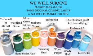
Blessed Jars Under Flash Photo
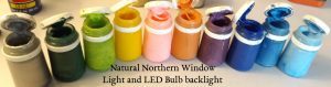
Under Natural Light from the North through a window and an LED bulb for back-lighting. You can see how much darker the woodland green appears in person which is why I used a flash for one of these photos.
The modern Citadel equivalent to their old Elf Flesh is listed as Kislev Flesh by the Vallejo chart, which may be correct, but my assessment without seeing the new Citadel paint in person is that Citadel’s “Bestigor Flesh” is closer. I have eldar flesh from their dry line of paints so should compare.
Another comparative chart told me that the Reaper equivalent is Rosy Highlight 9069, but Reaper has a lot of colors to choose from that appear closer to me and they have an Elfin Flesh. In fact Reaper seems to have a lot of skin tones, which is great. https://www.reapermini.com/Paints/corecolors and https://www.reapermini.com/Paints/hd
Another company that seemed to have a great selection of earthy colours that could be used for flesh was Foundry but I have no idea where to get them in America. (More research needed.) They also have a set that looks like it matches my old warhammer citadel set with the addition of a gold metallic, but they only have digital swatches and not photographs of them so I can not see the actual colours so I am not certain the set would match. http://www.wargamesfoundry.com/paints/foundry-painting-system/big-paint-list/ and http://www.wargamesfoundry.com/paints/foundry-painting-system/sample-paint-set/
Any earth tone will work to approximate Elf Flesh as it is a medium, slightly orangey (Trumpian) skin tone and stays away from the darker brown family of colours.
If I had decided to go with Games Workshop paints I would buy both Bestigor and Kislev to see which is closer for myself. If I went with Reaper I have a lot of choices. But in the end I went with Elf Flesh Hue by Vallejo.
Here elf grey appears darker than other photos I’ve seen from later labeled jars. I think the color got lighter in later production. I’ve seen other photos of spearstaff and it seems to be most recognizable by me when I see the creamy streaks within it which are very close to the main color in tone and hue. I assume that is the medium. Comparing to some yellow ochre I have (I have many kinds) I have found it to be like the yellow ochre in Winsor and Newtons watercolor line. That pigment would be a good place to start an investigation into how to replicate the color.
I know I’ll need a primer too so I picked up a white primer. You can get away with a thin coat of regular paint, but regular paint isn’t really formulated for that job and I have had mixed results in the past, especially with white, which is not absorbent and does not make a good primer unless the particular white pigments are the kind selected for the purpose of priming. I’ve never used the vallejo primer so I’ll let you know how well it works.
My dad used Ral Partha Primers which were excellent and back in the day I used two primers both being Citadel brand; the one being Skull White and the other Chaos Black.
The black citadel primer was thicker and more clumpy and was only really good if the next layer of color was opaque. Blood red was transparent, especially when water was added to help increase the flow so it wasn’t fun painting red directly on that black primer.
My best results were with the citadel white primer which made the colors vibrant, especially red and blue. Knowing more about paint and technique now I think a more absorbent earth based primer or lead white would be best with as little acrylic medium as could be tolerated and maybe even some rabbit skin glue and finely ground calcium chalk mixed in (see the process of preparation in the book by Cennini), but the less pigmentation that would be used the better as the detail on minis gets obscured up easily.
I knew that regardless of what system of paint I was going to choose I’d be going with brush on primer rather than a spray since I can get it without shipping restrictions and there is no odor to worry about and there would be less mess and drying time and less difficulty handling the figure and keeping dust off of it and all those problems overall. And I know that I won’t be priming large quantities of figures anyway. Also spray primer can be difficult to get between the legs of figures that are already based and the directional problems with spraying always annoyed me. So I decided to go for the Vallejo white brushed on primer for $2.99. Way cheaper than a Citadel spray (Corax White Spray) which is $17 and includes some shipping restrictions and ordering limits. That is demeaning bureaucratic bull and since I am an adult and do not appreciate being treated like a child Games Workshop can keep their can next to their other one. I’ll let you know how well the Vallejo primer works.
I knew I wanted to try an acrylic medium as well for making glazes and to make more paints from my pigment collection. This will let me greatly expand my color selection without having to buy so many expensive paints from the manufacturers. One of the great things about being a classical artist is that I have a huge collection of dry pigments for making paint and I can just change the medium to make either egg tempera, oil, watercolor, acrylic, etc. It just happens to be I have no acrylic medium right now and would prefer to get the stuff they sell for miniatures because I figure the viscosity will be optimal for that scale and it will closely match the paints that I will buy.
Since these are acrylics for making washes I just need water. And ivory soap will work for cleanup so I am good there making thinners unnecessary. I almost never use thinners in any case and when I do I usually use very mild ones like spike lavender oil but I would not use any thinner, even spike oil on a plastic mini until testing it thoroughly. The most odorless thinner I’ve used in the Gamblin brand odorless mineral spirit called Gamsol. It is significantly less smelly than the other brands, but even it gives me a headache and I hate it.
Surprisingly I have no trouble with lavender oil although I am allergic to most chemicals and paint in poorly ventilated areas a lot of the time, but I use very little and apparently have no allergy to that substance. Some brands may be different but I use stuff I got from naturalpigments.com and it seems to do fine by me but I noticed that the picture of what they sell looks different, however I suspect that is only a packaging change.
I could try egg also for washes and glazes but I have never tried egg tempera on minis and so I’ll experiment with that and let you know how it turns out. I do not see why it wouldn’t work as long as the figure has been primed. Egg tempera is a surprisingly flexible medium. A piece of paper with egg paint on it can be rolled up with cracking. Thicker applications may be brittle, especially in the long term, but thin applications seem to be fine and so it would probably work well for minis too.
I’ve tried oil paint on a larger figures and it works just fine, but it imparts far too much gloss for my taste (that can be useful for some effects though and for metal minis a spike oil can be used as a medium thinner to reduce gloss and speed drying time) so I’ll try egg next and see how that goes and let my readers know. I’ve read that to remove gloss a matte varnish is all that is needed like testors dullcoat, but I’ve never tried it so I can not recommend it at this time. For minis I always used ral partha sealer when it was available or citadel. The citadel stuff worked well for me. I suspect that regular fixative would also work, but I’ve had bad results with fixative on paper with pastels where the colour sank in badly and the edges blurred and the overall picture got darker, especially the whites which were dissolved or blown away by the spray. And I’ve read that citadel sealer is especially formulated to enhance and not dull the colours and so I have reason to change and so will probably need to buy some at some point. However it must be noted that sealing your figure is not absolutely necessary as acrylic paint is flexible and durable, but if you play with your figures they will be handled a lot and so sealer is recommended. It also makes the figure easier and safer to clean later when necessary.
My colour selection was based around a primary palette to keep my expensive low. The primary colours for artists are; white, black, red, yellow, blue and sometimes green and so I’ll go into explaining how these colours should be made and handled and compare replacements to the old citadel line.
Blood Red can be replaced by the new Citadel paint “Evil Sunz Scarlet” or by Reaper’s Clear Red, or by Vallejo’s Game Color “Bloody Red” or by their model color Vermilion.
The old Citadel color is pretty straight forward. It is a warm primary red that trends cooler than cadmium red medium, but the naming convention changed. The earliest version of blood red was much cooler and the red gore was the warm version, but quickly blood red was what they called their warm version. This has led to a lot of confusion.
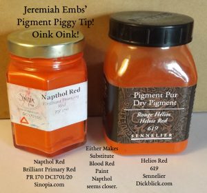
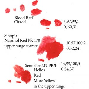
I compared it to Winsor Red which is made from PR254 (pyrrole red) and it looks like a match, but I do not have this is dry pigment form.
There are more red pigments available than for any other color including modern pigments and classical toxics and non-toxic classical earthtones. So we have a lot of choices in the red range. To get make a replacement for blood red any scarlet red (a cool red) that isn’t orange scarlet (an intense orange) will work.
In my collection of pigments I have genuine cadmium red medium which would work, but is too warm. I also have napthol red, which I have, and pyrole red would probably work, which I don’t. I also have helios red from Sennelier and that looks close (helios is a toluidine red pigment PR3). I could also use any alizarin crimson but it would probably be too transparent and too cool, but it is a common red on the artists palette you may use. A touch of yellow, and just a touch, with a little white to increase the opacity would bring it up to something close to Citadel’s blood red. Venetian red would also work in a pinch. Indian red is a little too cool so some yellow would be needed. Indian is also very opaque and bloody red is not, so a glaze would work best if that is what you use as a replacement pigment. Acrylic manufactures often have a color called “bright red” which is pretty close or just “red” which may be closer so you can find substitutes in any line of paints. Cheap acrylic paint from walmart would be fine as long as it is not gloss (unless you want it to look like real blood of course in which case alizarin crimson would be better).
I could go on, but hopefully you understand that any red is fine as your primary. The only red I think I would avoid as my only red on a palette for minis would be alizarin crimson, which is beautiful and versatile, but which is too transparent to make a good primary for acrylics where flow has to be increased by adding water whereafter the paint would be even more transparent. This is not usually a problem in mixes, especially if white is added (and since alizarin is dark it usually would be) but as a solo color it would not give you good coverage. However if you under-painted the area to be made pure red with white, as you do when you prime the piece initially, it would probably be fine, but that is too limiting in my opinion in the realm of minis. My memory tells me that citadels blood red is a bit transparent, but not as much so as alizarin crimson.
Since I have so many choices I knew I could try them all until I found the right one. After all I just wanted a red that is basically warm; that is, it would need to be warmer than the typical earthtone reds and warmer than rose-like-pinks made from alizarins and magentas, but not orangey like a warm cadmium. I also knew the undertone should not be too warm so I checked the transparencies of the colours looking for the ones that produced a clearly cool blueish tone when thinned out over a white surface. I tested a few of my pigments and found one that works well.
My tests suggest Napthol Red PR170 from Sinopia.com is the best pigment I have to make a paint to replace Citadel’s blood red because cadmium is too expensive and considered too toxic for minis (minis are handled quite a bit if played with and children may play with them) and cadmium is opaque. My tests showed that Helios was in the mid and mid upper ranges just a tad warmer (more yellow) than Napthol and that it also a little darker in the lower ranges. But both are very very close and either would suffice. I’ll go with Napthol since it appears to me a perfect match. I must be careful making this paint though, because like phthalocyanine, napthol stains everything!
I have a wet sample (actually a full pot) of the antique (1980s) Citadel Sunburst Yellow and noticed it is warmer than the later production. At first I thought Cadmium yellow would probably be optimal, but cadmiums are to be rejected for this project for the aforementioned reasons. But it does not matter for the rich darkening around the edges of the original citadel sunburst yellow reveals it to possibly be aureolin (cobalt yellow- potassium cobaltinitrite).
I can make a good sunburst yellow from hansa (arylide) yellow which I have as a pigment from sinopia.com whose variation trends warm for the family (http://sinopia.com/DC0741-Brilliant-Yellow-Hansa-Warm-Primary-Yellow_p_44.html).
That will work fine for the transparent yellow, but I also have genuine cadmium yellow medium from Gamblin (http://www.dickblick.com/products/gamblin-artists-colors-dry-pigments/) if I want an opaque yellow and do not mind the risks and I have lots of yellow ochres of course for dull yellows including a golden shade which does not have the same unpleasant greenish trend a lot of ochres tend to show which are great for landscapes, but undesirable the modern color mixing scheme that avoids complex colours.
Because I can make the correct yellow and seldom used it when painting minis I did not need to buy a yellow in actuality, but I got one anyway so I don’t have to mix up yellow each time I paint and to complete the set.
You see; hansa and cadmium are not fun pigments to mess with. The arylide used to make hansa yellow is very light in weight and gets everywhere (https://en.wikipedia.org/wiki/Arylide_yellow) and as I mentioned cadmium is considered by some to be toxic and it is very opaque so not really suited to effect painting and so can not be the only one I use since transparency is very desirable quality in miniature painting and opacity not as much so unless painting over a black primer. So overall I thought purchasing a yellow would be best; especially because it gives me an opportunity to see if vallejo made their colour more like the original Citadel line or more like the later.
The proper blue took a lot of study and I do not think I have the correct pigment to make it (that will be remedied I assure you).
What it seems is that the “Enchanted Blue” offered in the original boxed sets does not appear to be the same color as the “Enchanted Blue” offered in the later warhammer sets. Since I am really looking for a replacement for the later “Enchanted Blue” and not the earlier I will begin there.
Developing this section… readers ignore the information in this section until complete.
section begin… The old dark blue in the citadel set matches Antwerp Blue by Winsor and Newton which is made from PB27 (Iron Blue) which is also used to make Prussian Blue and Milori Blue and French Blue and Mineral Blue. It is a beautiful color and paints so nicely even now after it has set for decades untouched.
I have not researched the process of making Blue Iron, but I suspect it is something like blueing a firearm as that deep blue color on blue-finished Colts is similar and apparently another name for it is “steel blue”. http://www.artiscreation.com/blue.html and http://encycolorpedia.com/006c92
About antwerp blue/prussian blue pigment it is written, “PB27 can achieve a beautifully saturated, very dark color in some preparations, but when used in watercolors its finished color is usually muted, greenish and moody. The masstone color is close to a reddish phthalo blue; it shifts very noticeably toward green in tints, and presents a similar large drying shift (lightening by 68% and dropping 20% in chroma), making this one of the most dynamic pigments available. The pigment particles are extremely fine, but the pigment usually agglomerates or clumps, depending on how it is manufactured, to create a stringy or flaked texture that cannot be milled out and that appears in the M. Graham and Daniel Smith paints as tiny, dark flecks when the paint is applied. ” and “…Iron blue (PB27) … produces very moody darks, while ultramarine mixed with cobalt turquoise light (PG50) produces an equivalent hue with a distinctive pigment texture…” Source – http://www.handprint.com/HP/WCL/waterb.html
The two references to the “moody” aspects of PB27 which produces antwerp and prussian blue leads me to believe that the darkest blue within the original Citadel sets was the moody blue. In fact I found a picture of a pot without a label that someone else identified as moody blue which was darker than any of the other blues I have in my collection from the boxed set besides the one that matches antwerp blue. And so I am fairly certain that the moody blue of the old Citadel sets was the darkest blue.
However https://www.sherwin-williams.com/homeowners/color/find-and-explore-colors/paint-colors-by-family/SW6221/#/6221/?s=coordinatingColors&p=PS0 lists “moody blue” as what appears as basically a cool grey. And I have a cool grey in my set and I figured it was an earlier version of elf grey which I figured got lighter, and I have some reason to believe that it did as some photos of the color appear darker than others. Later the darker cooler grey was called stonegrey or something like that.
But the photo tells all. Moody blue was blue, not grey and not dark, but not light either. http://collector-info.com/Manufacturer/CIT/GAWPAT/GAWPATPAICLA/4976-26-Colour-Moody-Blue.html
That picture is certainly not the light blue I have. I beliebe that moody blue was later renamed storm blue and can be replaced by vallejos stormy blue.
I have three blue pigments in my collection and many more ready-made blues. Here are my findings.
Sinopia’s Royal Blue PB15.3 is beautiful and transparent but stains everything it touches, especially plastic, but it seems deeper and warmer than citadel’s enchanted blue, but it is close enough I suppose it would work however it would have to be used lightly or mixed with an ever so little amount of white which would make it more opaque, but that would bring it up to the right lightness and so would work, but it is not right as enchanted blue is an especially nice colour and I would want to get it exactly correct.
I also have Sennelier’s Ultramarine Blue Deep PB29 which seems more brilliant than the enchanted blue, but the colors are somewhat close however Sennelier’s pigment is cooler than enchanted blue.
I tested some French Ultramarine from Winsor and Newton and found it very close in overtones, but the French was darker in undertones (there appears to be almost no undertone at all in the enchanted blue as it dried very opaquely and with a visual quality I can only describe as extremely plastic and fully saturated), but I think that difference was partially because my French was an oil and that darkens pigments.
Also the French was a bit redder and bit less green making it warmer, but the blue level was the same and so I think this would be an acceptable pigment alternative.
The French Winsor and Newton that was so close uses PB29 like the Sennelier Ultramarine Blue Deep does, but the tube notes that the pigment is PB29 with sulfur so I am not sure if the dark undertone is only due to the oil medium or not (“Synthetic ultramarine is made by mixing anhydrous sodium sulfate or sodium carbonate with charcoal, clay, rosin, silica, sulfur, and slowly calcined in a reducing atmosphere…” – http://www.artiscreation.com/blue.html#pb29).
As an experiment I added some oil to the Sennelier Ultra Marine Blue Deep and found it darkened, but still was not as purple as the PB15.3 from Sinopia, but the fact that the Sinopia is warm is no surprise to me. Their primaries run warmer than usual for the same pigment which makes them ideal in my opinion as general oil colours.
The color of the Sinopia Royal Blue PB15.3 is close enough to replace the enchanted blue in my opinion as is my Winsor and Newton French if I want to allow oil paint into my palette (fine by me) as they would be if I wanted a gloss finish like as when I am painting water or something or if I take steps to reduce the gloss (discussed early and later).
I also have ultramarine blue light greenish from sinopia that is absolutely beautiful and I may replace my enchanted blue with it just for palette preference reasons, but it is not a match. The enchanted blue has more purple in it than the proposed replacement making it warmer.
But using the ultramarine blue light greenish is a tempting replacement just for its intensity and greenish hue which makes mixing bright greens easier. That means sky blue and turquoise would be more easily obtained which could be good if I were working on ship models with water surrounding them.
While I do not have genuine cobalt in a pigment form I tried a genuine cobalt blue from my watercolour collection (a retiring watercolourist gave me this paint as part of the huge library of colours she had acquired and passed on to me when she was moving into a smaller place for which I am very grateful) and found it a close match, but it seemed cooler. But it is so close that I woild guess that is the correct pigment in truth which may explain why the exact color is no longer made as cobalt is considered toxic and is expensive.
Cobalt is always an exciting pigment to have on the palette and is a really good for that medium but intense colour I think of as a “super hero blue” but in actuality it is not possible to reproduce that intensity of blue in comics with the standard printer’s primaries and so cobalt is a colour passed over by comic artists and so my association with the colour is more one of idealism and not reality, which only enhances my disappointment with the range of colours available to me when I color comics. However I have used a hue of cobalt for a comic hero model I built and found it worked wonderfully on that along side bright red.
So I compared the enchanted blue to that old model of Captain America which I painted a long time ago in that cheap cobalt blue and the two are very close. Genuine cobalt paint is very expensive and the dry pigment considered hazardous and so Cobalt Blue hues (which are mixtures or synthetics and not singular or genuine pigmented paints) are common in cheaper paints. Most likely these cobalt hues are made from PB15, but they could be made from PB29.
And so I already have a paint that I can use to replace enchanted blue and it is cheap enough I can use it any time I need serious coverage too. It also dries flat and neat.
I paint is from Apple Barrel Colors Plaid and called “Cobalt Blue 20596”. It is a cheap paint available practically everywhere or easily obtained online in a two ounce bottle. That is a lot of paint for minis! https://www.plaidonline.com/apple-barrel-colors-2-oz/5/product.htm?keyword=cobalt%20blue)
But it is still not an exact match. The enchanted blue is a bit greyer and slightly cooler, but to my eyes it appeared warmer, but computer color analysis seems to indicate that it only appears warmer because it is darker.
The differences between the Apple Barrel Cobalt Blue and Citadel’s Enchanted Blue are an acceptable difference to me since I seldom used the enchanted blue anyway. And so if you want to grab a cheap paint that will suffice go with that.
The official replacements recommended include Citadel’s Teclis Blue and Magic Blue or Dark Blue from Vallejo with Magic Blue being the obvious suggested replacement by Vallejo. And that is what I included in my order. Some other replacements recommended by other sources include Cyan Blue 9117 and Sapphire Blue, both from the Reaper line.
It is interesting to note that Cyan Blue might seem unlikely when first considered because Cyan is often light and almost sky when used in a paint mixture, but true Cyan printer’s pigment as I have available to me in the Maimeri Venezia watercolour (400 Blu Primario – Cyan Blue Primary) is a primary which is dark when concentrated and beautifully transparent in the mid-range falling right where it should to replace enchanted blue. And cyan blue paints are generally made from PB15 so I feel we are on the right track for a replacement.
By the way; I really like the Venezia printer primary watercolors. They paint beautifully and are transparent and so intense. And their flow is unbeatable. They have Cyan, Magenta, and Yellow which together were designed to be the paint equivalents of printer primaries. Printers use phthalocyanine for cyan (the blue printers use is called cyan) which is PB15 and in paint that pigment makes what is sometimes called monastral blue. The variation of that dry pigment which I have from sinopia.com is PB15.3.
As I have said before Sinopia’s primaries run warm and when tested against the enchanted blue it was close, but indeed a bit warmer and darker whereas the other colors I tested were mostly cooler than the enchanted blue.
That suggests to me that PB15 does indeed come in the shade used in enchanted blue and that the PB15.3 used in the Venezia Cyan is the normal shade of that variation and not the warmer version that seems to be sold by sinopia.com.
That may mean that a pure cyan PB15.3 paint would be the true replacement replacement for enchanted blue. Also I could in fact I could use the venezia on my minis and why not? It is a bit glossy when thick, but I love the venezia paints so I just might do that and see what happens. There are ways to separate pigment from binder that would work to reduce gloss and then acrylic medium could be added if necessary, but I avoided these complications by buying the Vallejo magic blue and will let you know if it looks the same as enchanted blue.
…Section end
Goblin Green was another color everybody loved which is not easy to replace. Their “Warboss Green” is what Citadel recommends as a replacement, but if the colour charts reflect the real color it looks to me that Warpstone Glow, which is equivalent to Clear Green in the Reaper line is closer, but I can not tell until I see both in person.
In the Vallejo Model Color line Olive Green is recommended, which gives you an idea of the kind of color we are talking about. The most obvious choice for minis would be to go to Vallejo’s Game Color “Goblin Green” following the recommendation since Vallejo tried to make sure that the colours they designed around the Citadel paints had similar names. In this case they were able to use an identical name.
It looks like Sinopia’s SCSG223 Cobalt Green would be fine as it has a slight yellow tone like Goblin Green does, but it does not look the same and cobalts should be avoided.
Again a cheaper alternative is at my fingertips. Delta Ceramcoat has a color called “Jubilee Green” which is very close. The similarity is good enough for me for things like scenery and it is cheap.
In actuality I do not really need a green since greens can be mixed from blue and yellow or yellow and black. But goblins are green and I have a lot of goblins so it would save time to use the Jubilee Green or buy another green or to make one from pigment.
I tested a few greens and found that I had the pigment I needed to make goblin green. The color can be made from Sinopia’s Chromium Oxide Green PG17 Opaque which is so close that the color swatch disappears when laid on it and so I would say they match. I have that pigment and so I can make this color exactly.
The pigment is opaque (amazingly so) so that the paint will be opaque however so I could still use a mixed green made from blue and yellow or yellow and black for certain effects.
If you do not have an oxide green, and would like a cooler green which is transparent, and which is on almost every artists palette at some time or another, go with viridian green. The pigment PG7 (Phthalocyanine Green BS) is probably what was used to make the old citadel “Woodland Green” which resembles Winsor Green somewhat and Hooker’s Green and that pigment is used to make viridian green hue. I noticed that woodland green is pretty dark and so I’ll test it against genuine viridian. If memory serves me viridian is not that dark nor as dull. Viridian is also more much cool green, but I’ll check again.
I also have genuine viridian green in pigment form so I am good to go with greens, but still I bought goblin green from Vallejo to save time and for comparison.
Let’s talk about browns now. Vallejo Game Color has a “Bestial brown” under the name “Beasty Brown” and Mournfang Brown is the modern Citadel equivalent. Also “Beige Brown” is recommended by the chart from Vallejo’s Model Color line. Also “Intense Brown” is what is recommended as the Reaper replacement for bestial brown.
Any coolish, but slightly tan or beige brown would do fine as a replacement for bestial. We can make browns from mixes. A dull yellow and dull red and white with a touch of cool blue or cool green would get you something close to it, but I hate mixing my browns. There are just too many great earth-tone pigments to ignore and neglect which have wonderful properties. I always have a number of earth-tones on my palette and will not purge them entirely from even a mini color scheme.
For the sake of comparison I made a swatch of Winsor and Newton’s Winton Burnt Umber oil paint. Bestial is definitely lighter and by reckoning cooler.
Just looking at the sinopia swatches online I would say Bestial Brown could be made from something like PC404RU Raw Umber Greenish, which I have, if I mixed a little white and yellow into it, but sienna is the proper pigment.
Raw siennas are opaque and come in many shades and all hover around orange getting more red and transparent when burnt. When mixed with white the color is washed from raw sienna and you have a nice cool brown. I always appreciated how easily bestial brown covered black as wood grain can be made by painting black into the groves of a wood grained model first and then applying brown on the raised areas.
I am not too worried about finding a replacement as I have many brown pigments and can try them all later or mix a brown, but nonetheless I again bought a Vallejo replacement which was “Beasty Brown.”
My comparisons however with other paints revealed bestial brown to be common burnt sienna as found in Winsor and Newton’s Burnt Sienna watercolour paint which uses pigment PR101 (Iron Oxide Red). The synthetic version of this pigment is used to make artificial variations of Indian Red (hematite) and venetian red and English Red and of course Sienna, etc. Even red shades of caput mortuum.
I have a wet paint from the 1980s set called “spearstaff brown.” It does not really look brown to me, but whatever it does not look brown to me but it appears to be yellow ochre of the common kind like Winsor and Newton’s watercolor paint. I’ll investigate more later. Some parts that have separated look like a light grey maybe in a pale tan (raw umber).
Another wet paint I have is “orc brown” which is more greenish. If I had to describe it I’d say it was a complex colour which resembles a muddled lime green. It’s possible this is made from yellow ochre and green as it is very close to spearstaff brown, but a little darker and with more green. It is also possible that if I search through army model paint selections I’ll find it. It could be that spearstaff was made with yellow ochre and raw umber and orc brown with yellow ochre and greenish raw umber or light green. I should check those combinations when trying to find a replacement although I have plenty of both. I think orc brown would make a good highlight for goblin green and spearstaff a good shadow for sunburst yellow.
Another green I have is called bilious green. It is just a nasty lime green. It looks like a mixture of a small amount of white or light green or light raw umber (which settled at the bottom) a goblinish green that settled above that and a yellow green at the top. It should be easy to make, but I must remind myself to keep the base colors as florescent as a reasonable set of mixing primaries would allow (arylide yellow and bright green, not dark like a combination of yellow with viridian).
Another crazy color that I still have, however not in the best condition (very clumpy like sand) is ghoul grey. The color could best be described both by its appearance and texture as greyish clay and so I surmise it is raw umber (possibly greenish shade) with a small amount of white (which I can see here and there). It looks like I can see dull red streaks (iron oxide) and lots of dull greenish sand around that and so that would be the iron and manganese which is present in raw umber. I should have no trouble imitating this color.
The titillating Pink is wet and full and in great condition. The color is beautiful. It is a warm pink (not blueish nor fuchsia) but not to the point of being orangey. I’d say it is around the salmon area but not quite that warm. It is very fluorescent so I’ll try making some pinks out of the different reds I have focusing on napthol and magenta. I would not be surprised if a little yellow arylide was added but what I see separated from the white is a powerful but clear orange red. This will be a challenge to get right, but it would be worth the effort.
Hobgoblin orange? What can you say? Awesome! It’s a dull orange, perhaps a sienna. I have mixed it, but I don’t see any mixture separation even though I have with the other colors that I mixed. I figure it is a singular pigment. It is kind of the color of southwestern mexican pottery. I’d say it was Sinopia’s PC206RS Raw Sienna Warm Shade as my first guess or PC210RS Raw Sienna Deep Orange Shade as my second. Any raw sienna would be worth testing to get this right. I have a variety. The color is INCREDIBLY transparent and it is the color of a dull pumpkin orange. Duller and less yellow (and so cooler) in fact than an old color my mom had labeled “pumpkin” that she used to use.
_____________
PURPLES
Let’s talk purple! Identifying the purples in the original citadel set is almost impossible. Two purples were listed. “Worm purple” came in the Creature set and “Imperial Purple” in the Monster set.
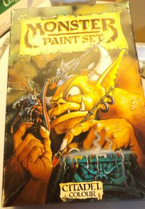
Coolest box art ever! The old paint sets from Citadel Colour featured cover art of monsters painting monsters. My box top got a puncture in it so I repaired it with PVA glue. A shame, but fixable.
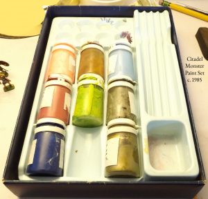
My Monster Paint Set with Bottom Half of Box and tray, some paints which I believe are the correct ones that I still have that went in that set, but I am still working on that.
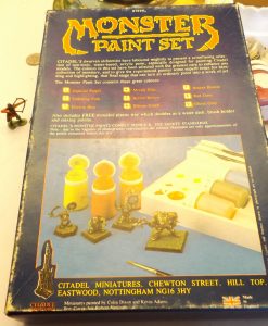
The back of the box. The colors were Imperial Purple, Titillating Pink, Electric Blue, Moody Blue, Bestial Brown, Bilious Green, Brazen Bronze, Red Gore (which I can not find and I think I threw out long ago), and Ghoul Grey.
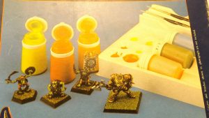
Closeup of the Picture on the back of the Monster Set – Cool Minis huh? Note the light blue which appears to be Electric Blue and either one of the reddish colors may depict the original Imperial Purple which according to my research was a magenta, not a violet.
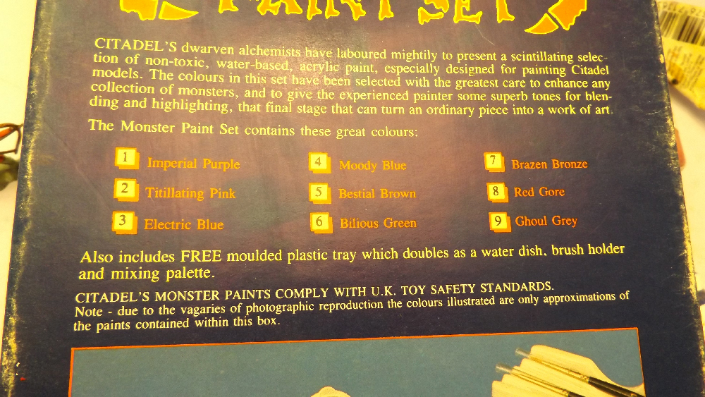
Closeup of the paint names from the Monster set.
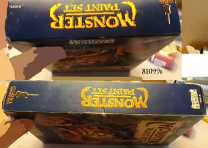
Note the Model Number 810998 (the last eight is smaller than the others)
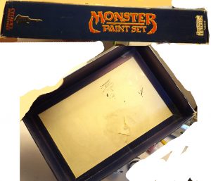
The problem is that the color names changed dramatically through the years. Worm purple disappeared actually. And so it is difficult to obtain samples of it. And when you do it is difficult to tell whether it is actually worm purple because other purples and a dark blue that is something like imperial blue were available so even some of the more violet blues could in theory be called purple by some so the naming conventions and unlabeled original boxes make identifying worm purple quite difficult.
I happen to have one I am fairly certain and have done a lot of research and so I think I can speak about it now with some clarity, but nothing I say is set in stone so keep that in mind and understand I have drawn no final conclusion which of the two was called worm. Without someone that worked on the paints sets to verify the naming conventions of that era or without a sealed box of one or the other sets I can not be certain (if anyone has one please contact me, I may be interested in purchasing it).
As I said there were two purples offered not three, and so what some people have identified as worm purple is probably one of the blues, but I’m not sure. There were officially only two purples. Worm and Imperial.
When one thinks of the word “Imperial” one is reminded of Imperial Blue and therefore thinks that Imperial Purple would be the darker of the two purples offered and indeed many people have identified it as such, but this may be an incorrect assumption.
The color’s name is “Imperial Purple” not “Imperial Blue” and so we should disassociate the idea of the word “Imperial” implying that a color is dark or blueish. That is an assumption.
The word “Imperial” I believe was the company’s variation on the word “Tyrian” which means like a tyrant or king (same thing) (tyrannosaurus rex, tyrant king of lizards) and the royal dye was derived from the place “Tyre” for the Phoenians made an incredibly expensive dye along that coastline (between Tyre and Sidon just as the Bible says) called “Tyrian Purple” which was used to dye robes for royalty. The shade of the dye itself when concentrated is a dark purple, but when it dyes clothing the clothing becomes a red-purple. That is most likely the shade of what Citadel called “Imperial Purple.” I have found corresponding colors to the red purple in the boxed sets called “Senator Purple” and “Emperor Purple” (Derivan Brand) etc. And so I believe that the “Imperial Purple” in the original boxed sets was the more red of the two purples. (I’ll upload photos soon).
The worm purple therefore would seem to be the other one (again I will upload photos soon). However I am not certain for while the more reddish of the two was still in production as Warlock Purple there was a more blueish purple in production called Imperial Purple, but I am not certain it was the same as in the original sets. See chart http://www.dakkadakka.com/wiki/en/Paint_Range_Compatibility_Chart
Now if you look at http://collector-info.com/Manufacturer/CIT/GAWPAT/GAWPATPAICLA/4933-81098-Creature-Paint-Set.html you’ll see the full Creature set. There is no dark blueish color there. Just a medium purple and on the box it says “worm purple.” (The neutral lavenderish color there is elf grey). At this link http://collector-info.com/Manufacturer/CIT/GAWPAT/GAWPATPAICLA/4966-16-Colour-Worm-Purple.html however what is identified as worm purple is much more blue. That however can be the effect of the flash as a flash throws blue light, but I do not think so. I think it is a mis-identification confusing one of the blues (a royal blue) as a purple. This is understandable as both are near violet. Now it is very possible the formula of the worm purple changed from a warmer redder purple just on the warm side of the color wheel in the early edition boxes and then to a royal blueish purple on the other side of the color wheel sometime before they started labeling the boxes (either version could have been the earliest), but I don’t think so. I just think it is a case of mis-identification since both my set and the set photographed show essentially the same color which is a grape like purple just slightly to the red side of an intense grape and slightly pale. Also it could be that what was identified by that site as worm purple was an individual color sold later that was a variant (individual pots were labeled, but labels can fall off and who knows if they were all labeled?) or it could the later color which was called imperial purple (even though the original set had another color called by the same name which was basically magenta) which appears on charts but of what I have no sample that matches. Let’s investigate that possibility.
If you look at the chart http://www.usagundamstore.com/products/game-colors for Vallejo you will see that Warlord Purple is the most red and Hexed Lichen next reddish being a bit more violet and Royal Purple the most violet and the least red. If Royal Purple is the correct replacement for Imperial Purple than Imperial purple was indeed the darkest, but my memory says otherwise.
I REMEMBER the boxed sets and indeed have one of the backs of those boxes in my possession (perhaps even one of the critically important ones to the discussion, but I will have to recheck that.) I remember the Creature box which contained worm purple and it had a picture of a dark purple paint and some kind of wraith that had been painted in that colour with a chaos warrior and wizard beside him (beautiful mini painting by the way on those boxes, we can all aspire to that). We have a picture of that box on the collector site http://collector-info.com/Manufacturer/CIT/GAWPAT/GAWPATPAICLA/4933-81098-Creature-Paint-Set.html
Now if we look at the box of the first set http://collector-info.com/Manufacturer/CIT/GAWPAT/GAWPATPAICLA/4932-81097-Colour-Paint-Set.html we can clearly see a green, a yellow, and a red displayed open and those colors were in that box. That particular green in called woodland green and the yellow is sunburst and that red blood red. And so we can draw the inference that the colors shown open are indeed supposed to indicate which colors are in the boxes on each box.
What does that mean? HMM??? That worm purple was on the box as shown and was DARK but not very dark, it was purple, but not violet, it was not a light reddish, and not a dark blueish.
http://collector-info.com/Manufacturer/CIT/GAWPAT/GAWPATPAICLA/4934-81099-Monster-Paint-Set.html
Now check out the picture for the monster box. It says it contains Imperial Purple as and what is shown? HMM??? A greenish yellow which is bilious green, a red scarlet color, and orange scarlet color, and left in the box a pink which is titillating pink, a dull green or brown which I surmise was the original bestial brown (although I could be wrong about that as I do not have a sample, but it is listed on the box as bestial so if the colors in the tray in the picture on the box are the colors inside the box that’s bestial brown), and then a light cyan blue which I surmise is the original electric blue (I do have a sample, but we’ll get to that later).
And so we can assume that the original IMPERIAL PURPLE WAS more RED AND LIGHTER and that WORM WAS more VIOLET AND DARKER.
Do we have a photographed set? It appears so. Again same site same page. http://collector-info.com/Manufacturer/CIT/GAWPAT/GAWPATPAICLA/4934-81099-Monster-Paint-Set.html picture at the bottom of the opened set. There’s our mystery color. First one. A reddish purple (magenta). That must be imperial. The next color is tit pink. The next electric blue. The next moody blue (that’s a weird color we will discuss later), a color I am not sure about but probably bestial brown, bilious green (easy to identify, it’s a vile bright yellow green), red gore (another easy color, red but dark), ghoul grey (sometimes hard to identify, easy to confuse with elf grey unless side by side), and a missing Brazen Brass (or bronze).
The photos and a presumed unbroken set although unsealed was submitted to a collector information site (scroll down to see all the photos associated with the creature boxed set) http://collector-info.com/Manufacturer/CIT/GAWPAT/GAWPATPAICLA/4933-81098-Creature-Paint-Set.html
An informational site shows all the boxes. http://realmofchaos80s.blogspot.com/2012/09/retro-painting-and-modelling-or.html and another page on the same site http://realmofchaos80s.blogspot.com/2014/10/smelly-primer-is-it-worth-collecting.html
Another one shows the fronts of the boxes and “moody blue” http://es.paperblog.com/las-primeras-pinturas-de-citadel-1567679/
Another one shows partial sets http://www.warseer.com/forums/printthread.php?t=314874&pp=80 post by OrlyggJafnakol at 31-12-2011, 17:19
Furthermore as if that was not enough a recent auction on the Italian ebay captured the allusive worm! There a dark purple is in the Creature Box (tan box) and the top is marked worm by the seller in the other photos. This could be a reconstructed set. After all the original boxed sets had a plastic tray not foam, but it appears that it is well known that worm was a dark purple. While I am very interested in buying a sealed box of any of the original sets or all of them I would not purchase an opened kit like this as modern paints are still being made and so modern paints could be substituted without anyone the wiser. However a kit like this would serve painting purposes just fine, but at a premium in comparison to replacement paints available from Coat D’Arms or Vallejo. http://www.ebay.it/itm/Citadel-Creature-Paint-Set-9-Colors-Warhammer-Worm-Purple-Hobglobin-Orange-U7-/371597453569
And so it think it is conclusive. Worm purple is the darker and more violet purple I have and Imperial Purple is the more magenta. I will color sample these for you guys and you will have the correct pigments for making a match as soon as I discover them.
The darker color is a reddish purple, but less red than the other and it contains more blue and therefore it is much closer to a perfect violet. In fact my manganese violet from Gamblin makes a color very similar to it, but the paint I made from the manganese violet and some gum is a bit darker and slightly more violet. Gum darkens things a bit and I will try the pigment again when I get my acrylic medium in the mail. Also I will try mixing white and a number of opaque reds and magentas into it to see the color trends towards a match. And I will keep searching for a perfect pigment to match it singularly, but until then I was say manganese violet would suffice as a substitute however imperfectly.
I found photos of a “worm purple” container which appears to be dark like mine and not reddish. I also found a photo of a lead figure worm somebody painted and he called it purple worm and it was the color I believe “worm purple” to be.
If I am correct that means many of the comparison charts online for replacement colors need to be corrected. Most do not even list “worm purple” as it was believed to be entirely discontinued. However I believe both colors were renamed.
However some of the charts were helpful for they suggested replacing the colour “warlock purple” with magenta. Magenta is a well known color and so the tint of it well known to be reddish confirming the idea that Warlock was the redder of the two
However the charts are all contradictory and since they do not list worm purple it is hard to draw and final conclusion as to the nature of the original worm and imperial purples from charts alone. Luckily I have wet sample..
The redder of the two became what is commonly known in the Citadel line as “Warlock Purple.” The exact recipes may have been different, hence the name change, but the colors are at least very close if not identical. There may be a slight difference as some charts suggest, but they are very near to each other and visually they look the same to me based on the photographs I was able to obtain.
I believe that name change from “Imperial Purple” to “Warlock Purple” came about to make the color seem more fantastical and less historical.
Vallejo’s color to replace Warlock Purple appears reddish like the color I believe to be Imperial Purple and they called theirs “Warlord Purple” restoring some of the historical element but retaining the “war” prefix. In the modern citadel line the color corresponding to it is “Screamer Pink.”
The title “Screamer Pink” is revealing as the color is obviously a magenta, but may have some white in it. Pinks are usually made by adding white into a red.
The darker and more violet color which I believe to be “worm purple” is a very medium purple in my judgement. Not much different than grape kool-aid. The “worm” prefix may have been a pun suggesting its slightly “warm” tone (reddish) instead of cool (blueish) which helped it to retain the title of purple instead of violet, however that is merely conjecture.
Someone suggested that a color called “companion violet” which is made by Derivan should correspond which suggests to me that “worm purple” is more violet than red and that “Imperial Purple” should correspond to Royal Purple in Vallejo and Emperor Purple in Derivan. Finding charts detailing Derivan and Vallejo’s colors I do believe that Worm Purple is the more violet of the two colors in the original set. http://www.derivan.com.au/derivan-products/minis-colours.html and http://scalemodeldb.com/paintcharts/vallejo.
The purple offered on the Citadel site now in their “Layer” range called “Xereus Purple” seems to be the closet match for the darker purple I am calling “worm purple.” But it too went through an intermediate name change. The closest color or color name which replaced “worm purple” was “Lichen purple.” http://www.dakkadakka.com/wiki/en/Paint_Range_Compatibility_Chart and it is called “Hexed Lichen” by Vallejo and “Poison Purple” by Coat D’Arms. The word “lichen” may have been chosen because a worm is like a leech and the word “lichen” sounds like leech but that is my conjecture. According to wikipedia, “There are reports dating almost 2000 years old of lichens being used to make purple and red dyes.” Source – https://en.wikipedia.org/wiki/Lichen
However in another chart I’ve seen reflecting official colors from a later era, which was printed, Liche Purple is reddish, warlock purple more blue than that and Regal Blue the next richest color probably being the name at the time for Royal Blue. And so again we run up against contradictory information. I know the chart is an official one because I remember it from material back when I purchased paints. I may have it tucked away somewhere, but I am not certain. I can not even find my warhammer manual, ugh!
However it could be that the difference was because of printing limitations and the limited colors that were shown on the chart or simply because the official names for the colors had again changed by that era. https://pbs.twimg.com/media/CPYGtiZUkAEIHg7.jpg or http://aaminis.myfastforum.org/about22884.html or http://hawkmancustomeminiature.blogspot.com/p/materiali-e-colori.html
If you look at this chart… http://www.astronomican.com/showthread.php?21943-Citadel-%28Games-Workshop%29-Vallejo-and-other-paints-conparisson-table you will see Warlock Purple listed as the most red and Liche as basically a grape. The marking after Imperial means that it was discontinued. But there is no worm purple on the chart. Warlock purple was still in production at the time the chart was made as was Liche and so again we have a conundrum. Which one was the replacement for worm? Because worm was listed in the original boxed set and imperial was as well we might assume that Imperial Purple is the darker more violet of the two and that Worm is Warlock which is red. But the chart could be in error. If it is correct I am wrong and Imperial Purple is the darker and more violet and Warlock Purple is the rename of Worm. Vallejo Hexed Lichen matches the darker and more violet of the two colors pretty well from what I can tell so it is possible that at some point Imperial was discontinued and Liche replaced it. And if that is the case then Warlock Purple is the rename of Worm.
Even so while I need to test a number of pigments which I do not have to find an absolute replacement for the darker purple in the original boxed sets of citadel paints, the color which I will call worm purple for the time being, at least it is the color I believe to be worm purple, I believe that if you want a replacement for that purple you can use Maganese Violet in a pinch or Hexed Lichen by Vallejo or Poison Purple by Coat D’Arms or Xereus Purple in the modern Citadel line however I will check to see if Vallejo’s royal purple is closer.
Possible purple pigments to investigate include…
Purple lake which is a possibility, but seemingly unlikely since my experience with the pigment is that it is very transparent.
Ultramarine Violet http://www.earthpigments.com/ultramarine-violet-pigment/ and http://www.danielsmith.com/item–i-284-600-108 has the right overtones, but appears too blue in thick coverage, but possible. However appears far too blue here http://www.dickblick.com/items/02993-6730/
Mineral Violet may work. http://www.dickblick.com/items/02993-6700/
Cobalt Violet may work http://www.dickblick.com/items/02993-6660/
Quinacridone Violet which makes “Caesar Purple” sounds likely :) and makes Permanent Purple Red. Here Permanent Purple Red http://www.dickblick.com/items/00665-6410/ looks identical. Match likely. http://www.dickblick.com/items/00504-6513/ Oh yeah Baby. Quinacridone purple is not the same, way different http://www.dickblick.com/items/02130-6183/. http://www.dickblick.com/items/00371-6510/ Undertones PRECISELY THE SAME slightly pink blue and mass the same. Worm purple is most likely Quinacridone Violet. I’m gonna get some if I can. Looks like it is the http://www.pigments.com/Products/Organic-Pigments/Violet/1419-Quinacridone-Violet-19.aspx variation not the http://www.pigments.com/Products/Organic-Pigments/Violet/1219-Quinacridone-Red-Violet-19.aspx variation.
Assumed Match for Worm Purple without testing : 1419 Quinacridone Violet 19 C. I. Pigment: Violet 19 C. I. NO.: 73900
A cheap paint version http://www.goldenpaints.com/products/color/fluid/quinacridone-violet
The pigment is considered safe https://www.basf.com/group/corporate/en/literature-document:/GPS+Safety+Summaries–C+I+Pigment+Violet+19-English.pdf
The red version appears to be the pigment for the original boxed set Imperial Purple but the picture looks a tad warmer (sinopia trends warm, as usual). http://www.sinopia.com/DCPV0191-Quinacridone-Violet-PV19_p_155.html
The mayan violet looks a good substitute for worm purple that isn’t too expensive http://www.sinopia.com/799V1000-Mayan-Violet-Pigment_p_137.html
I have the Mayan red and it is too red for replace imperial purple, but it is beautifully transparent and so nice.
The probable worm purple pigment available in a watercolor from W&N http://www.winsornewton.com/uk/shop/water-colour/limited-edition-water-colour?colourid=884955040928
Quinacridone Magenta is the probable original boxed set Imperial Purple http://www.dickblick.com/items/00319-3620/ I have tested Sinopias DC1221 Quinacridone Magenta. I have not scanned it, but the visual tests show it very close when in a gum. If not a precise match this is a reasonably priced and readily available substitute. If the match is not precise the pigment is correct, but a variation should be sought. http://www.sinopia.com/DC1221-Quinacridone-Magenta_p_35.html
http://www.sinopia.com/DCPV0191-Quinacridone-Violet-PV19_p_155.html could be a substitute for Imperial Purple as well looks a tad warmer.
Other sources for purple section:
The King James Bible – Ezekiel 26, 27, Jeremiah 10, 27, Exodus 25, 26, 27, 28, 35, 36, 38,39, Numbers 4, Judges 8, II Chronicles 2, 3, Esther 1, 8, Proverbs 31, Song of Solomon 3, 7, The gospels… Mark 15, Luke 16, John 19… Book of Acts 16, Rev 17.
https://en.wikipedia.org/wiki/Tyrian_purple
https://en.wikipedia.org/wiki/Purple
____________
Blues
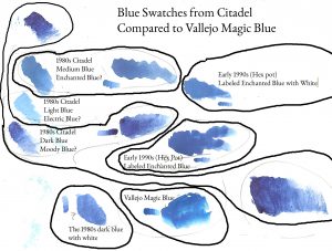
Here we see the three blues which I still have from the original boxed sets and an hex pot of labeled “Enchanted Blue” compared to Vallejo’s “Magic Blue.” The dark blue goes darker and warmer than any of them, but only the lightest blue is vastly different in the midtone range.
I’ve got the blues. All of them. Well the three that were offered in the original boxed set and they are still good, but I’ve also got a dried enchanted blue from the later citadel period (hard plastic pot) which is dry and I recently purchased a pot of enchanted blue from the mid citadel period (soft hexagonal pot) which I hope will arrive in the mail sometimes next week. I want to test these paints as carefully as I can to determine their pigments and try to establish what the original enchanted, moody, and electric blues were.
Since I have three blues from the original sets and the sets are broken and it has already been well established by the study of the purples that the names and colors changed dramatically through the years I can not properly identify them. The three blues which I have from the original set which I have which I will call the Pleiades will require a lot of research to nail down and the internet has not been helpful so far.
In the picture above we see the three blues which I still have from the original boxed sets and an hex pot of labeled “Enchanted Blue” compared to Vallejo’s “Magic Blue” in swatches. The dark blue goes darker and warmer than any of them, but only the lightest blue is vastly different in the midtone range. The graininess of the dark blue is greater than any of them and much of that graininess remains even in a white mix. The Enchanted Blue as labeled in a Hex pot from the 1990s is darker than the mid-range blue which I have from the boxed set, but when a bit of white is mixed in it matches that mid-range blue more so than the dark blue when white it added into it and compared to the Hex pot blue. And so I am fairly confident that the pigment which is in the Hex pot is the same as in the mid-range blue, but that the mid-range blue either had some or more white mixed into it or it was a lighter shade of the same pigment to begin with.
Today (May 21, 2016) my Vallejo paints should arrive (update: they have) and I will have a sample of Magic Blue from Vallejo. Magic Blue is the paint Vallejo designed to replace enchanted blue and so hopefully some color matching will be possible. However this does not answer the primary questions. The questions are; does magic blue match the original enchanted blue in the boxed sets or some later version and how would we know since the names of the colors are known to change? Update: The Vallejo enchanted blue imitates the later period enchanted blue from Citadel, not the early set. It was a color I needed so I am happy about that but it does not help distinguish the old blues from each other.
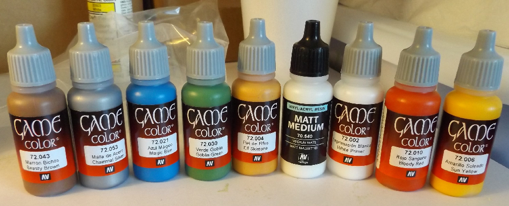
It has begun! My new Vallejo Game Color paint has arrived, minus a few which were out of stock. I got Bestial Brown, Chainmal Silver, Magic Blue, Goblin Green, Elf Fleshtone, Matt Medium, White Primer, Bloody Red, and Sun Yellow.
With the last mystery, the mystery of the purple worm we were able to solve it by an examination of the boxes. This however will not work as well when examining the blues and I will explain why. I am a comic book colorist that deals with the intricacies of the printers palette everyday. The problem is that some blues are difficult to print because the CMYK printers palette has a cool blue ink which is cyan. And that makes warm cobalt blues impossible to print. The colors either look too cyan (cool) or magenta has to be introduced to make them darker which makes them warmer and darker, but since magenta is a cool red rich blues like cobalt do not look correct either.
In 2008 someone found an old Citadel Colour set of the labeled kind in tact and photographed it under what appears to be a flash. http://forums.tauonline.org/painting/49153-hey-look-what-i-found.html
That is an excellent find because it shows enchanted blue! Let’s discuss the way the color has separated. First we can see that it is not super light nor super dark and has a lot of marbling.
We can say that the lightest blue I have then is probably not the enchanted blue because while it has visible marbling the bulk of the paint is in a higher greenish blue (cyan) tone with only the darkest streaks, which are few, very very few, near a cobalt (which is a medium blue). The whites are not much brighter than the main body of the paint, although to be fair I have mixed it a bit, but did not scrape the walls and floor much. The bulk of the paint could be said to be sky blue or like the light turquoise I used to see sold by the silversmiths at South-Western shows when I was a child as that was the variety being mined in Arizona then. And so this light blue looks somewhat similar to the enchanted blue shown at the link above, but not entirely so. There is far too much of the higher tone in the pot and not enough of the cobalt tone. In the labeled enchanted blue shown to us there is a lot of darker cobalt tone and some medium ultra marine tone. We must understand though that a flash typically throws blue light, but this photo was taken in 2007 and if you look at the highlights on the tray the white point is not too cool and in fact the reflected light from the box is throwing some warm light into the shadows and it is not much different than the highlights from the flash (which are fairly neutral) and so we can assume the flash is throwing mostly neutral light. In fact I do not think I could have asked for a better lit flash photo. And so we do not have to think that the color in reality is much different than what the photo shows and so we do not need to think that the flash is making a dark warm blue a lot cooler and we do not need to think that a cool blue like a cyan is being made a lot warmer and darker since a even a warm flash would brighten the light cyan by a lot making it appear much lighter than what the photo shows the higher tones to in the paint to be and actually all lights cool things since reflected lights are naturally warm and direct light is naturally cool so you have to have a very strongly hued light and a very strongly hued object throwing reflections to make that effect appear reversed (as you may in a room lit by a red lightbulb and the object receiving reflected light from a blue wall that is receiving some blueish light). As I say the photo is a very good flash that appears very neutral. I also know the lighting is neutral because we have a method for calibration within the photo itself do we not? We have other colors in the box right? And we know those colors and have already identified them. The blood red is the red which I have, it is slightly cool, but not dark. Just like the red I have (although mine is dry the color is very much the same). It looks as it does in life. As does the yellow (a nice neutral yellow, not too bright and not too highly saturated). The woodland green looks as it does in life, but brighter since a flash is lighting it but still retains it’s cool greyish body and so there we go. Calibration. The enchanted blue in life would appear much as it does in the photo.
Note the large amount of marbling in the middle-range blue and how almost none is present in the darkest blue which appears to be something like a royal blue. The marbling is mostly from the paint pulling away from the surface of the pot as it dries near the pot wall and so helps to reveal the true color of the dried paint.
So I think we can eliminate the highest toned blue I have, which is also the coolest from being enchanted blue. Now let’s consider the darkest blue I have, which is also the warmest and most violet. What strikes me about that blue is it’s transparency which means it is probably a phthalocyanine but it is difficult to assess transparency while a paint is in the pot and so that probably will not help us identify the color based on the photo so we can disregard that when considering the photographic evidence.
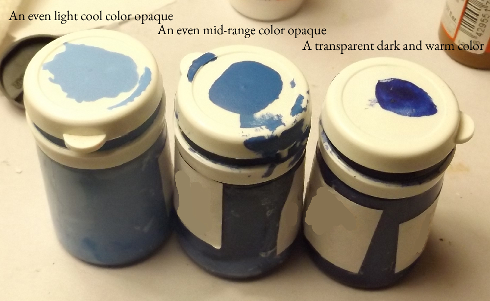
The blues with color samples applied to the tops of the pots. Note the range from light and cool to dark and warm and note how the lighter colors are opaque and how the dark color is transparent.
But another thing which strikes me about the dark blue I have is that it has very little marbling. Yes I have stirred it, but still even at the bottom of the pot near the edges where a larger rounded tipped stirring stick like I used (a paintbrush handle I had available) would have difficult reaching there is very little marbling. This is also an attribute of phthalocyanine by the way as the pigment is very fine being made in a laboratory and so it mixes to an even color very readily. The photograph presented shows a lot of marbling so already I would not think the two paints are the same. Another major difference is that my dark blue is very violet and deep in color like a royal blue something like a new pair of dark levis or even more so like the bell-bottom pants of a navy sailor (navy blue). And we do not see a lot of that tone within the photograph. In fact we only see it in the very darkest parts of the marbling which is scarce in the sample. And as I said my dark blue paint is almost entirely even throughout and so has almost entirely this dark navy color only. The difference between the high tones and low tones in contrast is almost non-existent in my paint and so my dark blue paint is not a match to the enchanted blue in the photo. That leaves only one of my blues that could be the enchanted.
However we must do our due diligence to examine my paint against the one photographed. Does mine have a lot of marbling like the photographed paint. Yes. Very much so. The contrast between the lowest and highest tone is great and there are many steps between. Near the top of the pot is a dark blue like a navy, a little farther down there is a slightly warm cobalt which makes up the bulk of the paint, in the higher toned areas there is a slightly warm ultramarine, then there is a medium ultra marine, then a cooler and light ultramarine, and then a medium cyan, and then a higher cooler cyan, and then at the very bottom of the pot there is light cyan which is almost so light that it matches the lighter cyan blue paint I have. And so there is extreme marbling in my medium blue paint. And since there is little warm dark in the marbling and about the same amount of light cool marbling and the bulk is in the middle we can assume that if mixed the result would be a medium blue paint very much like what is shown in the photo. I think I have identified my enchanted blue.
However let’s use one final test; that is one from logic. We know that the initial set, which was the Citadel Colour, was designed to be a practical set for general painting. We know this because it was designed around a primary palette scheme. There was a red, a blue, and yellow, a green, a black, a white, etc. And so we can assume the designers meant all subtle colors used by the artist to be those mixed by the artist themselves. And so we can assume the best blue for mixing would be the one chosen. After all the red is fairly medium, and so is the yellow, and the green is dark, but a good mixing green also, and black and white were also included so introducing greys into the mixture to dull the saturation could be something done. If you look at the other sets they introduced more complex colors as the primaries were in the original set and so we can trust that the most medium blue found throughout the boxed sets is the enchanted blue and so I have some confidence that my medium blue is the enchanted blue. It looks like it matches not the “magic blue” in Vallejo but perhaps the Ultramarine Blue “Azul” (from Lapis Lazuli stone from which Ultramarine paint is made) 72.022 and may be the Coat D’Arms “Marine Blue” and perhaps Deep Blue 20B for the Foundary paints. Like I said the color charts showing paint equivalents which I found on the internet need serious revision, correction, and clarification. They are not even close to being accurate. My great work is ahead. By the way if anyone wants to send me free sample paints or dry swatches (actual paint chips not printed ones) so I can make charts feel free to do so. I can not afford to buy every paint to make charts but I will do my best with the information the companies provide on their websites soon.
Now in all color charts I have seen electric blue is the lightest blue and the coolest. I have a light blue which is cool so I can assume it is the electric blue. However there is a bit of a problem. I have a paint which was destroyed by thinner and the dried hulk of pigment (rock hard) it is even lighter and cyan than my lightest cool blue, but the bottom of the paint is dark and looks almost metallic (I remember it being transformed by the effects of the thinner) and I loathing the paint which I ruined for it was a foul thing and remains so. And when I broke off a piece of this paint and reground it it was indeed a very very light cyan. Now I need to carefully count my pots so I can determine if one of the two light blues would have been an extra paint purchased at some point or part of the original sets. But so I can not be certain I have electric blue, however I think that I do. I have seen charts which include a color called “Ice Blue” (later called Lothern Blue) and the ruined paint looks ice to me but on those charts electric blue is not listed, so perhaps electric was renamed ice or an ice was purchased at some point. I’ll research further later. But from what I can tell from virtual swatches on the internet the light cyan blue I have that is still good looks like the Vallejo electric blue which it is meant to replace. And it matches the picture on the Monster boxed set (I found my box and I have photos from the internet) which was supposed to include electric blue, but that set also included moody blue. However…
I have seen pots identified by label as moody blue and they are not light. And as I said the electric blue was supposed to be the lightest of the original blues according to charts. Here we see a monster boxed set photographed with all its original paints. http://kingsminis.blogspot.com/2012_02_01_archive.html and there are two blues, one light and one dark. And the dark one matches my dark blue and the light one matches my light blue. And so I am confident I have both colors and that the dark one is MOODY BLUE and the light one ELECTRIC BLUE and that enchanted blue is the one between the two. I recognize that dark blue as what is known in some company’s paint lines as dark blue, royal blue, navy blue, and imperial blue, and antwerp blue, and milori blue, and french ultramarine blue, etc. etc. etc depending on the actual pigment and various shades.
And that explains why later versions of “Imperial” by Citadel paint line got confused, for “Imperial Blue” is a violet blue, while the “Imperial Purple” in the old sets which was magenta.
And so “Moody blue” was renamed “Imperial Blue” to make the naming conventions match more closely other paint lines and to avoid confusion over the difference between “Imperial Purple” and “Imperial blue.” The original set “Imperial Purple” was renamed Warlock Purple dropping the word “Imperial” would prevent people from thinking it was like Imperial Blue and the word “warlock” was something like “warlord” which the word used in what Vallejo calls their similar color which is called “Warlord Purple.”
And the original name of the dark blue in the set was “Moody Blue” because PB27 (Iron Blue) is known for “very moody darks” according to http://www.handprint.com/HP/WCL/waterb.html. You probably did not know that paint can get moody, but it can if you handle it improperly. Some are a bit temperamental after all; being tempered paints of course.
And so yes. It appears I have all three blues. The beautiful Pleiades of the original sets. I can make these colors. At first I thought Moody blue was probably and perhaps it is a phthalocyanine, however I need to find out exactly which type, my PB15:3 is a bit warmer from what I can tell, but I’ll check it again, but any phthalo-blue pigment would make a good substitute for Moody Blue although the correct pigment is probably PB27 (Iron Blue) which is also used to make Prussian Blue and Milori Blue and French Blue and Mineral Blue and Antwerp and so those paints could substitute. The enchanted blue could be made from cobalt or a medium ultramarine or a perhaps darker ultramarine paint or medium warm cobalt could substitute. And the electric blue from a cool ultramarine with white probably or sky blue paint or cerulean blue or cerulean blue hue paint could substitute.
We really have no reason not to use the classical Citadel palette do we? What a great selection of colours they had! Three blues in order from darkest and warmest to lightest and coolest! Wonderful. Perhaps this is why Foundry http://www.wargamesfoundry.com/, sells their colors in sets of three tones for each singular hue. That was the idea from the outset and they are carrying on that tradition (an expensive way to buy paint however as you need three colors every time you buy a hue, but it saves you from having to mix if that is hard for you like if you suffer from total or partial color blindness – I’m cheap so I wouldn’t do it that way, but I do collect pigments in a somewhat like manner because it gives me more options for making paint).
____________
“Smelly Primer” was a brush on primer available in the early Citadel line. An article written about it with a user named sonatris ooher finding “smelly primer” and photographing it. A VERY RARE FIND! Great job Sonatris! http://realmofchaos80s.blogspot.com/2014/10/smelly-primer-is-it-worth-collecting.html and http://s28.postimg.org/qcifeclod/IMG_20141022_00034.jpg
________
And perhaps at this point I should diverge a bit and explain why the paints I used are no longer being produced precisely as they were.
Before Games Workshop paints came along a good selection of colours were available through Citadel proper (which is now part of Games Workshop).
That original company is known as HMG Limited in Manchester, UK and apparently they still produce paint for labels like Foundry Paints and Coat’d’Arms, etc..
I have not tried any of those, but the selection of flesh tones from Foundry looks very good so you may consider trying them if you can get a hold of some (http://www.wargamesfoundry.com/paints/foundry-painting-system/big-paint-list/).
But at some point the companies merged with Games Workshop selling paints under the title “Citadel Colour” which was the title of the first boxed set of Citadel paints which was made long before the merger. They were very good paints and I used to buy them a lot. I got the warhammer set which came with archers as my base palette for a lot less than equivalent sets are sold for now and used them for many years.
Games Workshop paints are still available at most good hobby shops and you can order from the company directly online and so I’ve used them the majority of the time and found them to be very good, but their entire line has changed and that has caused confusion.
They have more colors available, but they have separated their paints into more categories and it can be confusing to the novice painter, but starter sets are a good way to go. The idea is that they have separated the paints into categories which describe the properties of the paints. It is a good idea, but they do not explain it well.
From what I can tell the base paints are good as primers because they are absorbent making a good foundation for the subsequent layers. The layer paints are regular paints and from what I can tell opaque or semi-transparent. The last layer they recommend is their glaze line which are transparent. Pretty simple concept, but as I say; they do not explain it well.
The names of the colors were changed also to make the recommended schemes more recognizable in relation to their new table-top games. That was not cute at all. The website does not feature a conversion chart and in fact has no colour chart whatsoever. There are no photographs of wet paint, out or else in the pots either way, so you have no idea of what you are really looking at when buying paint. The color swatches are digital and no photographed so you have no idea of the opacity and the overtones nor undertones of the paint. It appears that they want you to follow a system of coloring whereby you paint precisely in a specific order specific characters in specific colors that you get from books they sell. Fuk dat. Again Games Workshop insults its customers and at $4.25 for a small pot I am not going to take it.
However their paint has always been good and I have not heard otherwise.
The problem with the old paint pots drying out was a concern for me even when I was young, but I liked the paints and they were available at the shops I went to so that is what I used.
The pots did dry out and they are expensive, but the paint was very fine and I got a lot of use out of them. Apparently the new pots from games workshop are more airtight. But they went through many changes. I’ll supply pictures of each kind soon. For now a description will suffice.
The soft plastic paint pots the original citadel colours came in (before they were sold under Games Workshop) were amazingly airtight. I have a lot that are from the original boxes sold (mid-1980s editions) that had their seals broken and were hardly used and put away for decades in horrible conditions and are still good.
Those classic paint pots and lids are soft rubbery plastic (polypropylene) and seal entirely if you press down the lids hard. They are the kinds of paint pots that are still used at P3, Coat’DArms, and Foundry if my information is correct. Reaper uses drop tip bottles like Vallejo.
The classical and powerfully traditional pots are magical. They really are. As long as you make sure they are entirely closed they will keep your paints for decades in perfect condition.
Fulfilling an epic quest will gain you those kinds of empty pots and you will be the envy of the kingdom.
(http://www.shcweb.co.uk/eshop/product.php?xProd=67&xSec=38
https://www.theplasticbottlescompany.com/product/20ml-natural-paint-pot/
https://www.shcweb.co.uk/store/20ml-plastic-paint-pot-with-white-flip-top-lid.html
https://www.ampulla.co.uk/product.asp?P_ID=1511
http://www.warcolours.com/index.php?route=product/product&product_id=90
http://www.thewarstore.com/product61545.html or http://www.thewarstore.com/product61278.html for dropper bottles. Dropper bottle are also available at the other suppliers but the warstore has the clear top kind and they are a domestic supplier so that’s cool cause ‘merica! and the shipping would probably be less.
Apparently after a while when individual paint sales become common they started using hexagonal shaped pots with soft flip top lids. I have never about these drying out so I do not think that change was detrimental as the plastic type seems to be the same.
But later Citadel paint started coming in hexagonal shaped pots made of hard plastic with hard plastic twisting lids. Bad idea.
While the hexagonal shape made opening stuck lids easy enough those hard plastic lids did not seal correctly and dry paint would have to be scraped from the edges while holding the pots at an angle to keep the chips out of your paint to get them to seal well and you had to add occasional water to them to help them out. These are the kinds of pots my warhammer painting set came with and they dried up despite my best efforts.
After that Citadel retained the hexagonal pot, but changed the lid to a flip top that had an extension inside that stopped up the hole into the lower part of the lid. These were a lot better than the twist tops and my elf flesh from that era is good and was only partly dry and I was able to reconstitute it entirely even though I think I purchased it around 2001 AD.
My dad had three of the original citadel sets (1980 sets) and I still keep his dried up paints around for nostalgia sake and to keep samples of the colours so I know what they look like as they were manufactured then or so I merely thought. Shocked was I that most of the paint is still good! Some were entirely useless as the lids were not on entirely or had dried out before I stored them or because I had added thinner into them before I understood the difference between acrylic and enamel paints (don’t be too harsh, I was a kid then). But so many were perfectly good (including the chainmail paint which is amazing since metallics are known for going bad) that even I, who know of the special powers of the classical paint pot was surprised. Complete your quest and you too will have this power!
The original Citadel fantasy sets my dad had came in three boxes called “Citadel Colour, Creature, and Monster” respectively. They manufactured an “Expert” fantasy set as well which I never saw which apparently was a set of inks for shading. They also made sets called “Ork and Eldar, Space Marine, Epic Battle, and Metallic” for a total of 8 sets, but the original sets came with some metallics so you did not need the metallic set for basic metal effects.
My dad usually used enamels for models, but he painted in acrylic from time to time.
All together the colors my dad had available for his water-based paint palette would have been Skull White, Chaos Black, Blood Red, Bronzed Flesh, Woodland Green, Enchanted Blue, Sunburst Yellow, Mithril Silver, Shining Gold as that is what came in the Colour Set;
Rotting Flesh, Goblin Green, Elf Grey, Worm Purple, Hobgoblin Orange, Orc Brown, Spearstaff Brown, Swamp Brown, Chainmail, in the Creature Set;
Brazen Brass (or bronze), Bilious Green, Ghoul Grey, Bestial Brown, Electric Blue, Red Gore, Imperial Purple, Moody Blue, Titillating Pink, in the Monster Set.
The ones I had available in my Warhammer Citadel Colour Set were Blood Red, Goblin Green, Enchanted Blue, Skull White, Chaos Black, SunBurst Yellow, Bestial Brown, and Elf Flesh.
To give you an idea of the type of palette you could create from a set like the basic one I had I could describe it to you by saying that it is just a basic primary palette with a tan brown and a flesh and a metallic silver paint for guns, blades, and armour.
It was a great little kit and I am sad it is dried up, but the fallen Citadel can be rebuilt!
At first I thought I’d go with Citadel replacements and just get some medium and brush on primer and see how that goes. The replacement list would have been…
Skull White – White Scar (I can make white from titanium)
Chaos Black – Abaddon Black (I can make black from imitation ivory black)
Goblin Green – Warboss Green (I’ll try Warpstone Glow as well) (I can make from chromium oxide).
Bestial Brown – Mournfang Brown (I can make some from any raw sienna and white or burnt sienna and white for a redder tone).
Enchanted Blue – Caledor Sky and I might try Altdorf Guard Blue which is closer to UltraMarines Blue. (I can make some from any cyan blue pigment).
Elf Flesh – Kislev Flesh. This is perhaps a bad match according to one source even though it is recommended and so if I ever buy it I will try Bestigor Flesh as well and will tell you which is closer. (I can make a flesh mix myself from reds and yellows and white and green to dull it a bit if necessary).
Blood Red – Evil Sunz Scarlet. Korne Red and Mephiston Red might be worth trying but I do not think I will need them but they are pretty. (I can make from Napthol Red).
Sunburst Yellow – Flash Gitz Yellow. (I can make from Hansa Yellow).
Chainmail – Ironbreaker (I have no metallic pigments. I would need to buy this or find a metallic pigment supplier. I think dickblick has some dry metallic pigment.)
And to that I will add a bronze metallic which is very useful.
I do wish that games workshop had a real colour chart on their site with RGB swatches and numerics. It would help a lot.
But in the end I decide to go with Vallejo and got:
White Primer, Matte Medium, Dead White, Chaos Black, Sunblast Yellow, Bloody Red, Magic Blue, Goblin Green, Beasty Brown, Elf Skintone, Chainmail Silver, Bright Bronze each for $2.99.
Now regardless of what you pay for your paints you should be diligent about protecting your investment. After all I am still using pots of paint my dad had received as a father’s day gift from my mother about thirty years ago which I later inherited.
And so we know that if stored in good pots acrylic paints acrylic paints can last well over a quarter century and I have no reason to think they can not last double or tripple that.
To preserve your paints make sure all lids are on tight and pressed down firmly all the way around and that no paint is obstructing the seal. A moist paper towel will take away any wet paint and dry paint can be picked off plastic easily.
Before you close your paints add a drop or two of water to the top of the paint as a moisturizer and moisture seal and as a sacrificial offering to the air which will rob your paint of some moisture regardless of what you do.
If you are going to store your paint for a long time (over two months I would say) drop in water on the top of your paint until the container is almost full and unless the paint was dry when you did this do not mix that water into the paint. That will keep your paint wet for a long time. When you again open the long-term-stored paint do not shake or mix it initially. Just check it and if there is a lot of water on top pour out or spoon out the excess and check the paint for moisture by mixing it and adding more water back in as needed.
If your paint is semi-dry when you open it add a drop or two of water at a time and mix the paint with a toothpick or brush handle thoroughly to break up all the little chunks until the right level of moisture is achieved. (To clean your brush handle just wipe with a moist paper towel and make sure it is completely clean before using it in another pot of paint).
If your paint is very dry or even if it appear completely dry fill the container with water just a little below the opening and close the lid very tightly compressing the air inside. Let the paint stand for two days and try to mix the paint at the top. Use a stiff wooden dowel to try to mix the paint near the top or press into the paint and see if the center is soft. If you can not move the paint at all the paint is dead and perhaps a dissolving agent will work. Pour out the water completely and let airdry completely and try a little ammonia. If that does not work to soften the paint just pick out the paint and save the empty bottle and cry a little. You can save the dried paint if you suspect you may need to match the color later with a different kind of paint or a custom mix.
If you can move the paint pour off the excess water and mix the moist area as best as you can and refill the container and reseal the container with that water pressurized under the seal again and repeat. Eventually the paint will soften and be mixable and you will at least be able to recover most of the paint.
Now you are probably thinking adding water to paint will make it runny. That is so if you mix a lot of water into the paint, but acrylic paint dries quickly and needs to be re-moisturized so extra water will not hurt it and if you add too much just stir it and mix it slowly exposing it to the air and it will dry to a good consistency.
Two last tips: Adding water to your paint does break down the binding medium and so every so often add a drop of medium to your paint and it will retain some body despite having water in it. Remember only a drop is necessary, especially if the paint pot is new and fresh and full. You do not want your paint to be too sticky.
It is not necessary to add extra medium to paint during the preparation for long term storage as the medium is what dries during storage when water escapes.
Dry pigment and water alone will never harden although the heavy pigment will settle into a sludge and it may seem hard at first. Dry pigment can be stored in water alone indefinitely if the water is clean and kept free from bacterial growth and so you can keep dry pigment, which is difficult to handle dry, in dropper bottles where the dry pigment is suspended in water. That is called an aqueous dispersion or suspension (a suspension is the more common term when using oil as the viscosity forces the pigment to float more so and in water it is usually called a dispersion).
You just shake those before use and drop some of the water/pigment mix onto your palette add some medium from a dropper bottle to make a quick mix acrylic paint with very little to waste. Bacterial growth is your only enemy so do not make a lot of dispersion
For long term storage use dry pigment which you can stored in dropper bottles without water or in glass or plastic jars indefinitely. Many pigments fade in color when exposed to sunlight so store the containers in a box with a lid and you will not have a problem.
I hope this article was a help to you.
_______________
Penny Saving Palette Tip from dndlead.com which I thought was cool; never tried it, but it’s a unique tip. Check it out! also the drill dimensions for a paint rack could be useful. http://www.dndlead.com/Painting/Pallet.htm and http://www.dndlead.com/Painting/Paints.htm
Additional Notes: Ral Partha Paints…
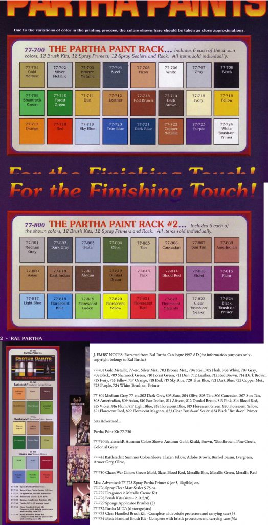
From 1997 Ral Partha Catalogue (provided for research purposes only – copyright remains Ral Partha) see below this caption for easier to read text.
From Ral Partha Catalogue 1997 – 77-701 Gold Metallic, 77-etc. Silver Met., 703 Bronze Met., 704 Steel, 705 Flesh, 706 White, 707 Gray, 708 Black, 709 Shamrock Green, 710 Forest Green, 711 Dun, 712 Leather, 712 Red Brown, 714 Dark Brown, 715 Ivory, 716 Yellow, 717 Orange, 718 Red, 719 Sky Blue, 720 True Blue, 721 Dark Blue, 722 Copper Met., 723 Purple, 724 White ‘Brush on’ Primer
77-801 Medium Grey, 77-etc.802 Dark Gray, 803 Slate, 804 Olive, 805 Tan, 806 Caucasian, 807 Sun Tan, 808 Amerindian, 809 Asian, 810 East Indian, 811 African, 812 Dunkel Braun, 813 Pink, 814 Blood Red, 815 Violet, 816 Plum, 817 Light Blue, 818 Florescent Blue, 819 Florescent Green, 820 Florescent Yellow, 821 Florescent Red, 822 Florescent Magenta, 823 Clear ‘Brush-on’ Sealer, 824 Black ‘ Brush-on’ Primer
Sets Advertised… Partha Paint Kit 77-730 77-740 BattletechR Autumn Colors Sleeve: Autumn Gold, Khaki, Brown, Woodbrown, Pine Green, Colonial Green 77-741 BattletechR Summer Colors Sleeve: Flaxen Yellow, Adobe Brown, Bunkel Braun, Evergreen, Armor Grey, Olive, 77-750 Chaos War Colors Sleeve: Mold, Slate, Blood Red, Metallic Blue, Metallic Green, Metallic Red
Misc Advertised: 77-725 Spray Partha Primer 6 [or 5, illegible] oz. 77-726 Spray Clear Matte Sealer 5.75 oz. 77-727 Dragonscale Metallic Creme Kit 77-728 Brush Kits (sizes – 2. 0. 5/0) 77-729 Sponge Applicator Brushes (3) 77-732 Partha M.T.’s (6 storage jars) 77-733 Clear Handled Brush Kit – Complete with bristle protectors and carrying case (5) 77-734 Black Handled Brush Kit – Complete with bristle protectors and carrying case (5)
Here’s a better version of what is above from a 1995 Ral Partha Catalogue which I found at the links… http://www.paintedminiatures.ca/catalog1.html and http://www.paintedminiatures.ca/PDF%20Catalogs/Ral%20Partha/partha1995.pdf
_______________________
http://theminiaturespage.com/ref/paintguide.html
http://www.dndlead.com/Catalogs/RalParthaHistorical1985.pdf
http://www.dndlead.com/Catalogs.htm
http://www.ralpartha.com/index.php/downloads/catalogs
Ral Partha Paint was introduced in 1985 (https://en.wikipedia.org/wiki/Ral_Partha_Enterprises) colors cost 99 cents each and were …
77-701 Gold Metalic
77-702 Silver Mtallic
77-703 Bronze Metallic
77-704 Steel
77-705 Flesh
77-706 White
77-707 Gray
77-708 Black
77-709 Shamrock Green
77-710 Forest Green
77-711 Dun
77-712 Leather
77-713 Red Brown
77-714 Dark Brown
77-715 Ivory
77-716 Yellow
77-717 Orange
77-718 Red
77-719 Turquoise
77-720 True Blue
77-721 Royal Blue
77-722 Ancient Purple
77-723 Purple
77-724 Partha PrimerTM (also 99 cents)
77-725 Spray Partha PrimerTM (was $3.50)
77-726 Sprayer Clear MattSealer(5.75 oz.) (was $3.50)
77-727 DragonscaleTM MetallicCreme Kit (6 colors) (for $8.00)
77-728 Brush Kit (sizes 2-0-5/0) (for $7.00)
77-729 Sponge Applicator Brushes (3) (for 99 cents)
Additional paints they offered were listed and you can see printed approximations of their selection here… (http://www.ralpartha.com/index.php/downloads/catalogs/47-ral-partha-1990-catalog/file and http://www.ralpartha.com/index.php/downloads/partha-pipeline/12-partha-pipeline-2000-january/file)
http://www.miniatures-workshop.com/lostminiswiki/?title=Catalogs_%28Ral_Partha%29 and http://www.fantasypartystore.com/scripts/openExtra.asp?extra=37 and http://www.enworld.org/forum/showwiki.php?title=2nd-Edition-AD-and-D-Collectors-Guide and http://www.dndlead.com/Catalogs.htm and http://www.ralpartha.com/index.php/downloads/catalogs
http://www.dndlead.com/grenadier/8000s.htm
There was a advanced dungeons and dragons 10 color basic paint set made in 1983 TSR5900 http://tomeoftreasures.com/tot_adnd/minis/tsr5900_basicpaintset.htm called “Official Advanced Dungeons & Dragons Basic Paint Set For Metal Miniatures” the box showed a photo of hands of a man painting with a series of metal figures in the left hand and a brush in the right with paints and figures between the two hands. The official TSR TSR, Inc. Logo was in the center of the design below the photo. The background was a rainbow with a red, orange, yellow, green, blue, and purple horizontal stripes in order from top to bottom. Below the photo between the photo and logo were the words “CONTENTS: 10 colors in 1/2 oz. glass bottles.” On the back two drawn and colored figures are shown with the colors listed as “Dragon Red Golden Yellow White Primer Shield Blue Goblin Green Ruddy Flesh Shadow Black Leather Brown Snow White Chainmail”
The back of the box read, “It’s easy… with Official Advanced Dungeons & Dragons TM Paints PICK THE PAINTING SYSTEM THAT’S RIGHT FOR YOU Brochure with complete instruction inside *OPAQUE paint is easy – just dab on colors straight form the bottle. Best for beginners. *Fast-Finishing is our unique technique for quickly painting figures complete with shading and highlighting. You’ll be amazed how fast miniatures can be painted! *FINE ART painting lets you turn your miniatures into works of art using profession artists techniques.
AD&D TM PAINTS GIVE YOU EXACTLY THE RIGHT COLOR: * BASIC PAINTS: Ideal for humans and other characters. Colors for skin tones, uniforms, weapons, equipment and backgrounds included. * ADVANCED PAINTS: Made for monsters! Colors let you match official descriptions in Monster Manual and Monster Manual II * BRILLIANTS Paints: Bright colors for fantastic effects! Perfect for science fiction, including STAR FRONTIERS TM Metal Miniatures and highlights on your AD&D TM characters and monsters. *METALLIC PAINTS: Only AD&D Metallics provide super realistic tones of bright brass, shining silver, gleaming gold and precious platinium.”
The sold an entire Paint Rack which included Brush Kits, 12 Spray Primers etc.
The idea was that a “Monster” set would be for monsters right? Since there was a “Monster” set for the Citadel line we can assume similar marketing strategies. Particularly since the monster set included a color called “Worm Purple.” We know this because the back of the box of the basic set listed the colors in the other set. I can not read all the words, but this is what I have so far with ? marking unreadable words…
AD&D Advanced Paint Set BEHOLDER TM Pink BULLYWUG TM Green White Primer Worm Purple Ogre Orange something Red Something Blue Minotaur Brown Troll Green? Hawk? Grey
Brilliant Paint Set Brilliant Green Brillian Orange Brillian Purple Brillian Red Brilliath L? Brillian Blue Brillian Yellow White Primer Snow White Gloss? Black
Metallic Paint Set Silver Platinum Gold Ocaclcum? Bross Clear Plum? Bronze? Clear C? Copper Clea? ?
Additional Open Stock Colours Scarlet Crimson? Sky Blue Linen Violet Sand M? B? M? Flesh
A Treasure Trove of Color – Dragon Illustration depicting the available colors from Ral Partha who produced both Ral Partha and Advanced Dungeons and Dragons Paints. This is provided for research purposes only – Copyright remains with Ral Partha. This is from this link http://www.ralpartha.com/index.php/downloads/catalogs/47-ral-partha-1990-catalog/file – See list below this caption for clear text of the list of paints in the AD&D line, see above this illustration for the others.
77-761 Aged Metal
77-762 Frost Gaint White
77-763 Minotaur Fur Bronw
77-764 Hell Hound Brown
77-765 Damsel Flesh
77-766 Manticore Mane Yellow
77-767 Mold Yellow
77-768 Goblin Flesh Tangerine [I’m willing to bet this was the color Citadel called Hobgoblin Orange]
77-769 Dragon Scale Red
77-770 Tentacle Pink [probably Citadel’s Titillating Pink]
77-771 Dragon Tongue Purple [hmmm maybe worm purple?]
77-772 Sembia Red
77-773 Cormyr Blue
77-774 Mind Flayer Mauve [this mauve may have been the magenta purple that I think was called Imperial Purple in the 1st Citadel sets]
77-775 Paladin Blue [possibly the AD&D sets “Shield Blue”]
77-776 Dragon Scale Blue
77-777 Bulette Blue
77-778 Remorhaz Blue
77-779 Storm Giant Green
77-780 Behir Blue
77-781 Troll Flesh Green
77-782 Elven Green
77-783 Ghoul Flesh Lime [maybe Ghoul Grey name was borrored, but this Green became Bilious Green]
77-784 Bullywugs Belly Green [probably the typical goblin green]
77-790 AD&D Silks & Satins (a) Royal Blue, (b) Lavender, (c) Blue, (d) Royal Red, (e) White, (f) Green (6 paints in a sleeve) [I think I remember satin paint from my mom’s plaster painting days, they were not metallic, but had a silky sheen, according to a Bon Artiste Paint container I still have which she used they were called “pearl paints” contrasting the other option which were flat]
77-791 AD&D Natural Colors (a) Werefur Brown [a great name], (b) Sunlight Yellow, (c) Guts Pink, (d) Elemental Orange, (e) Moss Green, (f) Blue Water Blue (6 paints in a sleeve)
This site http://www.enworld.org/forum/showthread.php?332821-1st-Edition-AD-amp-D-Collector-s-Guide lists sets like… http://www.enworld.org/forum/showthread.php?332821-1st-Edition-AD-amp-D-Collector-s-Guide
Polly’s Colors – Official AD&D Paints (1979?) AD&D Basic Adhesive Set (1983) AD&D Basic Paint Set AD&D Advanced Paint Set AD&D Brilliants Paint Set AD&D Metallics Paint Set AD&D Basic Brush Set AD&D Advanced Brush Set
____
10-516 First Quest Paint Kit http://www.miniatures-workshop.com/lostminiswiki/index.php?title=AD%26D_Box_Sets
___
Ral Partha and AD&D Paints
Photos shown here… http://gholascale.blogspot.com/2012/08/ancient-paint.html
– One of the AD&D paint label reads “AD&D Paints 77-772 SEMBIA RED… 3/4 oz.” and the AD&D paint labels have the address of “RAL PARTHA ENTERPRISES INC Carthage CT. CINTI. OH 45212” and the Ral Partha Paints were in the same kind of bottles with the same tops, the same stickers, but a different label with a blue “RP” on them with the address of “5938 CARTHAGE CT. CINN. OHIO 45212” and so I think we can safely assume that both brands of paint were made by the same manufacturer.
_________
Bon Artiste Paints
Paints called “Bon Artiste” paints were used by the mother to paint plasters and were considered the very best available for that purpose at that time. I have one bottle of dry paint with a label intact which reads “Bon Artiste Professional Artist Materials Picturesque Paints Permanent Water soluble flat and pearl paints.” The color is labeled as “MP – 3045 MEDIUM BROWN” that color is type-writer typed onto the label. The size is listed as “1 FLUID OUNCE NET” The label also reads, “DIRECTIONS: For best results use small soft brush. Can be sponged air-sprayed spattered rubber stamped or any other individual method of application. CAUTION: Wash off immediately with water while still wet. Do not take internally. KEEP OUT OF REACH OF CHILDREN.” Further information reads, “Bon Artiste Picturesque flat and pearl paints are specially formulated giving them wide variety of uses. One coat gives complete coverage in most instances may be use on surfaces including statuary (plaster) ceramic bisque fabrics unfinished wood canvas and most hobby & craft items. Once dry becomes waterproof weather proof alcohol proof and machine washable on cloth. Decorate ceramic bisque without firing.” The containers were glass jars with metal white screw top lids with labels on the glass jar no labels on the lids. The glass jar on the bottom has a symbol of two vertical lines with an underline beneath them. The numbers 17 and 87 with a number 1 between them surrounded by an oval circle. I surmise then the jar was manufactured in 1987.
Information on the internet about this brand is non-existant except a reference http://ceramic.tradeworlds.com/web_category_10214.html which says, “Caldex Craft Products, Inc Is The Manufacturer Of Old World Art Gold Leafing Products And Bon Artiste Craft Paint And Finishing Materials For The Statuary And Ceramic Industry” so apparently the paint was specifically marketed towards plaster and bisque artisans and those who would cover statues in gold leaf (religious icon makers (idolaters)). Old World Art gold leaf can still be purchased http://www.dickblick.com/products/old-world-art-leafing-kits/#photos and when I put in Old World Art into dickblick’s search I get a link to Daler-Rowney egg tempera but perhaps only because of the description which is Daler-Rowney is proud to be one of the few paint makers offering classical egg tempera — one of the world’s oldest painting mediums — in ready-mixed tubes for contemporary fine art applications.” And here is another source for their products http://www.duall.com/shop/manufacturer/view/237/old-world-art.html one of which is called “Satin Sealer” which may be of significance for “Satin” was one of the types of paints offered in the AD&D line. This document http://www.readbag.com/onboces-safety-msds-c-cplist says… “PRODUCTS AND MANUFACTURERS Ceramics Specialty Products American Art Clay Co., Inc. Caldex Craft Products, Inc. Caldex Craft Products, Inc. Crayola LLC DecoArt, Inc. DecoArt, Inc. DecoArt, Inc. DecoArt, Inc. DecoArt, Inc. DecoArt, Inc. DecoArt, Inc. DecoArt, Inc. DecoArt, Inc. DecoArt, Inc. DecoArt, Inc.” And that is all I could find and so I figure they no longer make paints.
The last version of these paints of which I have came in a plastic bottle just like Apple Barrel paints come in now, but the flip lids had a more sharp angle and the hinge is partly cut into the lid extending over the top. The label says “641 Wintergreen” (this color a dark green something like viridian but opaque and so probably a chromium oxide mixed with something) which appears in a greenish type that was printed on top the label and not part of the regular printing process and a correction is made to the label from 1 fluid ounce where a hand written number 2 indicates there are 2 fluid ounces. The manufacturer is listed as “CALDEXENTERPRISES ONTARIO, CA 91761” and there is a pigment company named Ferco there so maybe that’s who was making that paint at that time.
Sources:
https://www.games-workshop.com
https://www.reapermini.com/Paints
http://www.acrylicosvallejo.com
http://www.wargamesfoundry.com/paints/foundry-painting-system/
https://privateerpress.com/formula-p3/paints
http://www.thewarstore.com/vallejo-game-color-paint.html
http://www.miniaturemarket.com
http://www.sinopia.com
http://taleofpainters.blogspot.com/2012/04/review-citadel-paint-range.html
http://littlemetalmen.blogspot.com/2013/07/the-old-citadel-color-paint-sets.html
http://collector-info.com/Manufacturer/CIT/GAWPAT/GAW-Paint-and-Tools.html
http://www.dakkadakka.com/wiki/en/Paint_Range_Compatibility_Chart
http://www.paint4models.com/
http://scaleworld.webs.com/Colour%20Charts/Vallejo/VMC-Hum.png
http://3.bp.blogspot.com/-Tb5RNCujmA4/T2zt064BGSI/AAAAAAAACRI/vSfwoDVBOz8/s1600/m2320032a_Citadel_Conversion_Chart.jpg
http://www.danbecker.info/minis/miniother/PaintCharts/
http://www.talkwargaming.com/2013/09/citadel-paints-the-change.html
http://www.tinyworlds.co.uk/blog/paint-comparison-chart-citadel-vallejo-game-colour/