
Sepia is a color very similar to burnt umber but more neutral. The lighter shade I used is CMYK color something around 50 32 69 42 for darkest areas and 44 55 63 20 for a midtone).
Because it’s like umber it’s used in similar ways. In particular sepia is a useful color when creating skin tones. The lighter shades work well as a neutral tone and the darker shades work as a substitute for black when creating hard lines. It can be used in an under-painting, but because sepia is easier to conceal than pure black it is also regularly used as an ink to do ink drawings on the canvas before the painting is begun.
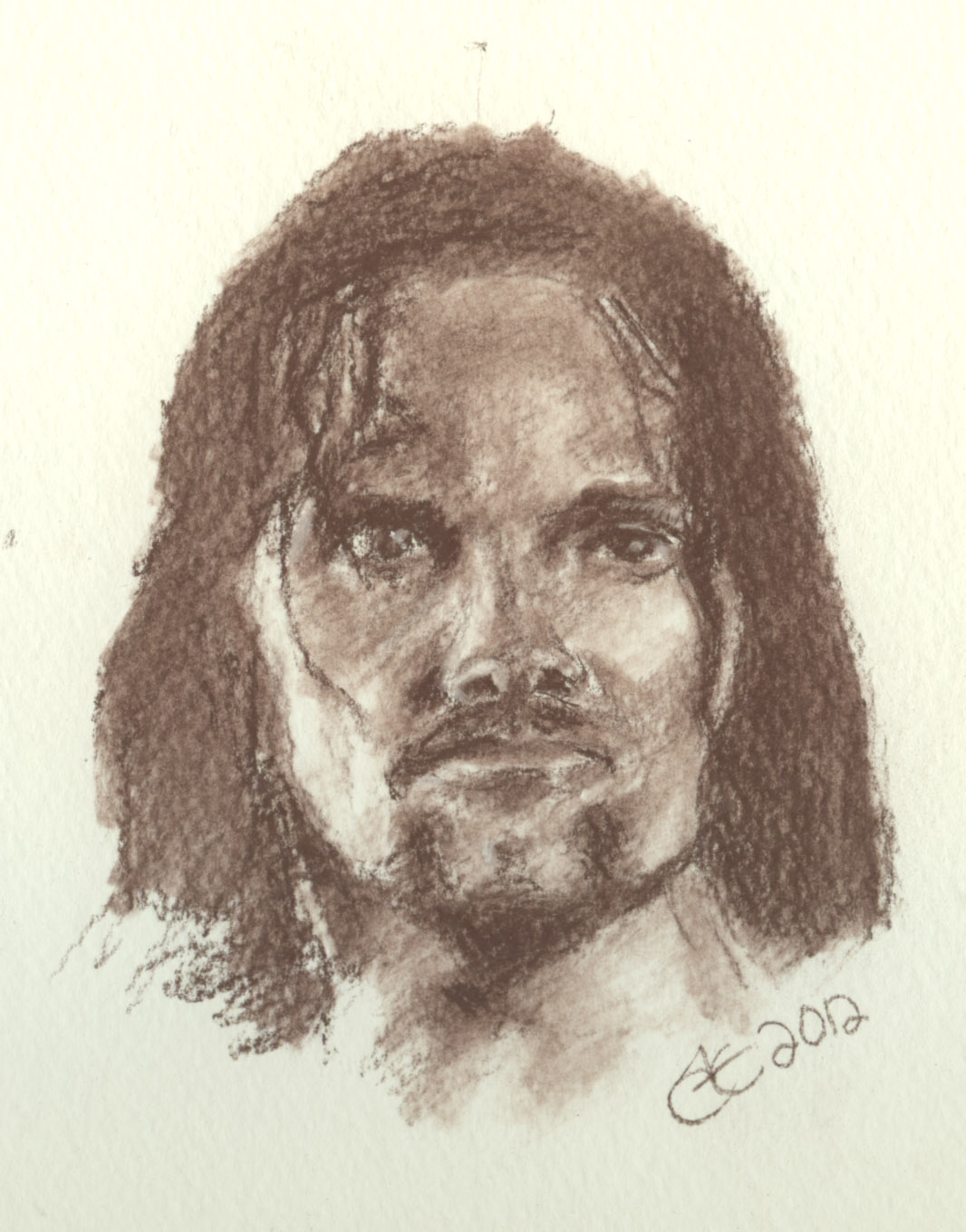
In this case I’ve done a simple sketch of Viggo Mortensen as Aragon in the Lord of the Rings movies. As you can tell the eyes are a little off but I did not take any measurements while doing the sketch and I did not use any construction lines since this was a study on color use and not accurate drawing. The pencil I used was a CretaColor Sepia Light Number 463 22. It came as part of a 27 piece set I got for Christmas available here…
http://www.dickblick.com/products/cretacolor-drawing-sets/
I used the pencil, the blending stick, and the kneaded eraser in the kit. I only used the eraser towards the end of the process to touch up ever so slightly. I also used the white pastel pencil in the kit to highlight the eyes. I like the eraser in the kit as it was super sticky and picked up material better than some generic kneaded erasers I’ve used.
I sketched on watercolor paper because I couldn’t find any sketch paper at the time and this perhaps made the project a bit more expensive, but… oh well, the added texture was nice.
The sketch was accomplished by viewing the image on the computer screen which was about 40 inches away. I simply held my pencil with an outstretched arm towards the screen marking lengths of one area of the picture to another from the tip of the pencil to any area on the pencil with my thumbnail (which is long because I play classical guitar) and used the lengths I obtained to mark the distance of one point and another on the paper making light marks until I was sure everything was in place and in proportion. No actual measurements were taken. That method isn’t really accurate enough for doing facial detail but it usually good enough for figure drawing. I choose to use the method only to save time and as you can tell the accuracy of the placement of features of the face is lacking.
I started laying in tones in a bit of a light cross hatch fashion with the point and somewhat side of the pencil very lightly. Then I used the blending stick to blend those areas into smoother tones and then I continued with the blender to sort of paint in areas to create the transitional areas as I would with a brush. When I needed to I would apply more pigment from the pencil to the paper and continued blending, but I also picked up some pigment from the pencil with the tip of the stick and applied it to the paper with the stick directly.
Once I got the picture done all in sepia I lifted just a few areas ever so slightly with the eraser to bring back a few of the whites and then used the white pastel pencil to add the highlights in the eyes and a few on the nose and lips and so on. It’s better to avoid having to do this because the pastel never looks like the paper does but it helps give you fine detail where it’s needed.
Sketching hurts my hands, but the results can be pleasing. Hopefully this gives you idea of how to use the color sepia in your art.